Do you want to learn how to design logos that your clients absolutely love? While you can find a ton of great logo design tips online, there aren’t many resources that explain exactly what you shouldn’t do when it comes to your logo design process—which is also key to your logo’s success.
Whether you’re working on logos for freelance graphic design jobs or just want to practice your skills, here are the top 10 biggest logo design mistakes to avoid. Know how to avoid them, and get ready to create a memorable logo design from scratch that your client will love.
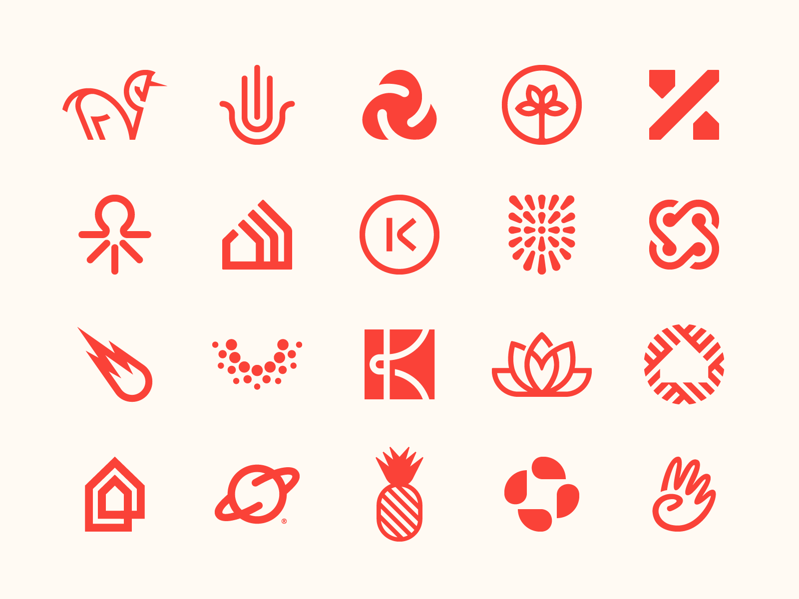
Plus, we’ve gathered some visual inspiration to get your creative juices flowing along the way. Let’s get straight into it!
- Mistake #1 — Skipping the research phase
- Mistake #2 — Following trends
- Mistake #3 — Using generic typography for your wordmark
- Mistake #4 — Using bland imagery or visual clichés
- Mistake #5 — Being too abstract
- Mistake #6 — Being too complex
- Mistake #7 — Relying on color or effects
- Mistake #8 — Giving clients too many options
- Mistake #9 — Not making the logo responsive
- Mistake #10 — Not providing brand guidelines

Mistake #1 — Skipping the research phase
Research and brand discovery should be the first stage of any design project, and logos are no exception.
Before jumping straight into your logo design software, take time to learn about the company you’re designing for, as well as their competition. Learn about their customers or user base and what they expect from the company.
Then, set aside some time to analyze and draw conclusions from the research you conduct. Consider using focus groups to find out how the target audience responds to various logo concepts.
The more research you do upfront, the better your logo design is going to be received by your clients later on.
“The key work comes before you start designing. Investing time in gathering clear direction will ease the process of creating a logo and getting it approved. Designing a logo is just the tip of the iceberg. It all depends on what happens before you get there.” — Daniela Madriz, Freelance Graphic Designer

Mistake #2 — Following trends
Logos are meant to be at least somewhat timeless. Some of the oldest logos are still in use today (consider the Chanel double-C logo or the Lacoste alligator). If you follow trends when designing logos, those designs will look dated sooner or later.
Since logos often form the backbone of a company’s branding, it’s important that the logo remains consistent throughout the years.
If the logo is based on current trends, that becomes detrimental to the company’s long-term branding.

Mistake #3 — Using generic typography for your wordmark
When incorporating typography into your logo or wordmark, beware of being generic. A logo that stands out needs to be unique compared to other logos in the same industry. Customizing the typography is one great way to do that.
Instead of just choosing a font for your logo and using it as-is, consider ways to customize the type. That could include simple modifications to things like kerning and letter spacing, or more complex modifications like changing the shape of individual letters.
In either case, take time to adjust the font you use in your logo to make it better fit the brand’s mood and purpose of the logo.

Mistake #4 — Using bland imagery or visual clichés
How many times have you seen a lightbulb associated with ideas? Or a globe associated with environmental causes?
These types of visual clichés are everywhere in the world of logo design and branding. Think of new ways to express these ideas that are still recognizable but aren’t seen everywhere.
The same goes for bland imagery, such as basic shapes. Adding a circle to your logo isn’t going to make it stand out from the hundreds of other logos that include circles. While you can certainly make a circle look unique, it takes a lot more time and skill than using an image that isn’t bland or generic to begin with.
“When researching concepts at the beginning of a logo design project, I often browse through icon sites like Noun Project . I love the idea of finding recognizable symbols from our shared visual language and mix them up in unexpected ways within my designs. — Jeroen Van Eerden, Freelance Logo Designer

Mistake #5 — Being too abstract
While avoiding bland or clichéd imagery is important, you’ll also want to be careful about being too abstract.
Abstract imagery can be eye-catching, but it also doesn’t do much to reinforce the brand’s message if it’s not still clear what it’s supposed to be.
If your logo’s imagery is so abstract that people can’t still recognize what it’s supposed to be, then it might be time to dial it back and make it at least a little more literal.
The goal of a logo isn’t to be artistic—it’s to reinforce the brand’s message and position.

Mistake #6 — Being too complex
Complex logos do a disservice to their brands. When a logo is complex, it becomes more difficult to recognize at a glance, is less scalable, and can be harder to incorporate into other designs like websites or business cards.
Your logo should be no more complex than it absolutely needs to be. While not every logo needs to follow a minimalist aesthetic, simplicity should still be key.
Consider what you can remove from an overly-complicated logo while still keeping the message clear.
“It’s often an issue that people try to put too much into a logo. They try to combine too many ideas so that there isn’t one clear, or core concept. If you can identify one thing that matters most in a brand, and communicate that in a clear and distinctive way, that’s the key to success. Don’t overdo it. — Mackey Saturday, Brand Identity Designer

Mistake #7 — Relying on color or effects
While most of the logos you design are likely to be displayed in color most of the time, there are still instances where a logo might need to be used in a monochromatic format.
If your logo relies on things like color or gradients to be recognizable, it’s at an immediate disadvantage compared to logos that translate well to monochrome.
While color and effects can be used to reinforce the logo’s message, they shouldn’t be used as the primary method for delivering the message.

Mistake #8 — Giving clients too many options
When designing a logo, you may present a client with multiple concepts at the start of the process. While this can seem like a good way to hedge your bets and make sure your client likes at least one of them, too many options can overwhelm your client.
Stick to two or at maximum three initial logo design concepts. This gives your clients options without overwhelming them.
It also helps prevent clients from requesting a Frankenstein-esque logo combining elements from multiple concepts into a single logo that risks looking like a jumbled mess.
Some logo designers even go as far as presenting only one single concept and putting all of their effort into this one solution (AKA “the one concept approach”). Logo designer Melissa Yeager explains:
“My clients aren’t paying me to create options for them. They’re paying me to solve their problems and design the most strategically stunning and versatile brand I can. So instead of creating multiple decent options, I channel all of my creative energy into creating one solution that’s truly phenomenal. — Melissa Yeager, Freelance Logo & Brand Designer

Mistake #9 — Not making the logo responsive
Since logos need to be scaled for use at various sizes, your logo designs need to be responsive.
A responsive logo design is a logo that exists in multiple, slightly different variations so it displays correctly at different scales and applications. For example, a logo displayed on an app icon might need to be reworked for scale vs. the same logo displayed on a billboard.
Making your logo design responsive helps to maximize legibility and recognizability for each size and type of communication for your client’s brand.
Are you advising your clients to go responsive? If not, you definitely should be. Doing so will not only save your clients a headache in the long run, but you’ll also impress them with your expertise and professional advice.

Mistake #10 — Not creating brand guidelines
Brand guidelines (also known as brand style guides or usage guidelines), are a vital part of any logo design package.
These guidelines let anyone using the logo on future design and branding projects know exactly how the logo should be implemented. These guides help with cohesion, describing how different assets come together in a single visual narrative for your client’s company or product.
Brand guidelines can include things like padding and margins, exact colors and typefaces, ways the logo should not be used, and similar information about proper usage.

How to design a timeless logo your clients will love
Keeping in mind that logos are meant to be used for multiple years or decades (rather than for only a few months or a year) should guide your design process.
Think about whether a logo would look out of place in a design from 20 or 50 years ago for some insight into whether a logo design is truly timeless. Consider, too, how well the logo conveys the brand’s messaging to create a logo that’s truly effective.
Do this, and you’ll be well on your way to creating timeless, memorable logo designs that your clients will love. ■
 About the Author — Cameron Chapman: Editor. Blogger. Author. Designer. Copywriter. Marketer. Entrepreneur. Speaker. Consultant. Coach. I wear a lot of hats. What most of them have in common, though, is storytelling.
Find more Process stories on our blog Courtside. Have a suggestion? Contact stories@dribbble.com.


