In this guest post, go behind the scenes with the team at Unfold as they share their process for designing responsive logos based on a real client project. Let’s go!


What is a responsive logo?
There are several good articles on the internet that cover what responsive logos are and why they are needed. In this article, I won’t go deep into history or consider various examples in detail, but I will tell you how we design responsive logos at the Unfold agency. To do this, I’ll take a real client case and walk you through all the stages step by step.
If you’re not familiar with the concept of a responsive logo, here’s a brief description: A responsive logo is a logo with design elements that differ slightly depending on the device or screen size on which they are displayed, without compromising the brand identity. Design elements considered may include icons or symbols, company names and slogans, colors, backgrounds, outlines, and other details.
Now, let’s move on to the project where you’ll see how our team developed a responsive logo for our client.
The Project: Design a logo for a next-generation testing tool
Some time ago, we were approached by the team at Testmo, who created a next-generation test management tool to help teams create high-quality software. The founder of Testmo explained that, “software is getting super complex; users demand flawless apps. We help teams get there.”
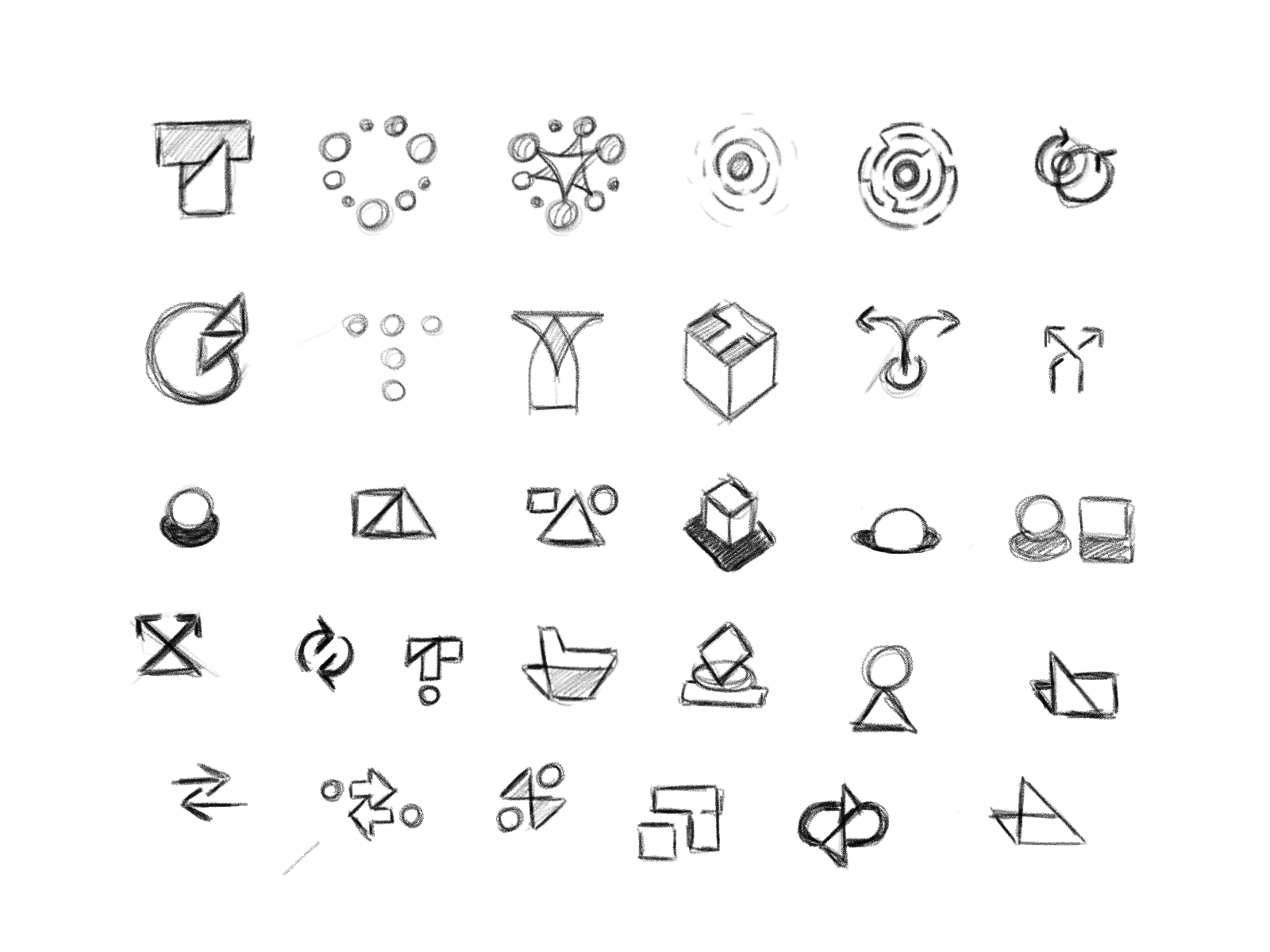
After agreeing on a visual direction with the client, we started developing their logo design. Since I was directly working on this project, I plunged headfirst into the study of images and symbols associated with testing software and related areas. In the course of my research, I came across an article called “Hexagonal Architecture for Testers” and decided to make some sketches with a hexagon to develop a logomark.
This idea turned out to be quite successful, and after some refining, the following concept was obtained:

But before presenting the concept to the client, we first needed to think carefully and test everything to make sure that the logo design works across different applications.
Step 1: The Mono Color Version
We started with a mono-colored version of the logo, because if the logo doesn’t work in black and white, then it technically isn’t a logo and will require a certain degree of stylization. For example, on Dribbble, you can see a lot of beautiful Shots titled ‘logo’. However, a logo isn’t a beautiful picture or illustration, but a sign that should work in a variety of conditions.
On top of that, because of production costs, sometimes only one color of ink is available. Therefore the logo must be reproduced using only one color. In this scenario, the logo, logotype, or symbol must be used following the convention of a light color on a dark background, or vice versa.


It’s also at this stage that we select the typography to go along with the symbol. We select suitable fonts, test them, and if necessary, modify them for the logotype and the logo mark to look as one whole.
Step 2: The Full Color Version
If the mono color version works well, then we start developing the full color version. Most often, it’s the horizontal basic version. The horizontal logo is mainly used for websites, business cards, advertising on billboards, and other sponsorship products.
The main challenge here is to find the right color combination for the logo design to work on both light and dark backgrounds. This isn’t always a simple task—sometimes the logo is perfectly readable on white and light backgrounds, but not so much on dark ones, and vice versa. When this task is solved, you can move on with a clear conscience.


Step 3: The Small Size Version
When it comes to logo design, at Unfold we adhere to the following rule: “less is more.” In other words, our goal is to make logos simple, memorable, and unique all at the same time. This is quite difficult to achieve, but as a result, such a logo will not lose its relevance even after several decades! But even simple forms in small scale sometimes lose their readability. Therefore, we have to make an additional version of the logo mark that can be used in especially small sizes.
We conducted detailed tests and defined the scale for scaling the logo. We usually don’t recommend using the main version of the logo at a scale less than 24 pixels, and instead, we create an additional version of the logo. Everything here will depend on how many details the logo contains.

When creating a small version of the logo, we basically remove the details without sacrificing the overall concept. For example, we delete lines and shapes, or get rid of unnecessary colors.


Step 4: The Greyscale Version
If more than one color is used in the logomark, we make a grayscale version. This is necessary when only shades of certain inks are available due to some restrictions. It’s also necessary in order to avoid reducing the logo to a mono color version when it needs to be placed it on a colored background.


Below, I’ve placed 4 versions of the logo design together that cover most of the responsive application aspects.

Step 5: The Vertical Version
After we completely worked out the horizontal version of the logo (steps outlined above), we created a vertical version, the so-called stacked version.
The vertical version is used for square and vertical layout formats. For example, for printing typographic products, t-shirts, mugs, for instant messengers, social networks, signboards, etc.
I wrote a detailed article on how to keep a good balance in building a vertical version, in which you’ll find many examples and a ton of useful information.


Additional versions
Testmo is a typical project in which I showed how we designed a responsive logo system. We also create other versions depending on the client branding project. For example, a full version of the logo with a description at the bottom, or a round version, etc. It all depends, mainly on the style of the logo, the scope of its application, as well as the wishes of the client ■
 I’m Benjamin Oberemok, born in Ukraine, currently living in Florida. My skillset is versatile, but I specialize in web design and visual identities. I love typography and painting as well. I gladly temporarily trade my computer for cycling, tennis, or archery. Follow me on Dribbble.
RELATED READING
- How to not screw up a logo design: 5 tips from the experts
- Jeroen van Eerden’s formula for designing perfectly balanced logos
- How to design a strong brand identity for digital products
- Brand discovery: 10 key questions to ask your clients before you start designing
Find more Process stories on our blog Courtside. Have a suggestion? Contact stories@dribbble.com.


