Looking to sharpen up your logo design skills? You’re in the right place. We’ve called upon the branding experts of our time and asked them to share their #1 tip when it comes to the logo design process. From coming up with a stellar design concept, choosing just the right shape, to ensuring client satisfaction, it’s all laid out here for you.
Let these great logo designers lead the way and learn what differentiates a good logo from a great logo. Let’s get started!
1. Don’t overdo it

“It’s often an issue that people try to put too much into a logo. They try to combine too many ideas so that there isn’t one clear, or core concept. If you can identify one thing that matters most in a brand, and communicate that in a clear and distinctive way, that’s the key to success. Additionally, always strive to create work that you are proud of and that you believe in.”

2. Prove the context

“Consider whether the logo solves the goal/needs of your client, suits their target demo, fits their aesthetic vision, and differentiates them from competitors. If you’ve defined these things with (not for) the client from the beginning (discovery phase), then you can use this information to make a case that your logo design is objectively ‘right’.
This is the key to getting focused feedback and approvals, instead of subjective uncertainty from clients purely focused on how a logo looks. Logos are much more than what an icon and typography look like in isolation. Prove the context and win the war!”

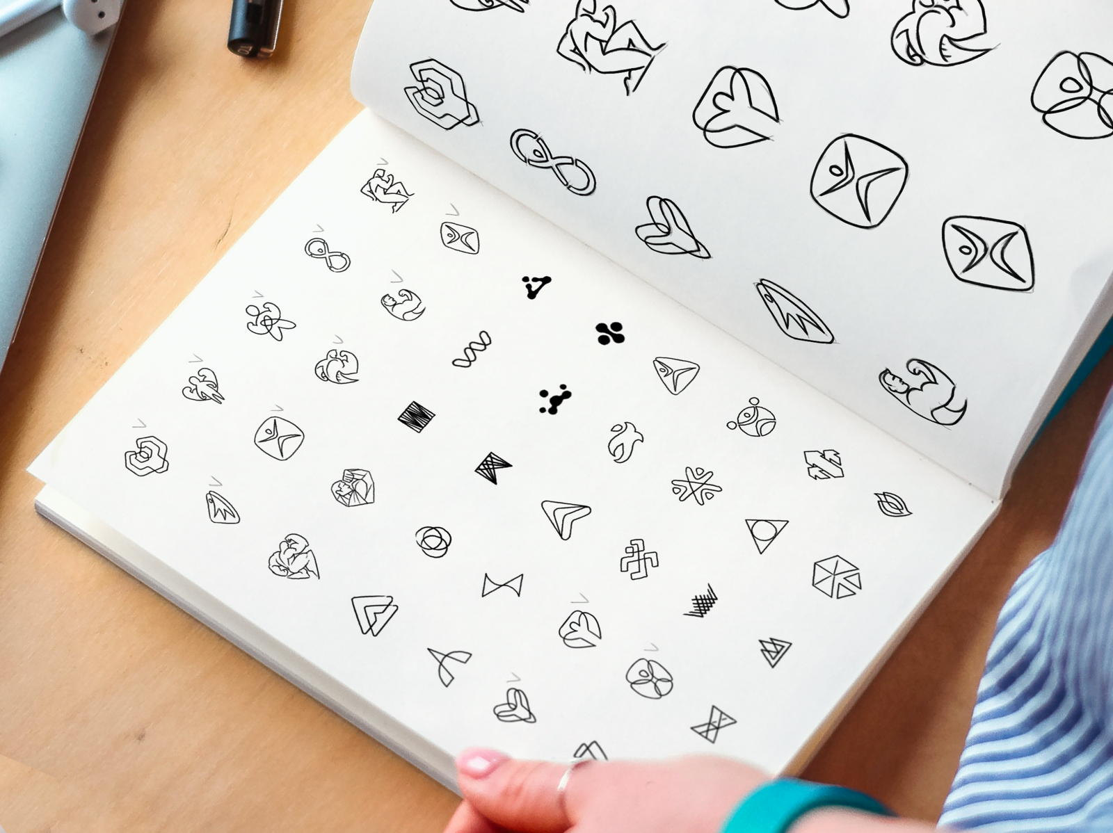
3. Shape matters

“Logos or symbols are probably the oldest form of visual communication and deeply rooted in our culture. The first alphabets originated in symbols that had complex meanings — for this reason, simple geometric shapes are something that we perceive at a subconscious level.
Just like back in the Stone Age, simple forms have the same effect on our emotions and understandings. A circle suggests unity, wholeness, and natural cycles while also implying simplicity, strength, and perfection. An equilateral triangle, on the other hand, evokes three forces acting equally, making an unbreakable whole. It can also represent three states of the same matter — i.e. liquid, gas, and ice. In most cultures, the square represents the material world, but nowadays it tends to represent artificial matter created by humanity.
So, remember to thoughtfully consider the shape of your logo, and choose it with intention. You’ll want to ensure the shape supports the brand’s message.”

4. Invest time in gathering clear direction

“The key work comes before you start designing. Investing time in gathering clear direction will ease the process of creating a logo and getting it approved. Designing a logo is just the tip of the iceberg. It all depends on what happens before you get there.”
“Interview your clients to understand their business, audience, and desires. Research to get immersed in the client’s world, to see what’s out there already, gather inspiration, and spark ideas. Create moodboards to help the client understand the possibilities and communicate what they like and what they don’t. Strategize to give you a clear direction and a solid ‘why’ behind your design decisions. Consume daily beautiful design and professional design blogs to learn design vocabulary and design principles, to later know how to articulate the reasoning behind any design choice. These will help your design process, time, quality, and approval!”

5. Observe the process of other designers

“In my downtime, I like to watch blogs that feature designers I admire. Through these videos, I am able to gain insight into their creative process and later apply their techniques to my own. Whether you are just starting out or have been in the design industry for 10+ years, it’s amazing what you’ll learn from observing other designers work!
When starting a logo project, I dedicate a full day to collecting inspiration. The internet is the easiest resource to find content, although graphic designers are often looking at the same images online. To avoid using similar inspiration as others, I’ll gather clippings of past ephemera to combine with my internet findings and consolidate into moodboards.”

6. Create logos that transcend paper

“When it comes to logo design, it’s always best to keep it simple. This helps with legibility and versatility. In today’s age, technology is always changing and evolving, so we as designers need to create logos that transcend paper. VR and AI, for example, are places where logo design might be more common in the future, so creating a logo that is simple can help set up the logo for success in these applications.”
“A simple logo is memorable which goes a long way in creating an identity and association with the brand. It can be tempting to want to over-design a logo or put too much detail into it. This can create problems when the logo needs to be used at a small size or if it needs to be printed in a certain way such as embroidery. In my experience, using thoughtful restraint and believing in the power of simplicity creates the most effective logo designs.”

Conclusion
We hope you found these logo design tips helpful! Remember that designing a great logo goes beyond following the design trends, or simply choosing a pretty color scheme or typeface. Make a statement, know how to defend your ideas, and be thoughtful in your design decisions. After all, the best logos out there are great because they stand the test of time (think Coca Cola, Apple, or Nike). We can’t wait to see what new logos you design!
Find more Community stories on our blog Courtside. Have a suggestion? Contact stories@dribbble.com.


