Lovely tactile words appear from time to time on Dribbble, dimensional type we want to touch — except we would never because it’s already been touched, painstakingly arranged by a designer possessing a great deal of patience, in addition to skill.
“Every material has limitations and will rip, break, tear, shatter, etc. at some point.”
Illustrator and designer Danielle Evans spends many a work hour lettering with food and other dimensional objects. She says that designing in a moveable medium requires recognizing the medium’s shortcomings up front.
“Artists regularly try to strangle their own work, and people generally want to systemize everything. With objects and definitely food, the unknown is very wide and greater than the known. Every material has limitations and will rip, break, tear, shatter, etc. at some point. We shouldn’t be afraid to push them to their brink, but can’t ignore their obvious shortcomings. For example, a large paragraph of sans serif type would be painstaking in sprinkles. Rather, consider a script treatment.”
Danielle discusses more object design principles in this interview with Go Media. Below, Danielle’s piece for the most recent WMC Fest, plus 8 more examples of tactile lettering.


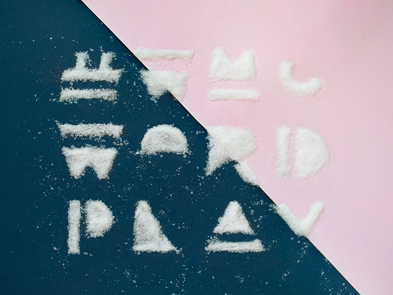
Top: Joseph Alessio, Enon Avital, Becca Clason. Middle: Joshua Hunt, Danielle Evans, Carolyn Bahar. Bottom: Will Dove for ISL, Christine Kawasaki-Chan, Jacob Waites
Shot Blocks offer a cluster of shots sharing a theme, a product, a method … whatever catches our fancy. We’re open to suggestions. Email stories@dribbble.com.
Like Shot Blocks? Check out Shot Block: Rock, Shot Block: Data, and Shot Block: Tiny.
Find more Inspiration stories on our blog Courtside. Have a suggestion? Contact stories@dribbble.com.


