
Icons are web elements that add both form and function to your UI designs when used properly. When used correctly, UI icons can speed up user interactions by being immediately recognizable, and they can also add style and visual interest to your user interface designs.
Using icons doesn’t need to be complicated. Even a couple of well-placed icons can improve your user experience when done correctly. Check out these iconography tips and best practices before implementing them in your next UI design.

1. Keep icons simple
Don’t overcomplicate your icon designs. Keep them as simple as possible, especially at smaller sizes. The best icons are simple shapes and pictograms that users can instantly identify.
2. Make them recognizable
Icons should be immediately recognizable. If users are left wondering what an icon means, it defeats their purpose. Don’t leave users wondering what an icon is supposed to be, as that will only lead to them wondering what the icon’s purpose is, harming the overall user experience.

3. Give icons meaning
The images used for icons should have meaning that’s easily understood. The meaning should be directly tied to the function of the icon, such as a house icon for the home page. While metaphors are sometimes easily deciphered by users, more literal icons are generally faster to recognize.
4. Make sure they are scalable
Icons are often used at small sizes, but you may occasionally find use cases where you want to use larger versions (or even smaller ones). For that reason, make sure that your icons look good regardless of the size they’re displayed at. You can use progressively more complex icons as the size gets larger, but make sure that you don’t let them get too complicated.
5. Make icons accessible
If you’re not using text labels to accompany your icons, be sure that you implement proper alt tags so that their functionality is still accessible to people using screen readers.
Along a similar line, be sure that your icons have enough contrast and are sufficiently sized to be accessible. You should also make sure that touch targets around icons are sufficient for users who might have fine motor control issues to still tap the intended area.
6. Be careful with color
As a general rule of thumb, icons should be a single color. Furthermore, don’t use different colors for each of your icons unless it directly contributes to making them more usable. In most cases, you might use a different color to indicate an active icon, while the rest are another color.

7. Always use vectors
When creating custom icons, you should always create them in a vector image format. This way, they can be easily scaled without losing clarity or crispness. When saving them for use in digital products, the SVG file type is the best choice as it preserves the scalability of the icon as well as transparency.
The next best alternative to SVG is to save them as lossless PNG files, as they’ll retain transparency and the quality won’t deteriorate.
8. Keep icons uniform
When using an icon set, all icons should be uniform in style and size. Using icons that don’t have a consistent style will confuse users and make your interface look messy. Using icons that aren’t the same size will have a similar effect.
When it comes to size, though, visual weight is more important than exact pixel dimensions. To that end, you might design icons that have a lower visual weight slightly larger than heavier icons.
Compare star and square icons, for example. If you make them the exact same pixel dimensions, the square will actually appear to be larger due to its more solid appearance. By extending the arms of the star slightly beyond the dimensions of the square, you create icons that appear to be the same size. Just be sure to put them in containers that are the same dimensions so that proper placement and spacing are maintained.

9. Prioritize clarity
Users shouldn’t be left wondering what an icon is, let alone what it represents. Make sure that the imagery you use is immediately discernable to users and that they aren’t trying to figure out what your icons are supposed to be.
You also want to make sure that the functions your icons represent are clear. Whenever you use anything other than universal icons (we’ll get to those in a moment), consider adding text labels to explain what the icon does. It’s incredibly helpful to new users and ensures that users aren’t left confused about what different icons do.
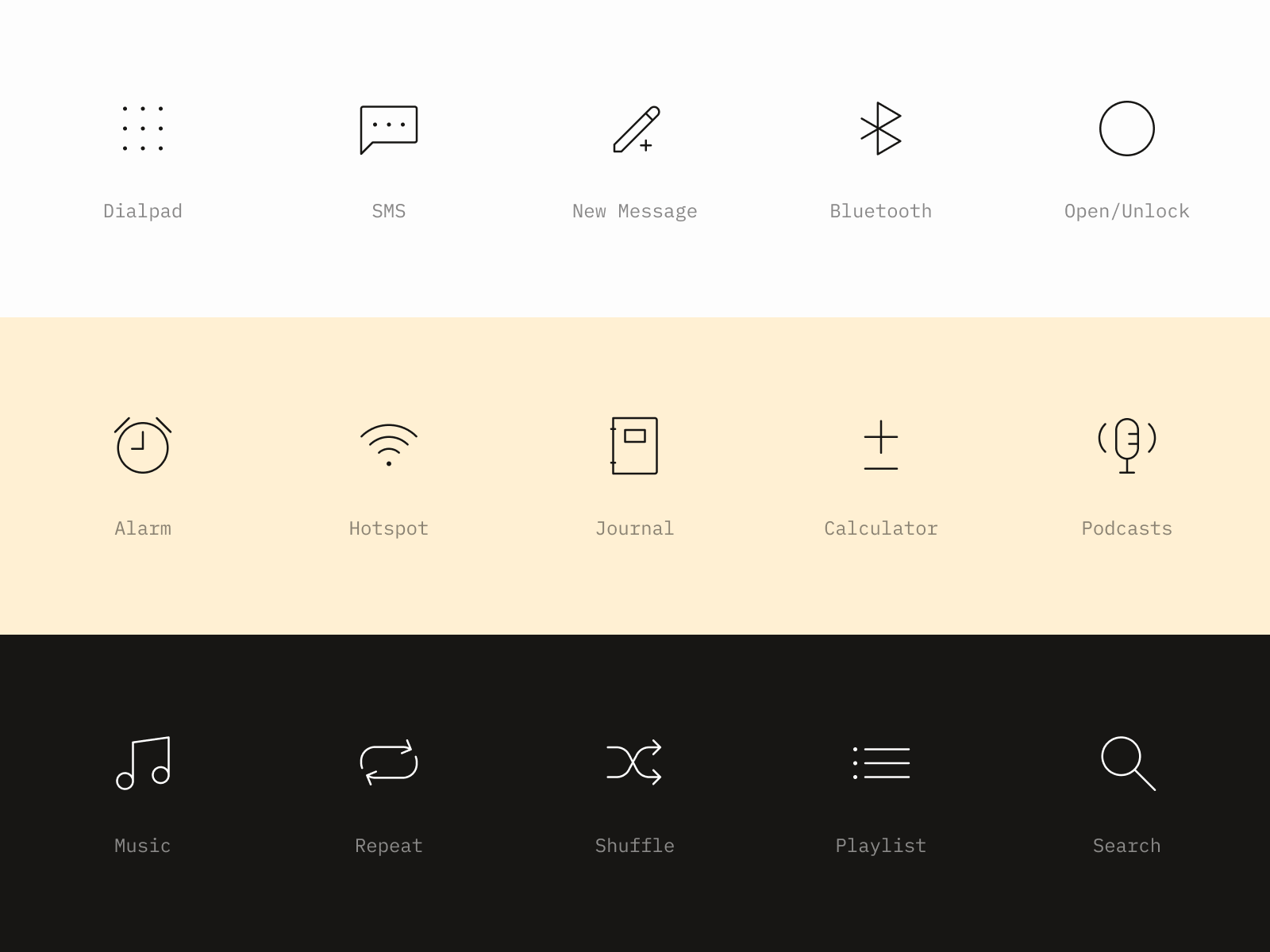
10. Use universal icons
When it comes to iconography, don’t try to reinvent the wheel. Sure, unique, creative icons can add visual interest to your user interface. But if users don’t understand them or they’re hard to decipher, you’re harming the overall user experience.
For common functions, stick to icons people recognize. Here are a few examples of universally recognized icons:
- House icon for the home page
- Three horizontal lines to indicate a hamburger menu
- A magnifying glass for search
- A pencil to edit or modify content
- A thumbs up or heart to like something
- A heart or star to favorite something
- A bookmark to save a bookmark
- An arrow coming out of the top of a square to share something
- An arrow pointing down into a square to download something
- A gear or cog for settings
- A lock icon to show something is secure
There are others that are context-specific (such as shapes for media player controls), but this is a good place to start. If you’re using functionality mentioned in the list, it’s generally best to use a universally recognized icon. If you deviate from a universal icon, be sure to add a text label to assist users.

Use these rules to design successful UI icons
Not every UI design needs to include icons, but when used properly, they can improve the user’s experience while also providing additional aesthetic appeal for your websites and other digital products. ■
Find more Process stories on our blog Courtside. Have a suggestion? Contact stories@dribbble.com.


