In this guest post, founder of Iconaday Samuel Lee Miller drops by to share the three do’s and don’ts of effective icon design.
Though they can be easily overlooked, icons play a crucial role in design—guiding users, communicating ideas and information, and bringing hierarchy to content—to name a few.
Yet, creating icons in simple, novel ways remains a challenge. While there are many variables to consider, this article outlines a few things to think through in your icon design process.

✖️ DON’T Design icons without research
Conducting research before designing is always important, but with icon creation, it’s crucial. A good practice for this is to not only research symbols visually, but also research words, associations, and other semiotic principles.
Some of the things that you should consider are: the intended meaning or desired action (think about how you hope people will understand the symbol) and how this concept has been represented in the past.
Looking at an icon marketplace like The Noun Project can help you to get a better understanding of how designers have visualized concepts before. You can use this research to discover patterns and inform your design.

✖️ DON’T Change commonly understood icons
Certain symbols are widely-known for a specific meaning. While it may seem interesting, or even fun, to use a dog icon for a veterinary website’s search bar—it could lead to a misunderstanding. At the very least, you’re likely making the user think about something longer than they need to.
Instead, if your task is to convey “search”, think through designing a magnifying glass in a way that ties into the project at-large. Is there a unique angle you can approach the icon from? Does the brand have signature colors, use a specific line weight, or have an exact angle in its logo? You can utilize these key attributes in your design.
Taking this approach helps your icons stay visually interesting and ownable—while retaining the meaning people commonly recognize them for.

✖️ DON’T Add unnecessary details
Icons are known for simplicity and the ability to communicate concepts quickly. A person should be able to scan an icon and have a sense of what it’s communicating right away.
When a designer adds too much detail into an icon, it not only can be distracting, but it can also lead to confusion. On the other hand, an icon that doesn’t have enough substance might be hard to understand.
Finding a balance of form and function is important when designing icons, so be sure to think through what the icon should convey first. Then work through how that can be expressed visually—always using an editing eye and considering what’s the essence of the icon.
Making icons in simple, novel ways is one of the biggest challenges you’ll face in icon design.

✔️ DO Keep your icons consistent
Ensuring that your icons look and feel cohesive is one of the challenges you’ll face when designing icons. If there’s visual inconsistencies in your icon library, you run the risk of confusion and hurting your brand’s visual credibility.
While not every icon should look exactly identical, having consistent properties throughout brings icon sets together. No matter what visual element you draw from, establishing guidelines for your icon library ensures consistency and quality.

✔️ DO Remember your icon’s context and purpose
Where will your icons be used? Will they be implemented in an app’s interface, on a marketing website, or in print collateral? It’s important to take these things into account before you start designing icons.
Your context can significantly alter how you approach designing icons. A 16px interface icon can, and should, look and feel vastly different than a larger-scale, illustrative brand icon. Keeping your end-goal in mind at the beginning of your project will help you design the icon more effectively.
Just as it’s important to think through where your icons will be used, it’s also important to consider what you hope to accomplish through the icon—and if using one is the best approach.
Icons, at their best, serve an intentional purpose. If they improve an experience, then by all means, use them freely. However, if they add clutter or confusion, think through other possible design solutions that solve the problem and convey the same principles. When used appropriately, icons add intuitiveness to a design—instead of making it more complicated.
Sometimes using an icon alone isn’t enough to communicate your information. Selectively adding text next to (or near depending on the context) can be essential to helping people easily understand your content. The more ambiguous or complex the concept is, the more likely it is that adding text to explain the icon will help the design. Another way to do this in digital design is by adding a tooltip. This keeps your design compact while also explaining what the icon means.

✔️ DO Build an icon library in your design system with documented use-cases
As mentioned, your context can drive how your icon looks, but it doesn’t always have the final say.
Mixing icon design styles (mono-line, glyph, etc.) throughout a design system can provide a visual hierarchy in your designs. Just as in typography—if everything is bolded, nothing stands out—so too does that in iconography. If all your icons look too similar, they may not communicate as clearly as possible.
Finding ways to meaningfully incorporate a variety of design styles into your brand’s icon library, with proper documentation, is a worthy pursuit.

 Samuel Lee Miller is the founder of Iconaday, a community that celebrates icons as the short stories of visual design. Product Designer by day and playlist curator whenever possible, he’s passionate about using design to solve problems and help others.
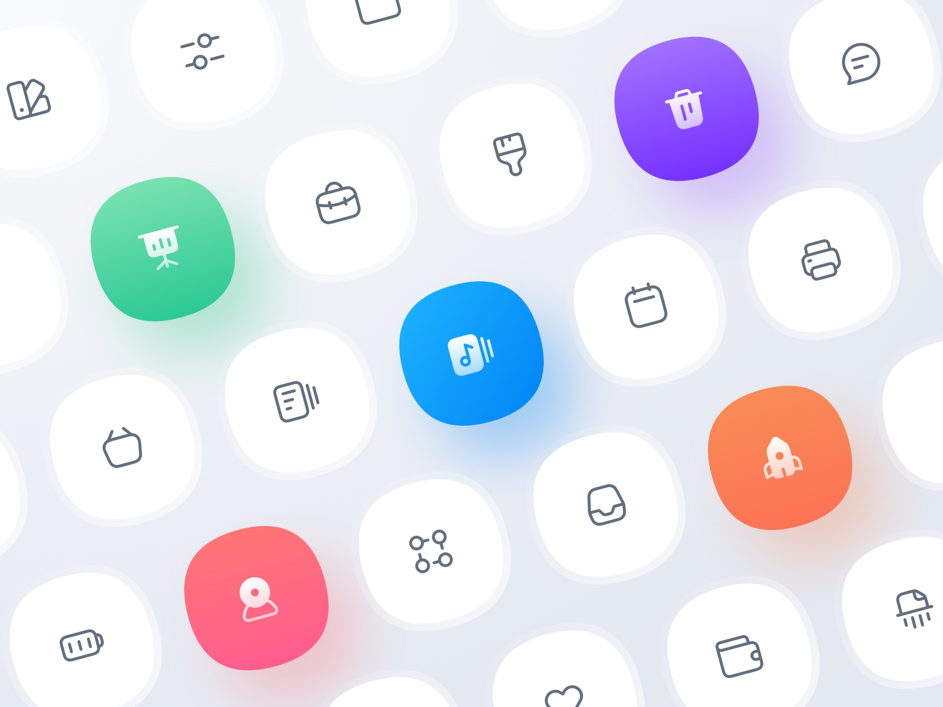
Icon design ideas
Ready to design your own awesome icons? Get inspired by the visual examples below and find more icon design inspiration on Dribbble. Happy designing! ■


Row 1: Alex Chizh for Icons8, Pixelbuddha, Matt Naylor. Row 2: Mohamed Chahin, Afshin T2Y ✪, Anna Raz. Row 3: Ted Kulakevich , Myicons✨, Nick Botner.
Find more Process stories on our blog Courtside. Have a suggestion? Contact stories@dribbble.com.


