close
Shot by

3 ways to experiment with latest UI trend—asymmetrical grids & layouts

There’s nothing wrong with working under the constraints of traditional UI grids. But sometimes, what makes a design really stand out is when it breaks the rules just a little bit.

In the last year, we’ve seen a huge trend emerge in the world of UI design—asymmetrical grids and layouts. Asymmetrical layouts push the boundaries of traditional web design by challenging one of the most foundational elements of user interface design—the grid system. Instead of creating perfectly symmetrical layouts, designers are experimenting with more dynamic, unbalanced compositions—and we’re here for it.

Want to try the trend out for yourself? Here are a few techniques to help you get started. Just remember to keep usability in mind!

1. Collapse gutters

In user interface design, gutters refer to the spacing between columns or rows in a grid (usually 10-20px). They serve to create structure and consistency on an interface and helps the design breathe. When it comes to asymmetrical UI layouts, try breaking out of the standard grid system by eliminating gutters and margins completely (or significantly reduce their spacing) like in these Shots below:

Shot Link

Limnia Fine Modular Jewelry Animation

by Zhenya Rynzhuk

Monday friends, This is another piece of the website for modular fine jewelry brand called Limnia. It is a clever, customizable jewelry line that morphs with you. How do you like it? Have a great holiday week! Cheers :) Press "L" to appreciate...

View on Dribbble

Innovative Metal Plant Web Design brutalism design graphic design heavy industry interaction interface metal plant metallurgy mobile responsive design ui user experience user interface user interface design ux web web design web interface webpage website
Shot Link

Innovative Metal Plant Web Design

by tubik for tubik

Take another glance at a project connected to heavy industry. Here's a page of the website for a metal plant that introduces innovations to make the industry less harmful and more productive. Atmospheric and trendy visual content instantly sets the vis...

View on Dribbble

✨New website ✨ branding cards portfolio web design

✨New website ✨

by Adam Ho

Been working on this thing for months, and I'm happy to put out my new portfolio in the world for everyone to break. 😁Desktop is fun, but mobile is neat too. ✨http://adamho.com

View on Dribbble


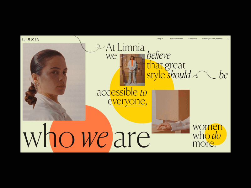
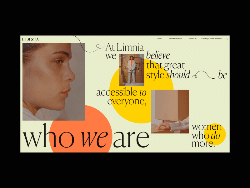
2. Overlay multiple elements

Get creative by layering imagery, typography, and other design elements to add dimension and character to your UI layout. Don’t be afraid to exaggerate your design by combining large, bold headings with small-sized images or vice versa. You can also experiment with unconventional type layouts—vertical, diagonal, etc. to add another layer of interest.

Pro Tip: Overlay multiple elements, but be thoughtful about keeping important areas clear and in focus so users don’t have a hard time navigating your site.

Nike Joyrides art direction art direction design concept design concepting design graphic design typography ui ux web website
Shot Link

Nike Joyrides

by Britton Stipetic

More design concept frames for Nike Joyrides

View on Dribbble

Manila Nav editorial journalism minimal modern navigation navigation menu pink serif font travel typography web design

Manila Nav

by Tony DeAngelo

Navigation exploration for Manila concept. Currently accepting remote freelance projects, hit me if interested!

View on Dribbble

Portland 2 branding cool design graphic design nike passion project product design sneakerhead sneakers typography ui ux web web design website
Shot Link

Portland 2

by Britton Stipetic for Rogue Studio

Design concept for custom Nike Portlands

View on Dribbble


3. Embrace empty space

Sometimes, the most important part of a design lies in the white space surrounding it. Not every surface area of your interface needs to be filled—In fact, when it comes to asymmetrical UI layouts, try embracing large areas of white space and use them to your advantage. It’s a great way to guide users to other focal points of your interface and help them navigate your product more efficiently.

Portfolio experiment - Photographer anim animation cedrick clean desktop fullscreen homepage interaction lachot minimal photo photographer portfolio transition type typography ui ux web website

Portfolio experiment - Photographer

by Cedrick Lachot

Little experiment for a photographer Portfolio. Press "L" 🤟 on your keyboard to show me your appreciation and follow me if you don't want to miss upcoming work. Cheers! Twitter Instagram Behance

View on Dribbble

Fashion Hero Composition big typography editorial fashion grids header hero minimal photography style typography user interface web design

Fashion Hero Composition

by Stefano Peschiera

Hey! Today I want to share this experimental header for a fashion website. I like so much big typography out of the canvas. Feel free to let me know what you think 😉👋

View on Dribbble

Minimal product design ecommerce store clean design ecommerce header layout minimal typography web website whitespace
Shot Link

Minimal product design ecommerce store

by Hrvoje Grubisic

Some unpublished work from the past for this sunny Friday

View on Dribbble


While there are plenty of other ways to work with asymmetrical layouts in UI design, these three techniques are a great starting point to experiment with the fast-growing trend. Have fun mixing and matching these tricks but keep in mind—usability should always come first. You can design the most beautiful interface but at the end of the day, if your users have a hard time navigating your product, they won’t be able to truly appreciate that asymmetrical aesthetic!


More UI Resources:

Find more Inspiration stories on our blog Courtside. Have a suggestion? Contact stories@dribbble.com.


Previous
Next