While there are plenty of fantastic color palette generators available on the web, in this post, we thought we’d share our favorite color tools specific to UI design.
It’s important to keep in mind that choosing colors for user interfaces calls for a different set of requirements than for example, a graphic design project. Not only does UI design require a comprehensive set of colors with a range of variations and shades — but designers also need to think about how color will add to the user experience of a digital product. This means carefully considering color semantics and ensuring designs are accessible, all while remaining on-brand.
It’s no surprise that color is one of the most essential foundations for a digital product’s design language, so it’s crucial that you choose your color palette with intention. Below are a handful of UI color picking tools we recommend that will help ensure the effectiveness of your designs and of course, keep them looking nice and polished!
1. Accessible Color Matrix
When it comes to product design, we should all be keeping accessibility in mind. Ensuring your UI’s color contrasts are in line with the Web Content Accessibility Guidelines (WCAG) is one of the ways you can do this. Accessible Color Matrix makes it super easy to test out potential color schemes for your user interfaces. What makes the tool especially unique is the ability to test a range of colors rather than just two at a time. Check it out:

2. Eva Colors
This handy AI tool generates a semantic color palette based on your brand’s primary color — each color is assigned to a purpose you should apply it to: success, info, warning, and danger. On top of that, Eva Colors produces the various shades for each color generated and has a really easy export feature. You can even toggle to view the colors in both light and dark mode! Simple, effective, and intuitive.

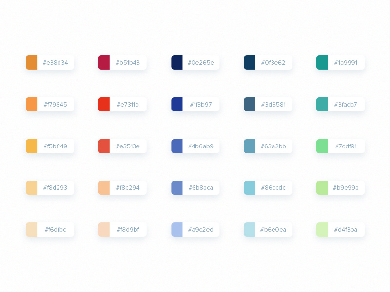
3. Palx
Palx is an automatic UI color palette generator. Input your base color, and the system instantly provides you with a full-spectrum color palette based on the primary hex code entered. The colors generated work harmoniously together and you can also easily export all of them by scrolling to the bottom of the page.

4. Copy Palette
Created by Dribbbler Dimitris Raptis, Copy Palette enables you to create consistent monochromatic color combinations and export them directly into your favorite design software. According to Dimitris, the idea came to him after struggling repeatedly with generating the consistent monochromatic color palettes he envisioned for his interface designs. We love that Copy Palette also lets you can adjust parameters like the contrast ratio of shades and number of color variations.

5. Cloud Flare
Cloud Fare is a custom tooling that not only helps you build out color sets, but also preview palettes against a plethora of UI elements like headers, icons, buttons, and much more. The best part is that you can check each palette’s accessibility contrast scores and edit those colors as needed. It’s an insanely helpful two-in-one color palette and visualization tool to help you work more seamlessly with color. Check out their extensive instructions so you can make use out of all of their awesome features!

6. Palettte
Use Palette to create and sample color schemes in which colors seamlessly smooth into each other. You have full editing capabilities in terms of fine-tuning hue and saturation, and adding more color swatches as needed. Simply click on the plus icon at the top left corner of the tool to get started and when you’ve got a palette finalized, hit the export button at the top right! If you already have a color palette on hand, you can easily import and edit it further to get your desired values.

7. Open Color
If you prefer to simply pull a pre-made UI color palette that’s guaranteed to work well, check out Open Color. The website essentially provides an open-source color scheme that is optimized for user interfaces. If you don’t have a brand color set in stone, this is a sure-fire way to ensure your UI color palette is both effective and attractive. And, if you’re new to using color in UI design, check out their Instruction tab which includes a helpful manual specifying the intended use of each color!

For more web design resources, check out our roundup of accessibility tools to evaluate your design’s contrast ratio, 7 best illustration resources for web design projects, and learn how to avoid the top 5 mistakes new web designers make when starting out.
Find more Community stories on our blog Courtside. Have a suggestion? Contact stories@dribbble.com.


