
If you’re working on web design projects, then it follows that web accessibility should be one of your top user experience considerations. Whether it’s finessing on-page readability for users with visual impairment, or ensuring that your web page’s visual cues remain effective on mobile devices, sometimes color alone may be what’s standing between you and a truly accessible and inclusive design.
One of the most important considerations is contrast ratio — or the luminance relationship between light and dark elements (most often text) in your design. Users with certain cognitive disabilities may require lower contrast text, while low vision readers may need high contrast user interface considerations in the visual design they consume.
Likewise, color blindness is also a consideration that needs the attention of any designer implementing a design process which strives towards equitable, accessible design.
The good news is that there are a handful of inexpensive — and even free — tools that can help you become more cognizant of design for all, and how you can help people equitably experience the design you’re creating.
1. Contrast
Contrast is a macOS app that offers designers a way, like its namesake, to immediately gauge the contrast ratio of color choices to assure they are in alignment with Web Content Accessibility Guidelines (WCAG). An app that’s built for immediate feedback without being a burden to your design workflow, Contrast also offers a guide on their site that acts as a primer on some of the WCAG accessibility standards.
The app acts as a small menu bar which you can integrate into whatever design software you’re using, or move the menu bar around your desktop to use as a floating window anywhere else on your screen.

2. Color Safe
If you’re looking for an in-browser option, Color Safe is a web-based tool that allows designers to generate color palettes based on WCAG standards for contrast ratio. Simply select your project’s background color, font family, font size and weight — plus the WCAG standard you’re trying to achieve — and Color Safe will generate palettes whose contrast ratio scores you can compare.

3. Tanaguru Contrast-Finder
Tanaguru Contrast-Finder is an easy-to-use, web-based tool that allows you to simply enter your preferred foreground and background colors (in either RGB or as a hex code) to monitor your design’s contrast ratio. The tool allows you to select your desired minimum contrast ratio scores, while also generating a list of adjacent colors to evaluate.
These provided alternatives also come with in-use samples of different text sizes, weights, and their resultant contrast ratios — giving you a sense for which color and text choices will not only be more accessible, but play nicely together as part of your overall design.

4. Stark
With plugins for Adobe XD, Figma, and Sketch, Stark is a plugin that features a suite of tools to foster accessible and inclusive design standards — right from within the software designers are already working with. Stark’s contrast checker tool allows designers to double-check that their typography and font size — in conjunction with the design’s background colors or supporting visuals — provides the necessary legibility and sufficient contrast to harmonize with accessibility guidelines.
As a bonus, Stark also assists with additional accessibility issues, including color-blindness. The app allows designers to view their work in color-blindness simulation and make tweaks to their design system.

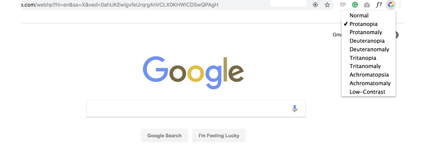
5. Spectrum
Spectrum is also a free tool that can assist you as you design with color-blind users in mind. A free Google Chrome extension developed by Yehor Lvivski, Spectrum also allows designers to directly test their sites across a range of over eight different versions of color vision deficiencies, including an array of red-green and blue-yellow color blindness.
With over 200 million people in the world who are visually impaired, web accessibility should be a top consideration in every designer’s process. Now that you’ve got some handy apps in your toolkit, it’s your turn to get out there and make the web a more accessible place for all!
For more color resources, check out a practical UI color application guide, and our favorite color palette picking tools.
Find more Community stories on our blog Courtside. Have a suggestion? Contact stories@dribbble.com.


