We’re back with a follow-up installment of famous logos reimagined by graphic designers on Dribbble. Before jumping straight into it, keep in mind these logo proposals are hypothetical and were created just for fun. Enjoy checking them out and get inspired to share your own logo redesigns with the community!
Don’t forget to have a look at our Famous Logos Reimagined—Part 1 where designers shared reinterpretations of other iconic logos like Starbucks, Amazon, Sony Playstation and plenty more.
1. FedEx
The iconic FedEx logo designed back in 1994 gets a fresh new look courtesy of designer Sergio Joseph. The design concept preserves the negative space arrow we all recognize, but Sergio makes a bold move by removing the ‘e’ in the orange section of the wordmark.

2. Twitter
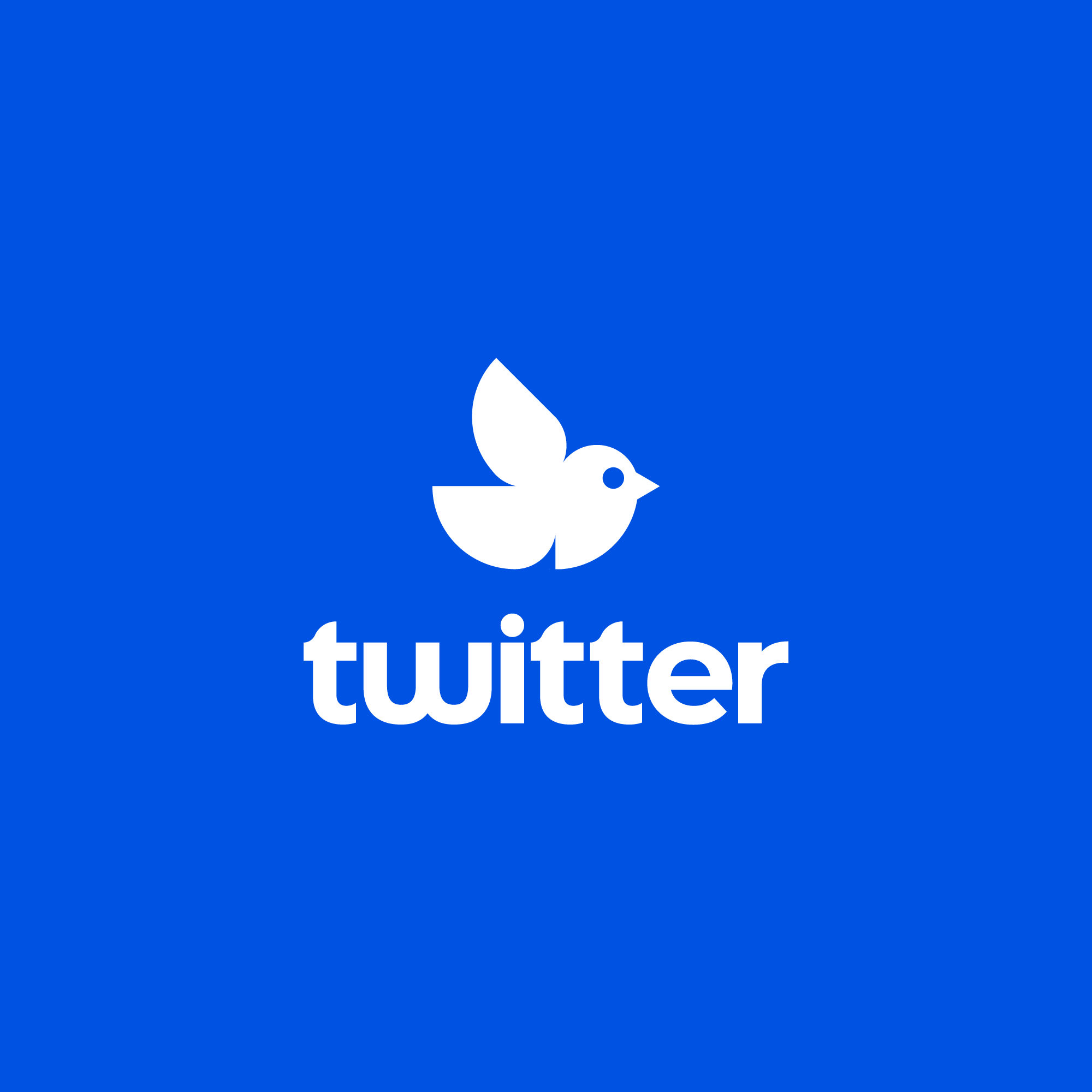
Twitter’s branding gets a little makeover here by designer Myles Stockdale. The blue bird icon is simplified significantly, but Myles adds a small circle to the eye for some detail. The letterforms in the wordmark also got rougher edges and the iconic Twitter blue is deepened.

3. Google
How would you go about redesigning arguably one of the most famous logos of all time? Designer Azzact has an interesting take on Google’s ‘G’ icon—it’s lowercase! Though quite different, this hypothetical rebrand remains true to Google’s color system and placement.

4. Nike
We love following type designer Rafael Serra on Dribbble—he’s always sharing really fun and interesting wordmark concepts of existing brands. In this Shot, Rafael reinterprets Nike’s logo design. The swoosh still goes strong, it’s just rendered down to its basic shape.

5. Apple
Brave are those who attempt to redesign, dare we say, the most iconic logo of all time? Either way, we think this modernized take on Apple’s logo from 1977 looks pretty cool. Designer Ruslan Babkin played with gradients for a futuristic vibe along with clean-cut lines.

6. Häagen-Dazs
The American ice cream brand Häagen-Dazs has been around since the 60s—and so has its wordmark logo. In this rebrand concept, Lance updates the logo’s typography, changing it to a serif. If you look closely, you’ll also notice the double dots on top of the ‘a’ are slightly morphed into having very subtle edges.

7. Star Wars
Star Wars has made quite the comeback in the last year with the likes of Baby Yoda and the newest film premiering in late 2019. Well, designers are all over it— and the folks at Unfold shared a redesign concept for the famous movies’ wordmark. One designer, in particular, said it reminded him of a ‘techy, sci-fi, art deco ‘vibe. What do you think?

8. Burger King
This Burger King rebrand concept is exceptionally unique because designer Tom Brinton actually updated one of their older logos. Tom says, “I saw their logo, and I did not like it. So I made them a new logo. It’s really an updated, flat take on their vintage 80s/90s logo—with a crown element mixed in with the bun.” Well done!

9. Spotify
Does anyone really know what the three lines on Spotify’s logo signify? Are they radio waves? A wifi symbol? Maybe both? Well in this new logo exploration, Designer Dennis Pasyuk tries his hand at rebranding the popular music streaming service so the lines in the app icon create the form of an ‘S’.

10. NASA
This revised proposal of NASA’s logotype by Damian Kidd is clean, simple, and classic. Damian stacked the letters on top of each other, and created sharper edges around each letterform. It screams modern and cutting edge.

Related Articles
- 20 hilarious logo design parodies you can’t unsee
- 5 rebrands of 2019 that got all of the designers talking
- 10 famous logos reimagined by another graphic designer
- 5 online graphic design exercises to boost your skills
Find more Inspiration stories on our blog Courtside. Have a suggestion? Contact stories@dribbble.com.


