Every year, a handful of major rebrands are unveiled that get everybody in the design community talking. And regardless of whether a new design is successful or not, we can always count on designers to share their opinions—or better yet, their own takes on a different design solution.
Of course, every brand refresh has a reasoning behind it—whether it be to realign with a target audience, embark in a new direction, or make efforts to drive more sales. Today we’re recapping five major rebrands of 2019 to better understand why certain design decisions were made, and how designers reacted to these new visual changes. As you can imagine, some rebrands were more well-received than others!
1. Mozilla Firefox
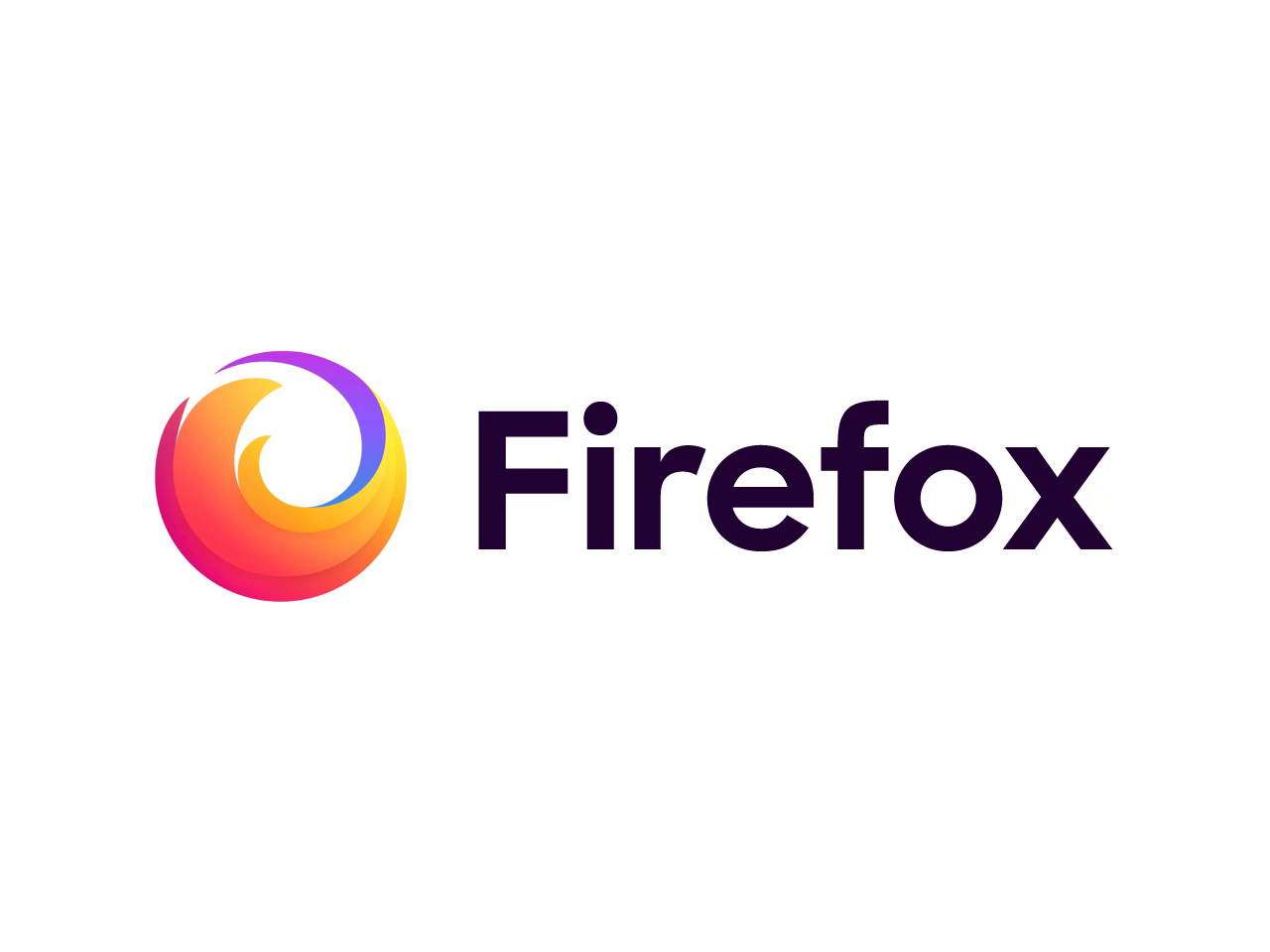
For the last couple of years, the designers at Ramotion have been hard at work in collaboration with the Firefox team to evolve and modernize the famous internet browser’s branding. This year, they finally unveiled the outcome of their efforts.
While some designers expressed that they hoped the new logo would still incorporate the brand’s iconic fox symbol, the overarching sentiment was extremely positive. Here’s what the team had to say about the rebranding process:
“We explored not dozens but hundreds of options and directions. Looking back and at the final result, we ask ourselves: Why did we spend months creating something that we could draw within a few hours? It takes time to explore all possible options and come up with a single solution that just works. This simplicity is the ultimate sophistication.

2. Staples
In the Spring of 2019, the office retailer Staples underwent a massive rebrand, rendering its logo of over 25 years even more literal. In an effort to stay relevant, Staples is looking to reposition itself as a “worklife fulfillment company”. The new brand promises to provide customers with tools and solutions that help them be more productive and inspired wherever their work and life takes them.
According to Staples CMO Marshall Warkentin, the new logo’s symbol (a literal staple) “is symbolic of the commitment we are making to our customers.” As you can imagine, designers were pretty divided with where they stood on the new look, and many questioned why the retailer invested so much in a rebrand in the first place.

3. Slack
Slack unveiled a new logo this year that got all of the design community talking. According to the team , the reason behind the brand refresh was to create a more versatile logo that would add a more cohesive feel across their products and online presence.
Designers had a lot to say about this new logo—a popular sentiment being that the new colored symbols resembled four ducks in a cirlce. A ton of designers tried their hand at re-branding the logo for themselves which was quite fun to explore on Dribbble!
Here are a few words from the Slack design team on the design decisions behind the new logo:
“[The new logo] uses a simpler color palette and, we believe, is more refined, but still contains the spirit of the original. It’s an evolution, and one that can scale easily, and work better, in many more places.”

4. ZARA
The famous Spanish apparel retailer ZARA underwent a rebrand of their wordmark logo this year, and designers had a lot of opinions about it (especially typographers!). The new wordmark’s serif typeface is reminiscent of its old logo, however the kerning between the letters has drastically changed—so much so that the letters overlap each other quite significantly.
The new design proved to be very controversial, with many designers stating that the wordmark almost becomes illegible. What do you think?

5. Android
What we can appreciate most about Android’s rebrand is that Google aimed to make it more accessible. On top of launching new accessibility features, they added blue to the brand’s iconic green palette, making the logo much easier to see. The famous Android robot character also got a makeover—simplifying it significantly so it’s now only his head that appears.
The wordmark’s typography also got a redesign—curves were added to the bottom of each letterform to stay consistent with the radius of the robot’s head. We love that the new color contrast in the logo now meets the web accessibility standards and seems to integrate much better with the Google brand.

While plenty more notable rebrands happened throughout 2019, these five new brand identities definitely made huge waves in the design community. How would you design any of these differently? We’d love to see your own interpretations or alternative solutions on Dribbble!
Related articles
- 10 famous logos reimagined by another graphic designer
- Wordmark logos 101: Why and when to use them
- 5 types of personal logos to brand your design services
- How to not screw up a logo design: 6 tips from the experts
Find more Inspiration stories on our blog Courtside. Have a suggestion? Contact stories@dribbble.com.


