The majesty of America’s National Parks needs little additional aggrandizement—its splendor, and the generations of visitors it has enraptured is no secret. However, one designer is trying to do just that, by paying creative homage to what has been called America’s best idea. Austin-based designer JP Boneyard is the creative director of the Fifty-Nine Parks Print Series, an expansive visual celebration of National Parks that includes immersive prints and goods which showcase the unabashed natural richness of America’s parks.
The project is collaborative, with prints in the series created in conjunction with an incredibly talented roster of designers—including many Dribbblers, such as Brave the Woods, Eric Nyffeler, Curtis Jinkins, Emrich Office and more.
Threads of Boneyard’s previous work as founder of the National Poster Retrospecticus—a popular traveling poster exhibition featuring hundreds of participating artists—can be seen in the Fifty-Nine Parks Print series. It, too, features a true breadth of participating designers, and the project has also toured across the United States—including stints at Disney Animation Studios, Adobe Max, Facebook HQ, and SXSW. Additionally, the Fifty-Nine Parks Print Series has also been licensed for the board game PARKS in conjunction with Keymaster Games, as well as a limited-edition collection from Field Notes.
Importantly though, alongside the success and popularity of the project, Boneyard seeks to make a tangible, positive impact for the parks system. 5% of each online poster sale is donated directly to The National Park Service to continue its stewardship of America’s national parks.
JP Boneyard takes us behind the scenes of what inspired him to usher the Fifty-Nine Parks Print Series to life, the incredible design talent he got to collaborate with, and what designers can learn from the disconnected experience America’s national park system offers.


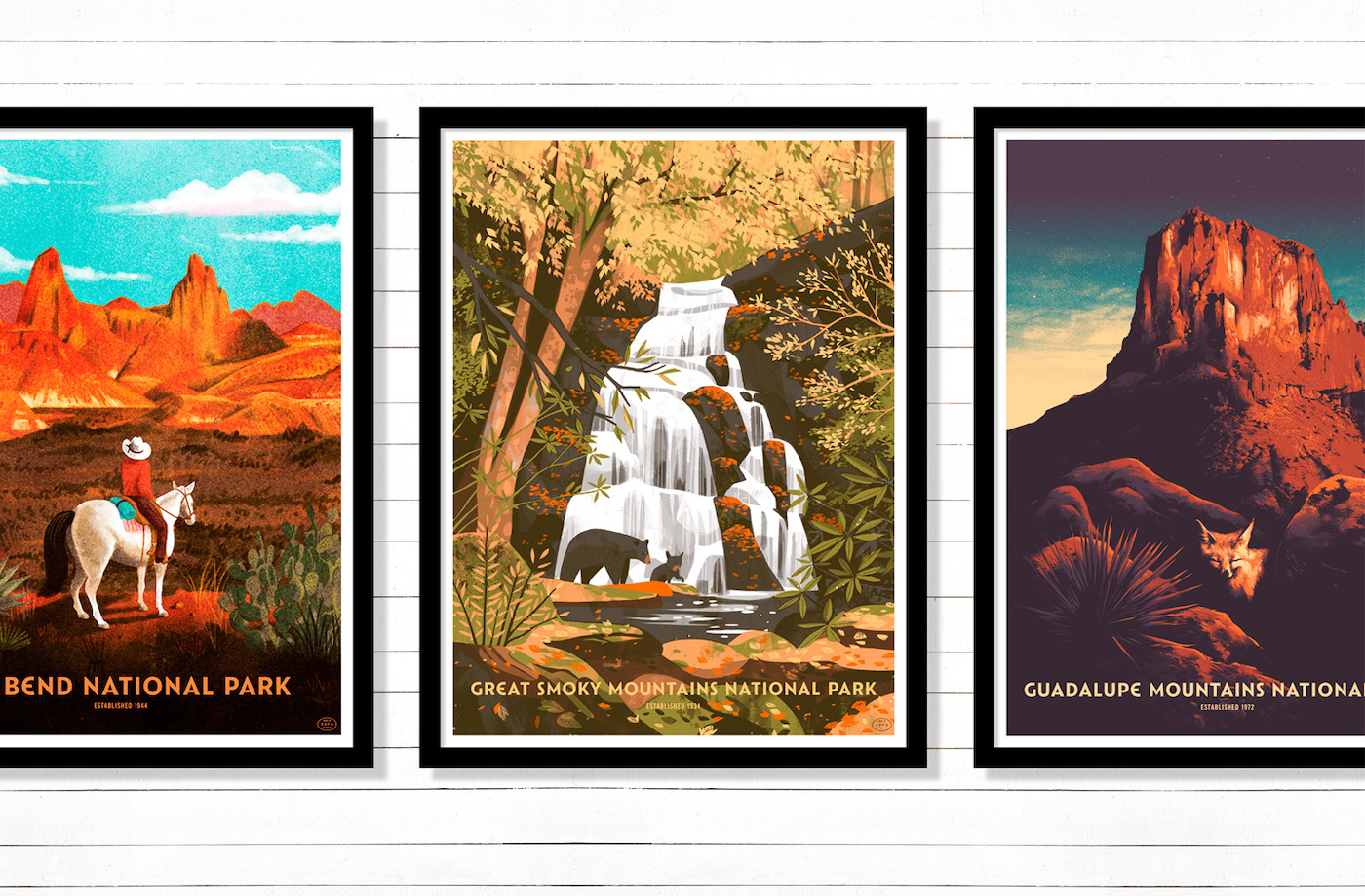
Row 1: Brave the Woods, MUTI.

Hello, my name is JP. I provide creative direction for Fifty-Nine Parks and produce The National Poster Retrospecticus. My background is in graphic design, code, printmaking, and event production. I grew up in Massachusetts but have lived in Austin, Texas since 2014.
What spurred you to bring Fifty-Nine Parks to life?
Our love of printmaking and National Parks is what inspired Fifty-Nine Parks. Back in high school, friends and I would take road trips all over the United States. Sometimes we were on tour with our bands, and other times we went on road trips just to see what was outside of New England. It was around this time that I discovered my passion for graphic design and printmaking.
Design and printmaking came out of necessity to promote the DIY music events we set up. When we were on tour we’d often visit parks and public lands because they were affordable, inspiring, and sometimes a place to sleep. In a lot of ways, Fifty-Nine Parks is about going back to our original passions. To this day, travel, design, printmaking, and parks are some of my favorite things that exist!

Brian Buccaroni and JP Boneyard of Fifty-Nine Parks.
With designers often glued to screens as an inherent part of their profession, what lessons can be learned from the offline experience of the National Parks and what they offer?
Dang — there are so many lessons to be learned from the offline experience. Not having a cell signal often reminds us to be present in the moment. Being offline limits so many distractions that come along with always having a gosh-dang supercomputer in your pocket. Just being able to sit and stare at Dream Lake in Rocky Mountain National Park for 35 minutes is so refreshing. The air is amazing, a huge elk is eating berries to your right, little kids are tweaking out with excitement over the view—and when the kids head out—there’s just the sound of the breeze and some cool birds, like a Stellar’s Jay.
Being in the middle of nowhere also reminds us of the essentials—things like food, shelter, water, reliable transportation, and our personal relationships. When the maps app goes MIA in middle-of-nowhere-Montana you often have to learn to trust your own sense of direction, too. All of these ”lessons” are invaluable in those moments but also in our day to day lives. I’d say being in the parks and offline reinforces my efforts to simplify and be mindful of sustainability. Those considerations could be seen through the lens of our natural resources, our time, our work, our health, or how we live our life as a whole.

Rocky Mountain National Park detail — Rory Kurtz
You mention that Fifty-Nine Parks posters pay deference to the WPA posters of the 30s & 40s, without simply being modern reproductions.
What sort of creative direction is given to the participating artists to achieve both a distinct voice for the project, and common thread amongst the series of posters?
Totally! Any poster of a National Park is going to draw comparisons to the beautiful WPA (Work Projects Administration) posters of the 1930s. WPA posters are an eternal sense of inspiration for us—even dating back to my early gig-poster work. Those are the posters I looked at endlessly for inspiration. Not just aesthetically but in deconstructing how to actually print a poster with my DIY setup.
There have been a number of modern poster series made in the WPA style. Many are done incredibly well. It was a conscious decision on our part to distance ourselves from that aesthetic. Mostly because it’s already been done. While all of our posters are screen printed — screen printing technology has evolved so much since the ’30s. Making prints today we’re able to employ so many new tools and techniques that have evolved since the ’30s. In a lot of ways, the thought was, “what would those classic travel posters look like if they were made today?”
Our creative direction really starts with the pairing of each artist with each park. We’re incredibly intentional with these decisions. We want to play to each artist’s strengths and interests. A lot of our creative direction is also based on the scene—meaning the location, wildlife, or activity we’re depicting.
Color is another place where we share a lot of feedback. It’s important that the prints feel unified despite having so many unique visual voices contributing. The format and template of the posters aren’t heavy-handed but they do help unify everything. We do so with consistent borders, type placement, type size, and a portrait orientation. To that point—Catlin Sans—the beautiful and custom typeface made by Riley Cran—does a lot of heavy lifting to unify each print. Not to mention the typeface evokes an awesome blend of classic and modern vibes. It’s perfect for the series. Riley nailed it!

Select a few Fifty-Nine Parks posters and give us your rundown on them.
Sequoia National Park — Glenn Thomas

Glenn Thomas’ Sequoia poster comes to mind. Depicting the scale of those massive trees is deceptively difficult. The warm, delicate lighting of the scene totally captures the magic and quietness of the park. Glenn felt like a great fit to handle all of those challenges. A lot of parks have epic views. Sequoia is more about the intimate experience of being surrounded by some of the oldest—and tallest—trees in the world. Those trees have a presence in person that’s hard to describe. Glenn captured the vibe so well!
Mesa Verde National Park — Claire Hummel

The scene in Claire Hummel’s Mesa Verde poster is so much fun to explore. Partly because she developed a 3D model of the Cliff Palace to get the layout and the lighting just right. That’s a level of commitment—and nerdom—that we really admire. Claire loves drawing rocks and has a great sense of lighting so she felt like an inspired fit for this park. Having visited Mesa Verde after the poster was made—it was so much fun to walk through the scene in real life. It helped us have an even deeper appreciation for Claire’s hard work, too!
The National Parks Map — Brad Woodard

Our US Park Map with Brave the Woods feels pretty remarkable, too. Brad invested so much of his time and himself in that print. Brad does the classic road-side-attraction style so well—he felt like an awesome fit for the map. Brad was super gracious when it came to the amount of detail and feedback that went into the map. His hard work really shows through. I smile every time I see that map!
I could go on and on about every poster in the series. There are fond memories of struggles that were overcome, moments of total joy, and so much inspiration throughout. I admire the heck out of everyone we’ve worked with!
What takeaways do you have for designers who wish to build collaborative design projects? Any words of wisdom?
Keep things simple. Don’t over-promise. Think win/win. Honor your word. Share gratitude often.
What’s next on the horizon for Fifty-Nine Parks?
We have our busiest touring season coming up. That will take us through January. By then we’ll be gearing up to roll out the next batch of prints—perhaps expanding on our theme. In the meantime, we’re stoked about collaborations on a beautiful board game with Keymaster Games, custom backpacks with Topo Designs, puzzles with Mondo Games, and more notebooks with Field Notes!
Want to keep up with the Fifty-Nine Parks Print Series? Follow JP on Dribbble, and check out the series of prints on 59parks.net and on Instagram at @fiftynineparks.
Find more Interviews stories on our blog Courtside. Have a suggestion? Contact stories@dribbble.com.


