Thanks to our friends at Elinext for sponsoring this blog! Author: Anastasiya Babich, UI/UX Designer Elinext
Modern interfaces are about much more than functionality. They must be user-friendly, intuitive, and enjoyable. If you have two apps with the same functions, you’d likely choose the one that feels more comfortable and speaks to you in clear, unambiguous language.
Over 20 years ago, an often-cited Stanford University study showed 75% of users form their perception of a company’s credibility based on the design of its website or app.
Just imagine how much design affects perceptions of credibility today! Good UX design can not only improve the user experience but also significantly increase trust in the company and greatly boost sales.
UX/UI designers use various tricks to create user-friendly interfaces: they work out information architecture, conduct usability tests, and much more. But the true UX magic happens when the main structure of an application is ready — and this magic has a name: microinteractions.
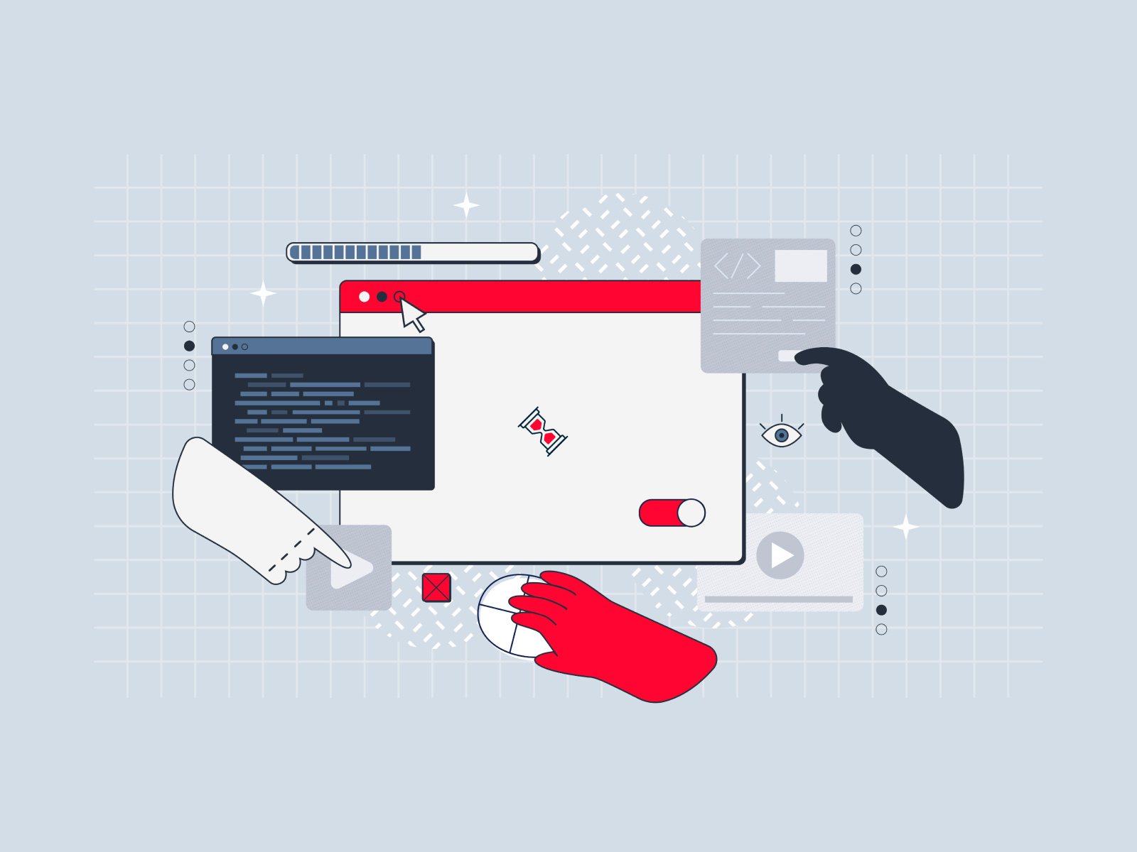
UX microinteractions are subtle system responses to user actions or system events (e.g., updating the order status, receiving a new message, and so on). Usually, they are small animations, visual or sound effects that follow some action.
Most of the time, users don’t consciously notice the presence of microinteractions in the interface. However, what they will undoubtedly notice is their absence.
Consider opening an application and seeing a blank screen with no loading indicators. It will likely trigger a sense of uncertainty: what is happening? Or imagine that the buttons on the site don’t change their state when hovered over. In that case, it will be unclear whether they are functioning at all.
Finally, visualize filling out a lengthy form, but the fields remain unchanged, and the interface doesn’t provide any feedback on whether they are being filled out correctly. Only after you submit the form would you learn that errors were made, and all the information you entered must be reset.
Bottom line: after such an experience, you likely won’t return to this product and will instead switch to a competitor’s app with good UX.
All the issues mentioned above are the result of not paying enough attention to microinteractions. This impact — the essential value that microinteractions hold for today’s UX — is precisely what we’ll talk about in this article.
How do UX microinteractions improve the user experience?
Microinteractions turn an automated, soulless system into a responsive, friendly, and more human interface. It’s like adding spices in cooking: without them, any dish may seem bland, but as soon as you add a pinch of seasoning, a whole range of flavors and aromas is revealed. But how exactly do microinteractions enhance usability? Let’s delve deeper.
👀 Display the current system status
Here, we can recall the fundamental usability heuristics formulated by Jacob Nielsen. One of these heuristics emphasizes that the system’s state should always be clear.
Thanks to microinteractions, users understand what’s happening in the interface: a loading indicator shows that the application is working, and a pop-up window informs about an error. Users shouldn’t be left with questions like What’s happening here? Or where am I? The system should provide answers to these questions before they even arise.
👀 Capture and hold attention
When a person interacts with an interface and receives a lively response from it, a dialog begins. This dialog generates interest and engagement. For this reason, well-crafted micro-interactions encourage visitors to stay in the app or on the website for longer periods, which, in turn, positively impacts analytics and conversion rates. Research conducted by Forrester indicates that a well-designed user experience can increase conversion rates by up to 200%.
👀 Provide hints and guidance
Hints make it easier to navigate through the system and help newcomers get acclimated more quickly during onboarding. Small supporting animations, tooltips, and hints direct the user, assisting them in better understanding how to interact with the application.
For instance, when a newcomer first enters the application, a pop-up animated hint can offer action options, reducing the feeling of confusion and making the process more intuitive.
👀 Prevent Errors
Here, we can mention another one of Nielsen’s heuristics that emphasizes the importance of error prevention at early stages. This can be achieved by providing users with feedback and warning them in advance about possible issues before they become critical.
For example, when creating a password, the system should provide feedback on whether it meets all the criteria before the user presses the confirmation button.
The Anatomy of UX Microinteractions
Let’s take a closer look at the anatomy of microinteractions and figure out what they’re made of.
Typically, four key elements are recognized:
🙌 Triggers are events or actions that initiate microinteractions. They can be categorized into two types:
- User-initiated triggers — these are intentional actions taken by the user, such as clicking a button, dragging an element, or sending a message;
- System-initiated triggers — these are specific system events, like the completion of a page load, a change in network status, or the detection of an error.
🙌 Rules define what actions will happen and in what order they should occur after a trigger is activated. Typically, these rules are not visible during system use; they are essential for managing the microinteraction. And the third part of the scheme — feedback — is used to visualize the rules.
🙌 Feedback is the mechanism for informing the user about the results of a microinteraction.
- Visual feedback includes animations, hover effects, icon changes, and other visual elements;
- Audio feedback can manifest itself in the form of various sound signals, beeps, clicks, etc.;
- Tactile feedback typically involves vibration on mobile devices.
🙌 Cycles and Modes
- Cycles of a microinteraction determine its behavior over time: the duration, repetition frequency and the changes that occur when the interaction is repeated. For example, a repeating cycle can be illustrated by the sound signal of a microwave oven, which repeats after some time if the door is not opened after heating is complete;
- Modes define how a microinteraction adapts to changes in context or conditions. For instance, if a user activates the silent mode on their smartphone, sound notifications will be disabled.
Breaking Down Microinteraction Anatomy: An Animated Carousel Example
To see how the structure functions in the real world, let’s consider the example of an animated carousel used in the onboarding process of one of Elinext’s projects.
We will break down this microinteraction into the four core components we discussed earlier.

🙌 Triggers
In our example, there are two triggers that initiate slide switching. The first trigger is system-initiated: the slides change automatically every 5 seconds. The second trigger is user-initiated: the user can manually switch slides by swiping left or right.
🙌 Rules
In the case of the carousel, the rules establish the order of slides, the delay time before automatic switching, and the ways users can manually navigate between slides. Additionally, the rules specify situations in which the automatic slide change is paused (in our case, when the user starts swiping).
🙌 Feedback
In the carousel, visual feedback is used. It involves an animated transition from one slide to another when the trigger is activated.
🙌 Cycles and Modes
The cycle of our microinteraction starts with the demonstration of the first slide and ends with displaying the last one. After that, the cycle automatically repeats. This cycle remains unchanged when replayed.
Microinteractions in Real-Life Examples
To better understand how microinteractions work in practice, let’s explore a few examples implemented in Elinext’s projects.
👾 Dragging
Dragging is a very common microinteraction often found in task trackers and list-based applications. It allows users to move objects, change their order, and transfer them to different sections. This pattern creates a sense of interaction with real physical objects.
For example, when you drag a task from one section to another, it’s like moving a task sheet made of paper from one folder to another. This tactile stimulation engages users, leading them to spend more time in the app.
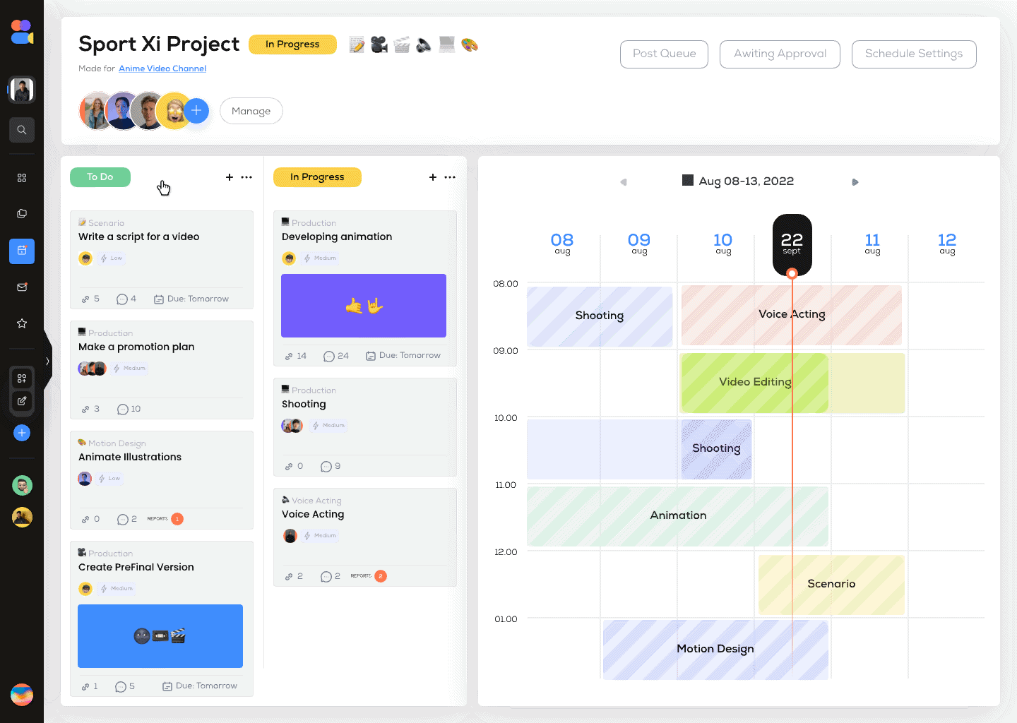
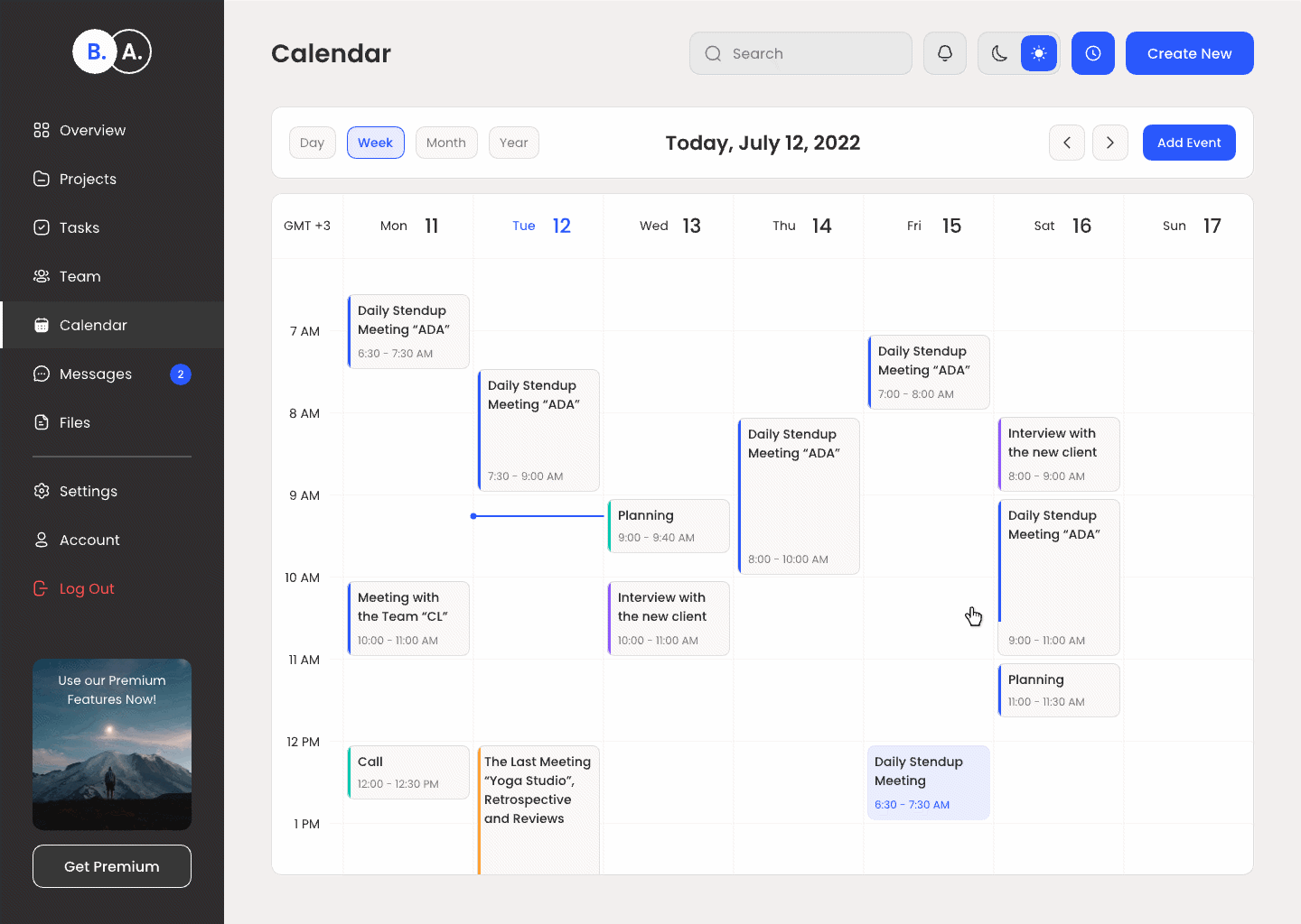
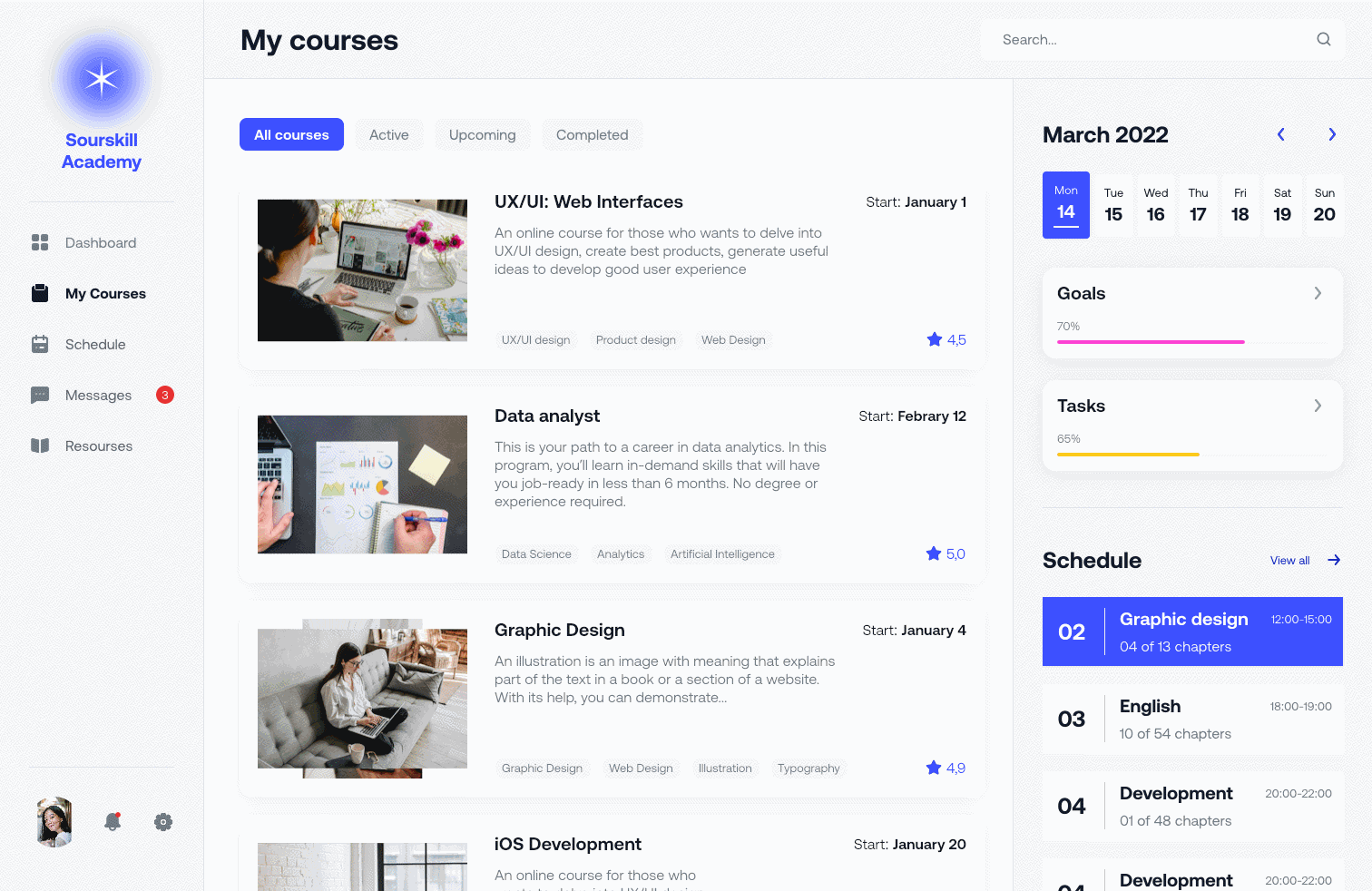
👾 Interactive Dashboards
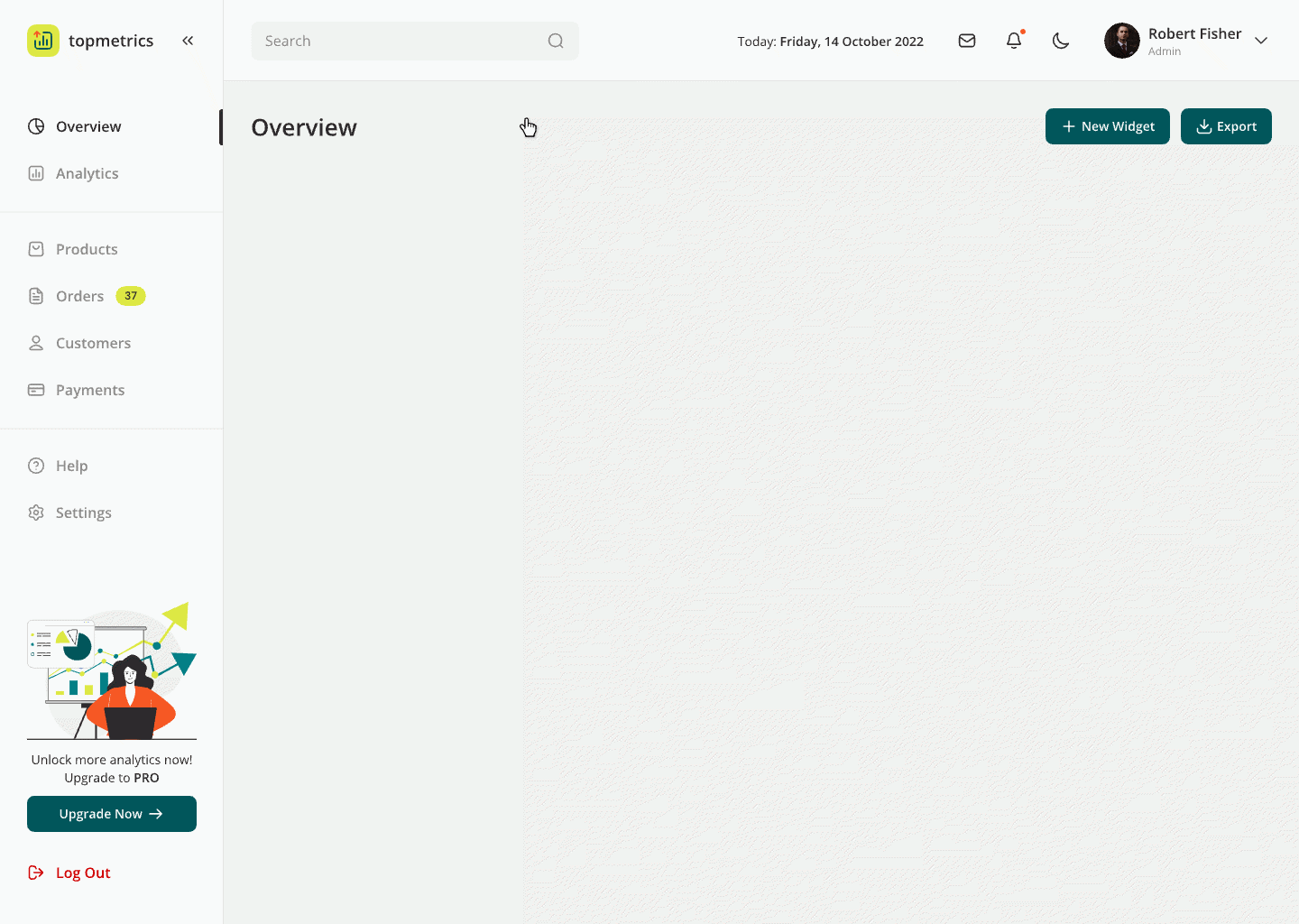
Dashboards provide a large playground for implementing microinteractions. You can make widgets more dynamic, allowing users to zoom in and out of maps and charts, navigate freely, update statistics in real time, and customize settings on charts and graphs.
These techniques encourage existing users to engage with the application more frequently.
👾 Hover Effects

Without hover effects, a modern user can’t imagine a web interface anymore, this microinteraction is among the “must-haves”.
When you move your cursor over a clickable item, it should change its state to indicate that it’s interactive. This pattern significantly simplifies navigation by making it clear which objects are clickable and which are not. Additionally, hover effects can make essential elements more noticeable, increasing the chances of completing specific actions, such as making a purchase or subscribing.
👾 Popovers & tooltips
Popovers are pop-up windows that provide additional information without navigating to another page. They are usually triggered by clicking on a specific interface element and can be closed by clicking in the negative space.
Tooltips, on the other hand, offer hints and extra information when hovering over a specific element. Both of these microinteractions help save space on the main screen without overloading it.
Tooltips reduce bounce rates by giving guidance to anyone experiencing confusion. Moreover, they significantly reduce the load on the support team.
👾 Autocomplete

As soon as the user starts typing text or initial letters, autocomplete suggests options that match the entered characters. This saves time and eliminates the need for laborious text entry. Another advantage here is that it eliminates the likelihood of errors in entered data, thereby increasing the chances of successfully completing the intended actions.
👾 Day-Night Mode Switching
Day-Night modes contribute to a more comfortable app usage experience at different times of the day, which, in turn, leads to enhanced user engagement and a rise in the overall number of sessions.
👾 Microinteractions in Tables

If you add microinteractions to a table, working with it becomes much more convenient and enjoyable. For instance, automatic data updates allow users to see the freshest information without reloading the page. Animation during updates makes the table more dynamic and engaging.
As you may have noticed, what users see in microinteractions is just the tip of the iceberg. Behind small animations often lies detailed, systemic work. But these efforts pay off, making users’ lives a bit better and more pleasant.
Investments in the development of UX microinteractions and overall user experience pay off multiple times, making them a very profitable investment.
Conclusion
In conclusion, microinteractions are a powerful tool that can significantly improve the user experience and bring substantial benefits to businesses. However, it’s important to remember that before delving into microinteractions, you need to thoroughly and reliably develop the core functionality and architecture of your application, because functionality serves as the foundation of the product.
You can compare this to Maslow’s Hierarchy of Needs: first, we address the basic things we require to exist; after that, we move on to higher-level needs. If the core functionality isn’t working, all the micro-details we discussed today will simply be meaningless.
Once we’ve reliably established the foundational stage, microinteractions help us elevate the product to a substantially higher level of quality!
If you’re looking for skilled UX/UI designers, Elinext is here to be your reliable UI/UX partner. With over 26 years of experience, Elinext specializes in creating appealing designs and also in developing user-friendly software solutions aimed at achieving your business goals through intuitive user interfaces.
We are experts in various industries, including healthcare, finance, IoT, telecommunications, and e-commerce.
Find more Community stories on our blog Courtside. Have a suggestion? Contact stories@dribbble.com.


