
With humble beginnings as a rubber manufacturer in Finland in 1865, Nokia has come a long way. After making its name as a communications company producing arguably the most indestructible cellphones, this tech giant is ready for a new adventure.
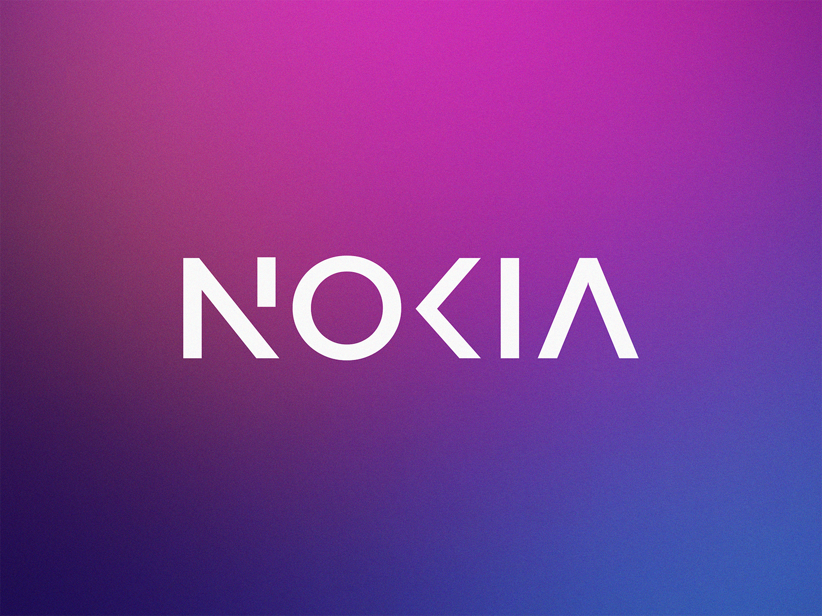
The pivot into a more service-oriented business model as a B2B innovation and tech company comes with a new brand identity, including an updated logo to shift perceptions of the company from a mobile phone company. The new logo has a more geometric and abstract approach, balancing visual evolution and instant recognition.
Some say that the “new Nokia” resembles a distant echo of the original logo since so many elements have been stripped away. A bold graphic was used throughout all content, repurposing the logo’s N, O, and K letterforms to make every communication “distinctively Nokia.” To reflect the changes, Nokia updated the brand purpose: “At Nokia, we create technology that helps the world act together.”
This stripped-back approach to the new logo is typical of heritage or established brands, especially in technology, communications, or automobiles, looking to rebrand to seem more contemporary. Kia’s confusing signature-inspired rebrand from 2021 has been compared to the change in early online commentaries, with some saying it puts the “Kia in Nokia.” Others have raised concerns about its legibility at a time when brand recognition and accessibility are crucial.

Graphic designers share their own redesigns
Nokia’s recent logo redesign sparked inspiration for designers on Dribbble, who rose to the challenge of reimagining the brand’s new identity. Our team loves exploring the Dribbble community’s interpretation of rebrands, so check out some of these redesigns, and let us know what you think!

“As yall already NOKIA just announced their new logo, and it triggered me to do a quick exploration of my own within same direction.” — Eddie Lobanovskiy


“The idea is to add more rhythm to the logo layout by using similar geometry of “N” and “A” letters and adding a “pixel” element for a more dynamic and techy feel.” — Dmitry Lepisov


“I think a squared ‘O’ makes more sense by keeping a connection with the old logo. Also, it’s more readable by completing the ‘N’ and ‘K’ letters.” — Vadim Carazan


“We saw the NOKIA Logo Redesign in the media several times in the last week, so I decided to change the design to my aspect with their direction. — Kiarash Amalivand


Find more Inspiration stories on our blog Courtside. Have a suggestion? Contact stories@dribbble.com.


