Nokia redesign idea


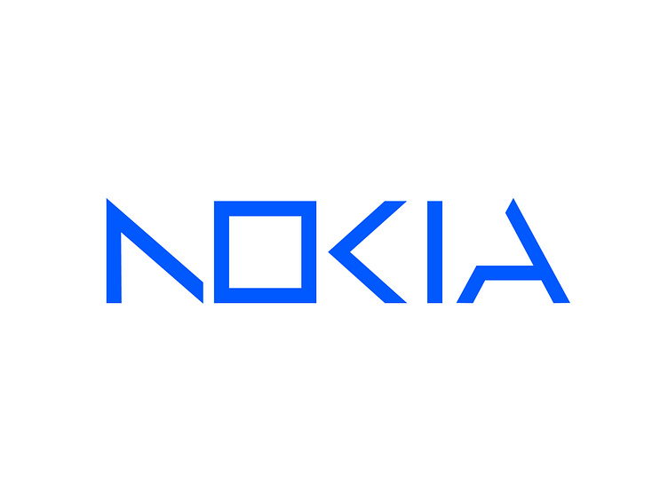
I think a squared "O" makes more sense by keeping a connection with the old logo. Also, it's more readable by completing the "N" and "K" letters.

I think a squared "O" makes more sense by keeping a connection with the old logo. Also, it's more readable by completing the "N" and "K" letters.