Learn 5 key principles to follow when choosing colors for your mobile app designs. Get inspired by app colors that are beautiful and effective.
Renee Fleck
Written by Renee Fleck
Published on
Last updated
Every year brings new mobile app design color trends which is why we often see standardized color schemes among apps emerging simultaneously.
However, best practices for choosing colors in app design dictate certain unbreakable, long-lasting rules.
The simplicity of using two of three colors, for example, is one design principle that has proven its worth over time. Red and green have been used for so long that they are ingrained in our psyche to signal permit and ban correspondingly. Blue calms while red puts us in alert mode.
Next to app functionality, color scheme is factor number two for effective UX and how well your mobile app performs.
It’s vital to pay attention to the colors you will choose for app design because they can affect people’s moods, behavior, and stress levels and therefore foster or distort your brand message.
Next to app functionalities, the color scheme is factor number two for effective UX and how well your mobile app performs. In this article, we’ll be sharing tips to help you choose the right colors for your mobile app design along with some visual inspiration to guide you.
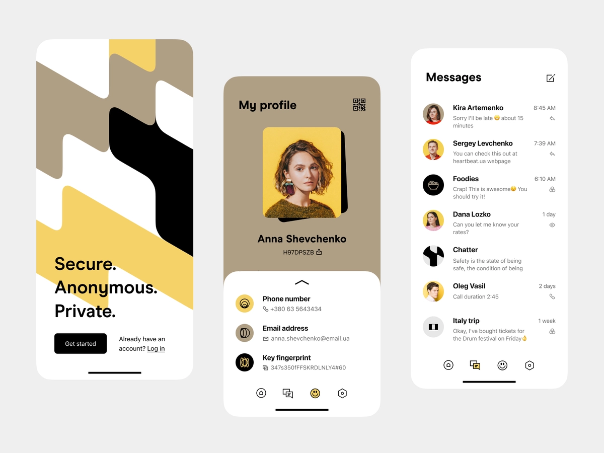
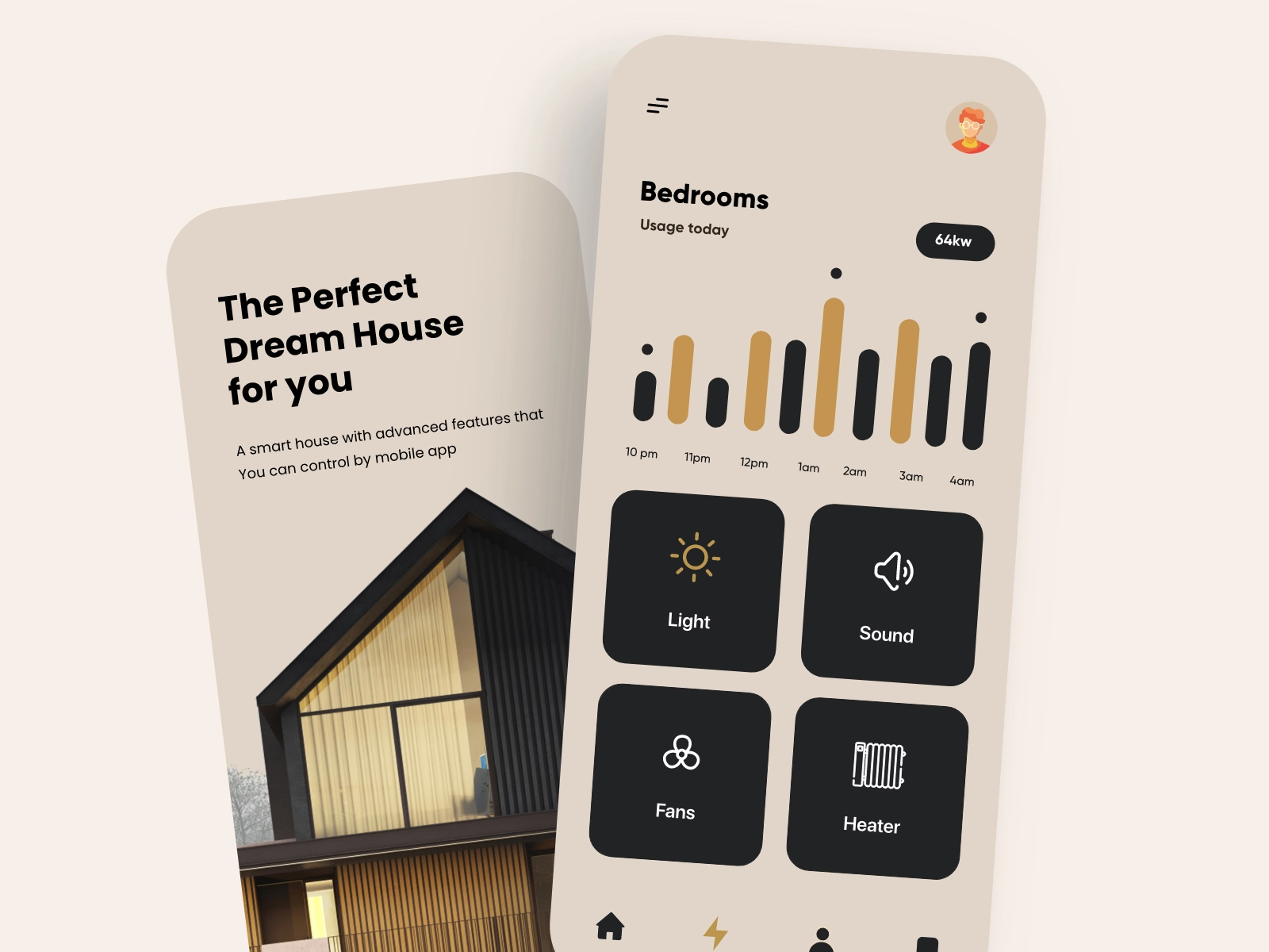
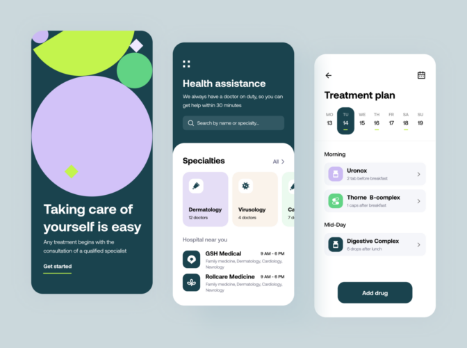
Mobile app design principles for color patterns
How many black and white apps have you seen? Probably none.
Even the simplest monochromatic scheme usually has at least two shades of the same color. Adequately chosen color patterns encourage user participation and brand recognition. Choosing colors for the app icon, brand logo, and certain features should be well-thought-out since they can accentuate something for all the wrong reasons.
For example, if you are designing for a visually impaired audience, you’ll need to adjust the color choice to cater to the needs of your users.
If you are not a specialist in color theory , you may struggle with creating appealing color patterns. Let us cover the basics of visually captivating app design and try to make things simple for you.
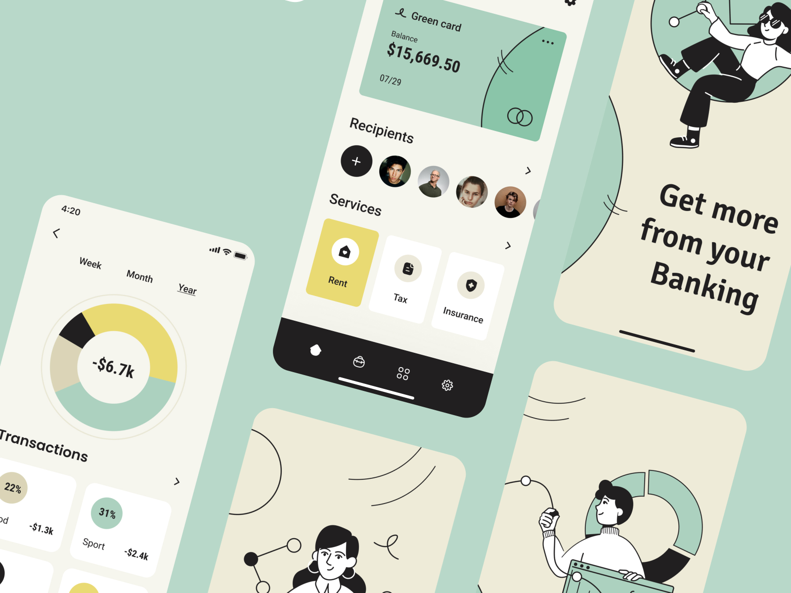
1. Choose the color that channels the corresponding emotion
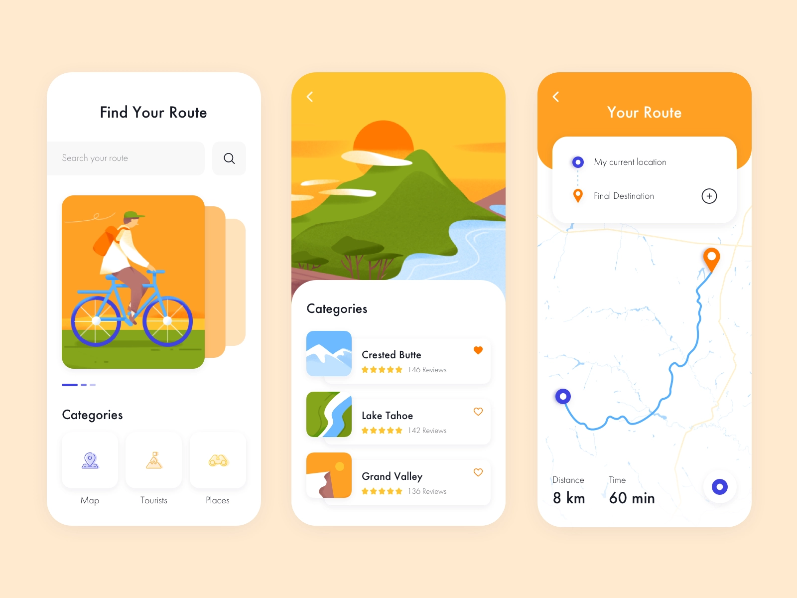
We associate specific colors with certain emotions. For most people, blue corresponds with trust, security, and reliability. Red is associated with speed, energy, and urgency. Orange signals fun and action, while yellow is optimistic and attention-grabber. Black color indicates a high-tech, sleek design, while pink is considered feminine. Green, unsurprisingly, signifies wealth.
But keep in mind: color associations are cultural. Therefore, knowing your audience is critical to choosing a color palette for your app design.
2. Check the colors your competitors use in the app stores
Mobile app design is not only about the app icon. However, reviews in the app store regarding the app icon will give you a solid starting point for understanding what works (and vice versa) in your niche.
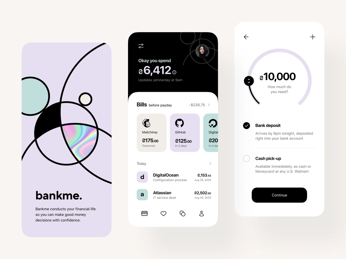
You want to be discernible, even if you have to stick to a tried and tested color palette. Several ways in which you can move beyond déjà vu app design ideas is to make the color scheme easy on the eye and add dimensionality to colors, for example, with neuromorphic details.
3. Add the fourth C of mobile app design
The 3-C’s-rule of design consists of consistency, clarity, and content. When you choose colors (the fourth C), remember to make them supportive of content and functionalities.
Think of color schemes in the visual interface design along with interaction design, system design, and service design. Incorporate the chosen color patterns within the user behavior and flow. Consider the interaction of interface elements and how the app functions in the brand, product, and website ecosystem.
Related Reading — How to design a strong brand identity for digital products
4. Start with the basics
Yes, this is all about UI hierarchy, primary and secondary colors, surface and background, and communicating with your color choices.
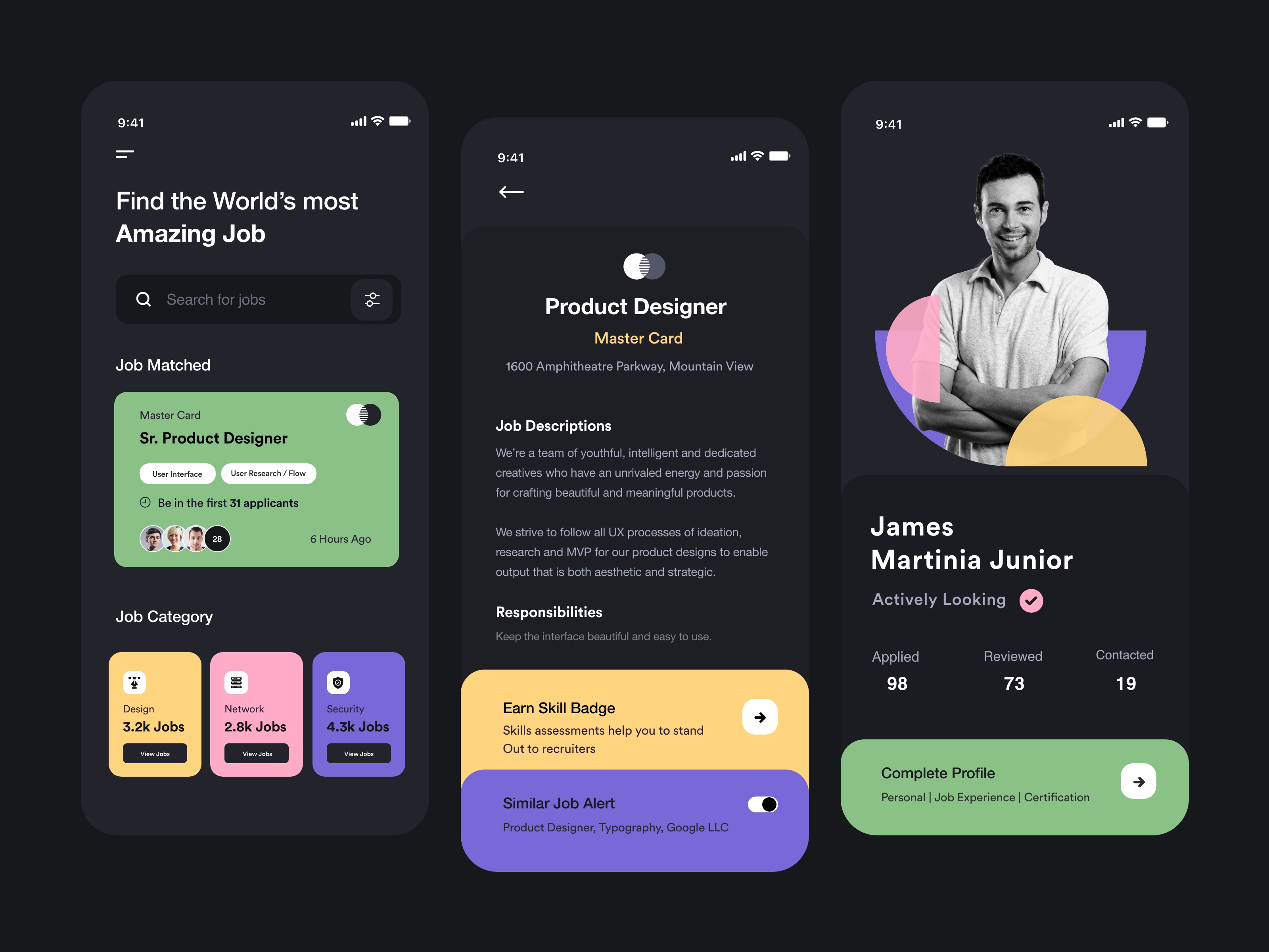
Use colors to create a visual hierarchy of elements with contrast and continuance. Create structure and navigation paths. When in doubt, strive towards minimalism. Keep bold color variations for different functionalities.
The bonanza of mobile app design tools available today makes it easy for designers to merge basic rules with a bit of ingenuity and come up with fresh ideas.
5. Don’t be afraid to break the rules
Google’s new app icons have been demonstrably criticized for their lack of clarity. Regardless of whether this critique is justified or not, the company has probably completed a fair amount of testing and has a good reason to choose this color scheme.
Even if it breaks the rules of fewer colors and clarity, it remains loyal to consistency. Perhaps Google aimed to retain visibility across the user’s screen or to strengthen the brand. For now, they are sticking with it.
When you decide to break the rules, make it for a good reason, and trendsetting is always a solid one.
Be intentional when choosing mobile app colors
Whether you go for safer or riskier color options in mobile app design, make your choices sensitive to the best solution for your audience’s problem. Colors should provide easy, enjoyable, and effective interaction.
Written by Renee Fleck
Published on
Last updated


