Everything you need to design a book cover that sells. Get top tips for a successful book cover design.

We’re told from childhood to “never judge a book by its cover.” But in reality, covers offer valuable clues to potential readers about what they may find inside a book.
Books with eye-catching covers are more likely to be picked up from the bookstore shelves (or clicked on when browsing online). And that’s the first step a reader takes before purchasing a book. So how do you design a book cover that sells?
Before you start designing a book cover for yourself or for a client, study up on these nine best practices for designing a high-quality book cover that flies off of the shelves:
- 1. Gather book cover design inspiration
- 2. Outline the book’s main themes
- 3. Consider the genre
- 4. Use visual hierarchy
- 5. Get rid of the clutter
- 6. Think in terms of thumbnails
- 7. Choose appropriate fonts and colors
- 8. Make your title stand out
- 9. Don’t overlook the spine or back cover
1. Gather book cover design inspiration
Before you start designing, you should always gather visual inspiration first to help guide your cover’s overall look and feel.
Gathering different book cover ideas will help you to understand what you’re drawn to, what works, and what doesn’t, so you can narrow down what you want to accomplish with your cover design.
Start by browsing Dribbble to find eye-catching book cover designs and create a moodboard where you’ll collect all of your ideas. As a good rule of thumb, aim to collect between 10 – 20 pieces of visual inspiration.
Once you’ve gathered enough ideas, you should start to notice certain patterns of visuals, themes, imagery, and layouts that you’re drawn to. Keep this in mind throughout the next steps.
2. Outline the book’s main themes
A book cover needs to support the themes the book explores. It also needs to support the mood of the book. What is the book about? Is it a serious exploration of modern society? Is it a fun, adventurous memoir all about finding yourself?
A serious book should have a relatively serious cover, while a fun beach read needs an entirely different kind of aesthetic.
Outline your book’s main themes and keep these top of mind when deciding on the kind of imagery you’ll want to use on the cover.
Note: If you’re a graphic designer working with a client, you don’t necessarily need to read the entire book to design a cover. However, you should read a synopsis and the first chapter or two to get a feel for the book’s tone and mood.
3. Consider the genre
Different genres have different conventions when it comes to covers.
You’ll rarely find a steamy romance novel that doesn’t feature a couple embracing on the cover. True crime books usually feature dark covers that hint at the crime.
To get a sense of what the genre expects, look to competing books. If they all follow a certain convention, you’ll likely want your cover to also fit that convention so that readers of that genre can immediately recognize it.
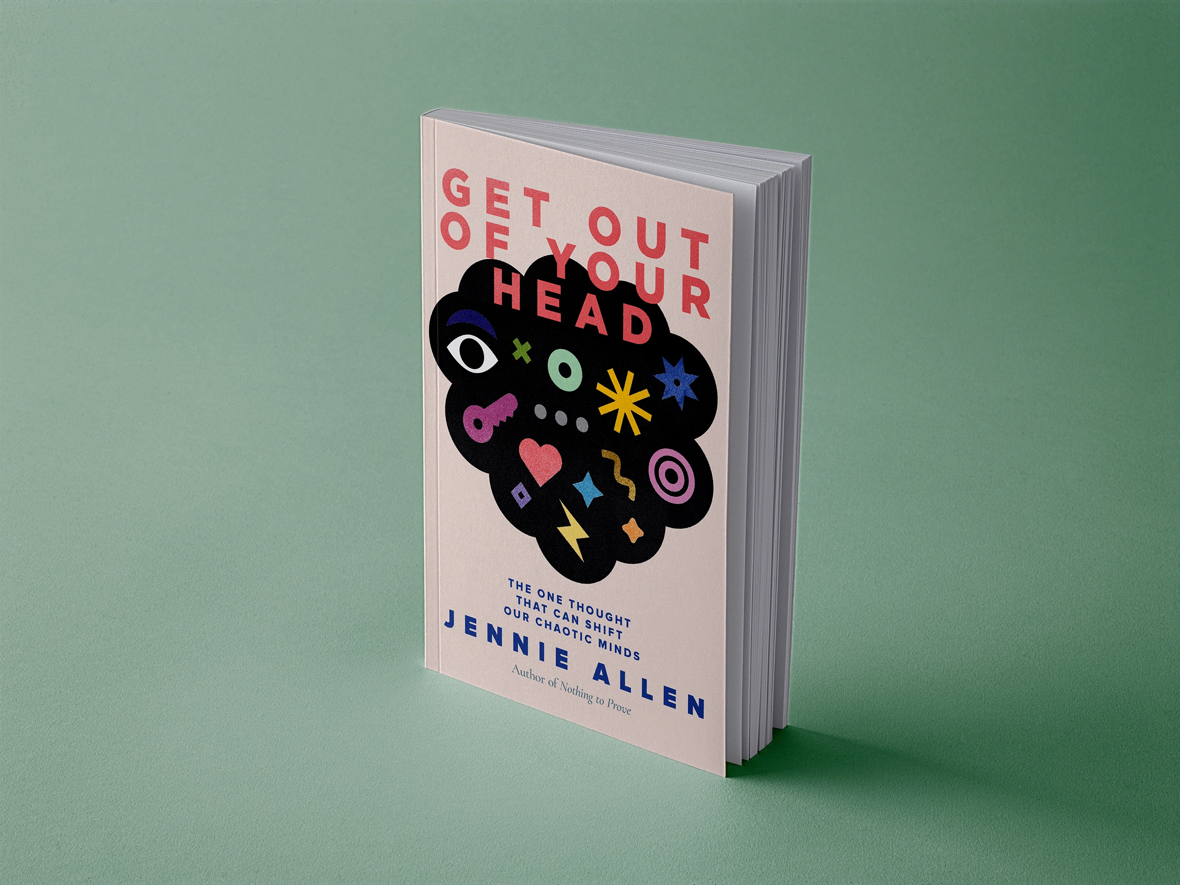
4. Use visual hierarchy
Visual hierarchy on a book cover is key. You need to make sure that the reader browsing the shelves (whether physical or virtual) sees the most important part of the cover first.
For most books, this will be the title. But for certain bestselling authors, you might want to consider emphasizing their name so that it’s even more prominent than the title. That’s because fans of that author can immediately recognize that it’s one of their books.
In general, your hierarchy should place the title and cover graphics most prominently, followed by a subtitle (if there is one), followed by the author’s name.
There may also be endorsements or prizes to include on the cover, but those are usually placed less prominently than other elements.
5. Get rid of the clutter
Cluttered covers don’t work well when viewed at small sizes. Since a lot of book browsing happens online, covers are usually shrunk down to thumbnail size. If your book cover looks cluttered at thumbnail size, you will risk turning away potential readers.
Choose one focal element for your cover. This could be part of the image used on the cover, or it could be the title of the book.
Once you know your focal point, you can design the rest of the cover to emphasize that point. Also make sure you leave plenty of white space around that focal point.

6. Think in terms of thumbnails
When people are browsing Amazon or other online publishers such as Bookshop.org, they’re presented with a series of cover thumbnails. These are often pretty small—less than 200px high.
That means that if your title isn’t prominent enough on the cover, it won’t be legible. It also means that if your cover has a ton of fine details that are important to its meaning, that will be lost in thumbnail size.
That doesn’t necessarily mean that you shouldn’t include those details on a cover. What it means is that you need to make sure that your cover still has a powerful impact at thumbnail size.
Make your title legible at small sizes and ensure that the most prominent part of your graphics are recognizable (i.e., a mountain should be recognizable as a mountain, a person should be recognizable as a person, etc.).

7. Choose an appropriate font and color palette
Choosing a typeface for your book cover can be tricky. It needs to look great when viewed on the full-size cover, but it also needs to remain legible at small sizes on thumbnails.
For the most part, try to avoid any super detailed display or complex script typefaces. When searching for the perfect typeface, try it out both at large display sizes and at smaller body sizes to see if it’s still readable when displayed at 12px or 14px sizes.
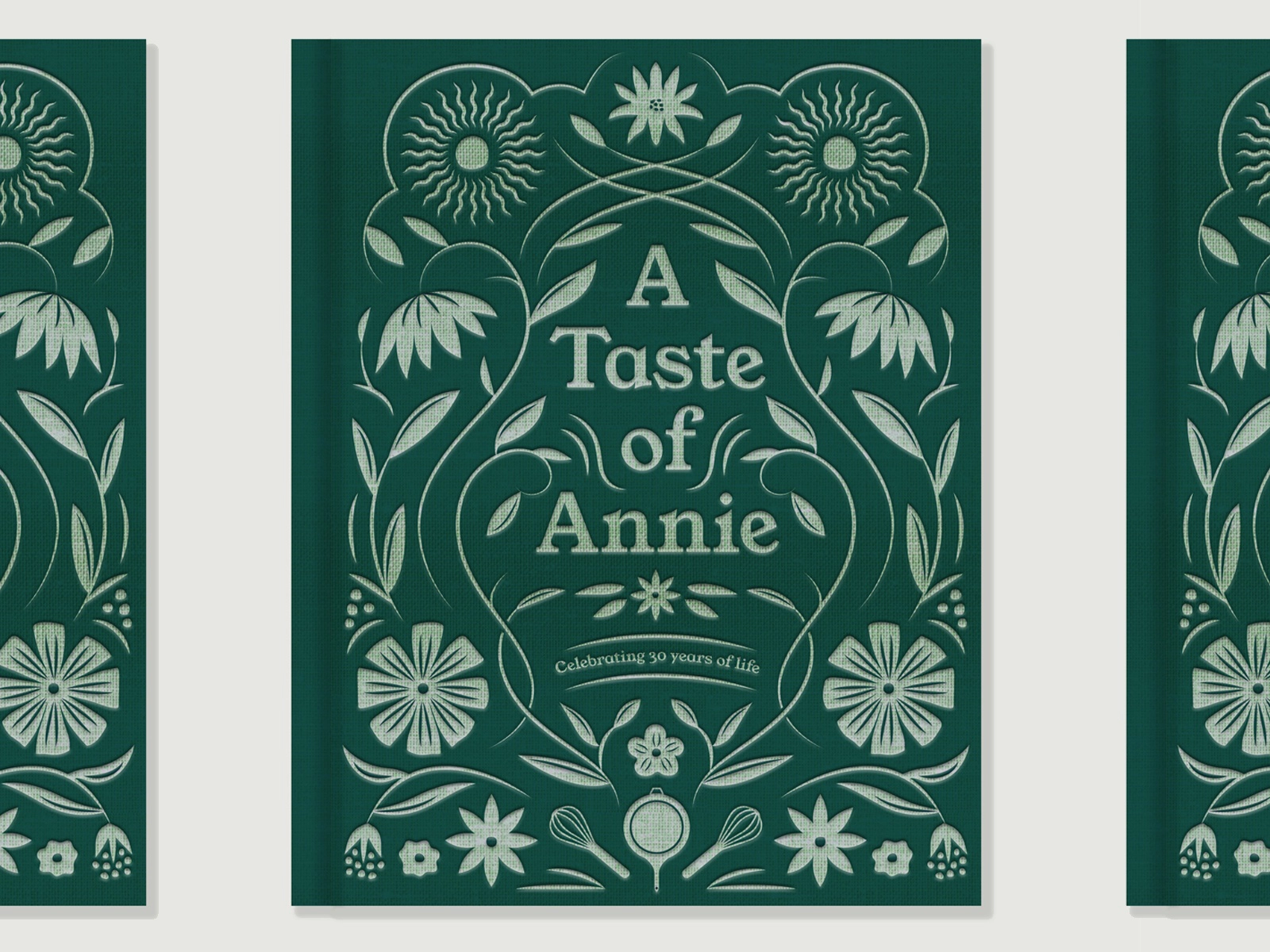
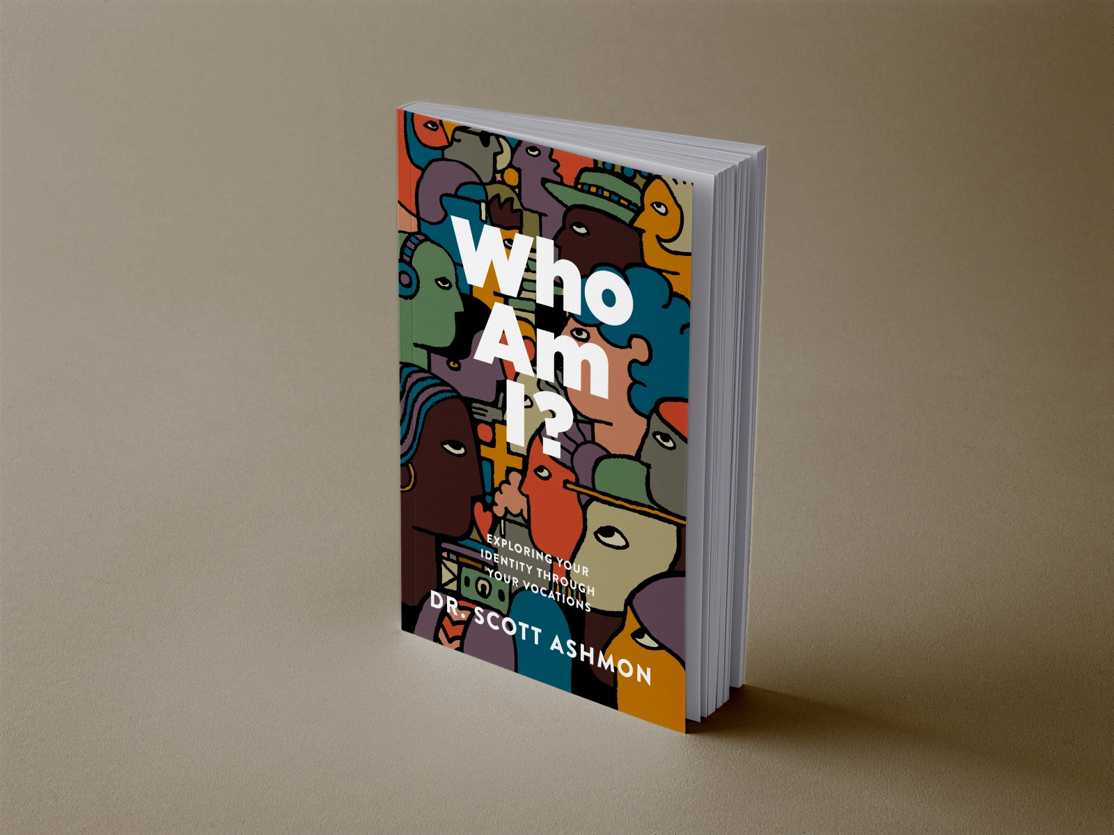
Color palettes can be a book cover’s biggest asset—or biggest downfall. The right color palette draws the reader’s eye and gives them an idea of the tone and mood of the book, while the wrong colors risk confusing your audience.
For example, neon colors typically indicate that a book will be fun to read and not too serious. Dark colors? This book could be serious or scary (depending on genre). Muted colors? This book likely has an important message.
Remember: Color palettes are only one part of establishing a mood. You can, for example, create a scary mood with a pastel cover with the right visual elements (The Dark Descent of Elizabeth Frankenstein by Kiersten White has a pastel pink cover that’s decidedly creepy).
8. Your title needs to stand out
We’ve already mentioned titles, but it’s crucial that your title stands out on your cover.
If someone is looking for a specific title and the title isn’t immediately recognizable on the cover, they may scan right past it. Titles can also give powerful clues as to the content of the book.
Make sure that your title is readable at small and large sizes, and that it stands out from the background graphics.

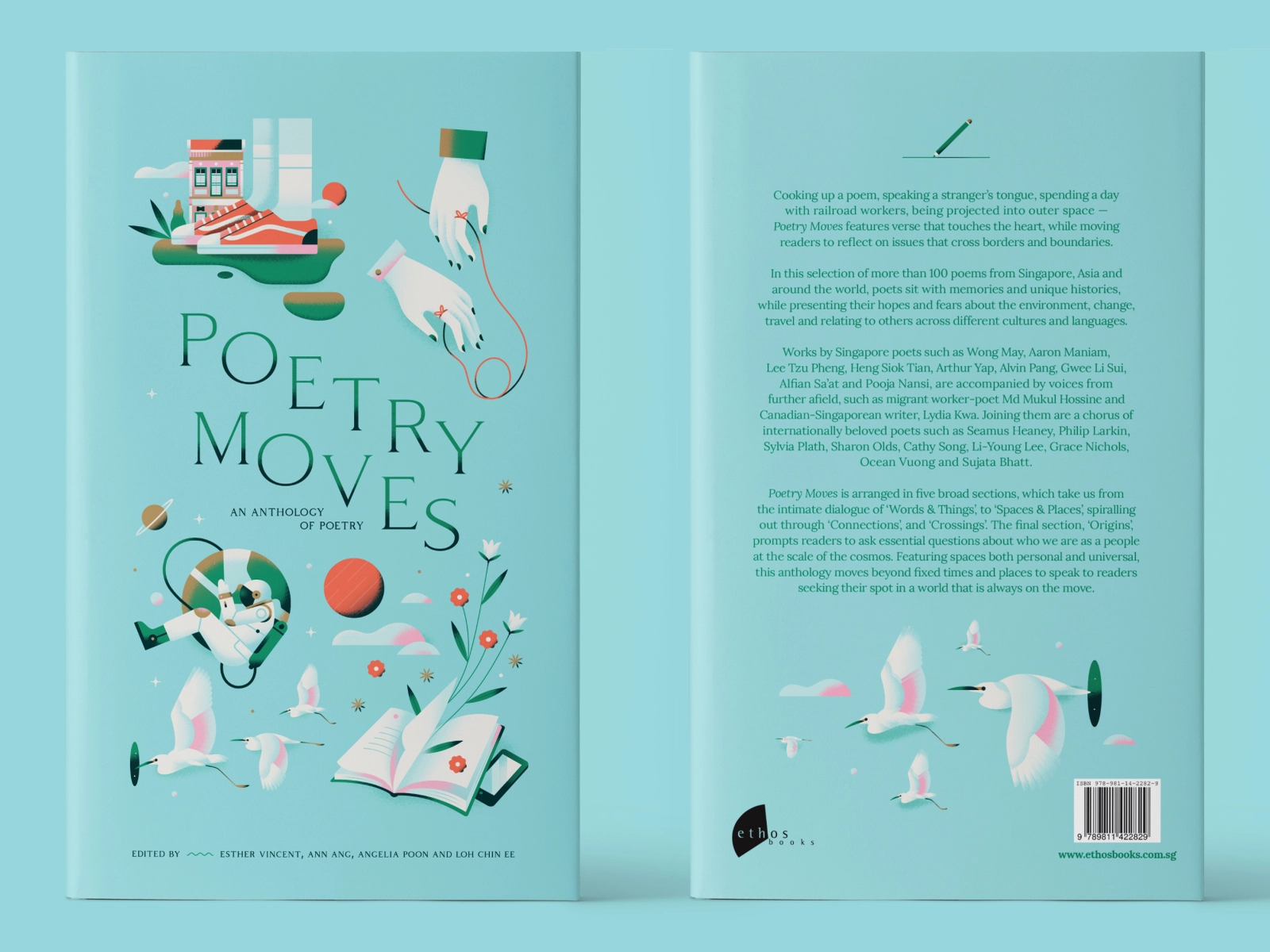
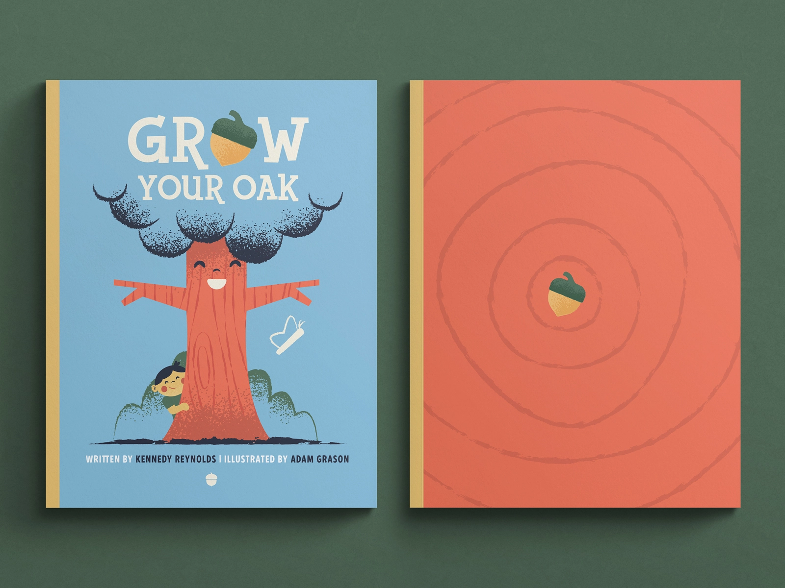
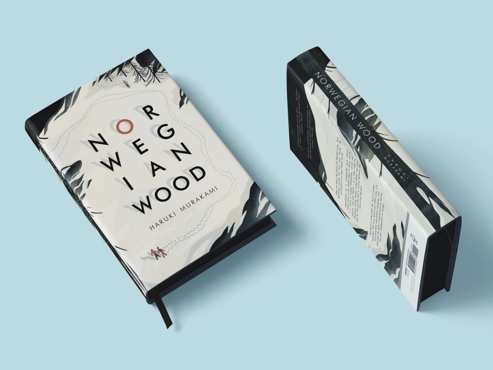
9. Don’t overlook the spine or back cover
While a book’s front cover gets all the glory, the spine and back cover are also important design elements.
Spines, especially, are important when a reader is browsing bookstore shelves, where most books are arranged on shelves with only the spine showing.
You also need to take into account that due to the way offset printers work, your front cover, back cover, and spine may not always align perfectly.
By continuing the basic background design around the entire cover, you avoid the spine or back cover looking bad due to printing errors. This ensures that your entire book cover looks professional and consistent.
Design a memorable book cover that sells
Book cover design has changed with the popularity of online booksellers and ebooks, but the basic principles of good design still apply. Designing a cover that catches a reader’s eye is key to the success of a book.
What’s more, you can find some incredibly handy book cover design templates online if you’re not comfortable using design software like Adobe Photoshop or Illustrator. However, we strongly suggest finding a professional freelance graphic designer who’s an expert at designing a memorable cover that actually sells.


