This post was originally published on Creative Market, the world’s marketplace for ready-to-use design assets. Authored by Mark Wilson at Packlane.
Packaging is more than just a pretty box. The right product packaging can turn ordinary customers into raving fans. It’s the difference between being added to the cart or being left stranded on the shelf. And believe it or not, product packaging design is easier than you think.
With amazing product packaging, your product and brand can and will stand out in a crowded marketplace. Recognition of your brand based on the right packaging will not only help drive sales but will help cement a loyal and dedicated customer base who will rely on your product over and over. Let’s get started on the road to designing product packaging to always make your product the first choice.
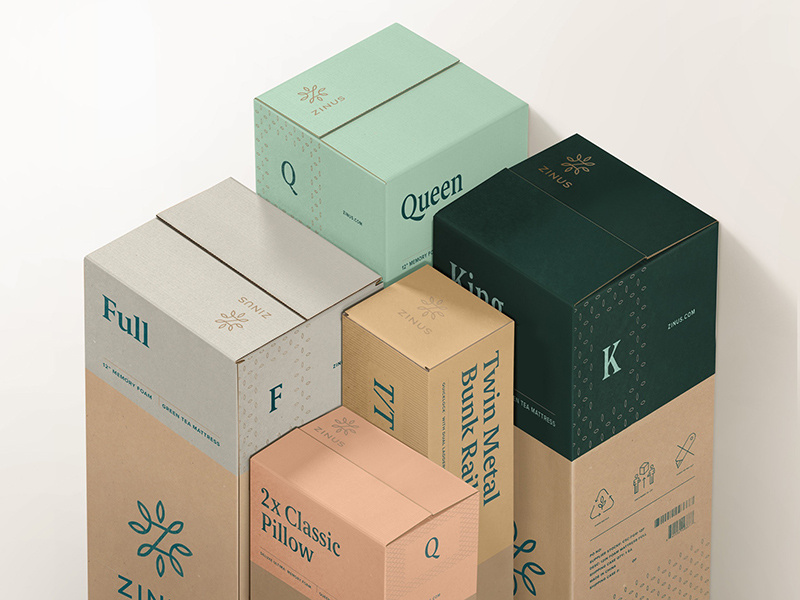
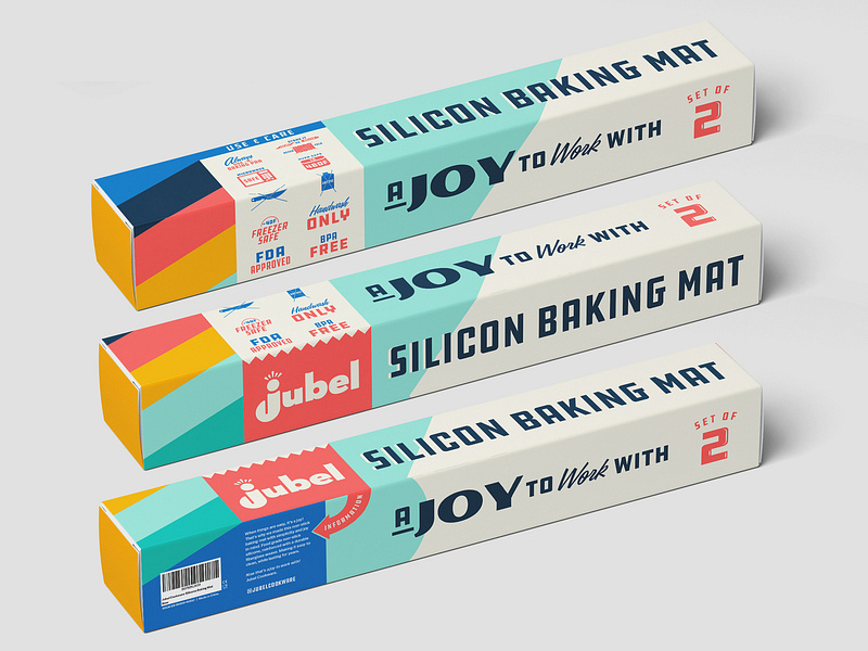
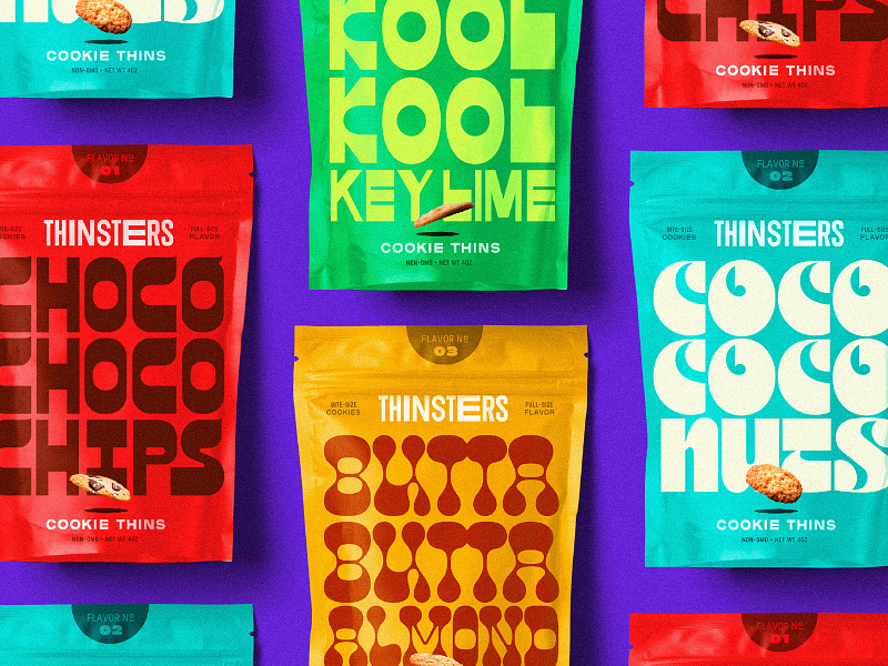
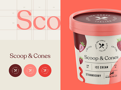
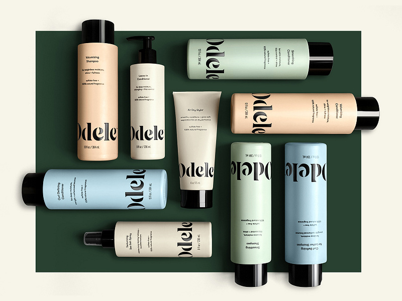
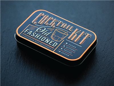
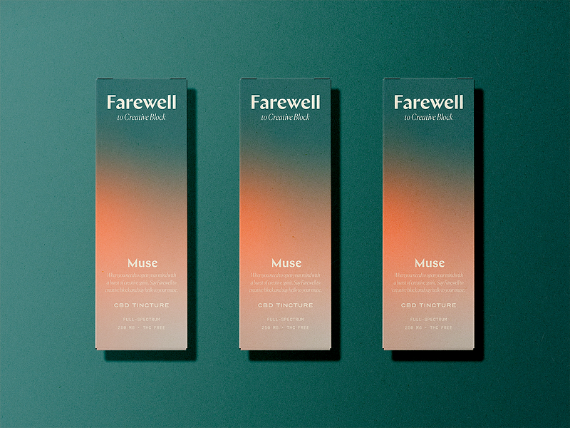
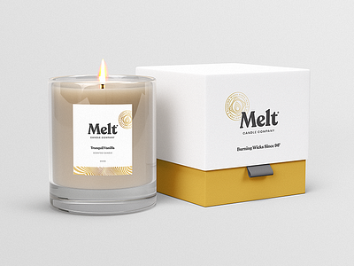
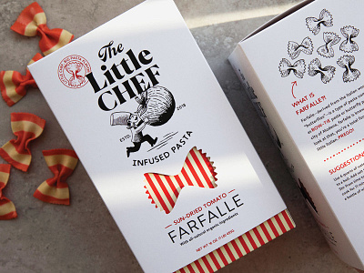
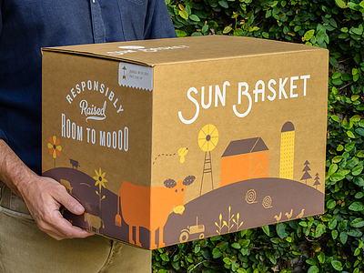
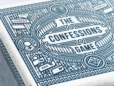
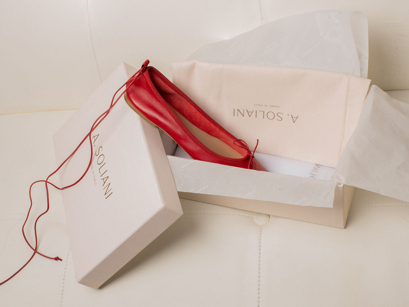
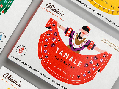
Row 1: Matt Thompson, Joshuah Xaiver Miranda, Mustafa Akülker for Marka Works Branding Agency.
Getting Started
Even if you’ve never created custom packaging, that’s okay. Understanding some basic elements of product packaging design makes it a lot less scary of a process to get started. And regardless of your experience level, you’ll soon discover it’s easy to get up and running.
Get inspired by checking out some awesome package design blogs. Before you know it, your first package will be shipped to customers or stores to be placed on a shelf.
Glossary of Terms
Understanding a few common packaging terms will make the process of designing your packaging much easier. If you want to go beyond the basics, here is a more in-depth technical guide to creating custom packaging.
Dieline
A dieline is a 2D representation of 3D packaging that can help show your design on a flat and unassembled box. Dielines are important because they guide both the designer and the printer on how to correctly determine the layout and position of each artwork element to be printed on the box. As well, they act as a guideline for equipment operators on how to precisely cut, crease, and glue the box structure.
Spot Colors
Spot colors are ink colors printed using a single run. These standard ink selections are premixed from a numbered list commonly provided by the Pantone Matching System (PMS) in North America. The colors are only applied to areas assigned for that particular color. This ensures consistency and helps keep printing costs down.
CMYK vs. RGB
CMYK refers to the four inks used in color printing: cyan, magenta, yellow, and key (black). The CMYK model works by partially or entirely masking colors on a lighter, usually white, background. The ink reduces the light that would otherwise be reflected. Such a model is called subtractive because inks “subtract” brightness from white.
The RGB color model (website display) is an additive color model in which red, green, and blue light are added together in various ways to reproduce a broad array of colors.
Foil
Hot stamping is used in the packaging industry for food, tobacco, luxury goods, and alcohol. It’s a method of decorating your packaging that transfers an image in a thin layer of film or foil onto paperboard or plastic. This process uses heat and pressure which releases the image from a carrier film into the substrate, creating a laminate.
Emboss
Embossing is when your design is raised. This can be text or an image that is pressed into paperboard from below. It requires a male and a female die. The raised area can have ink or foil applied to it. Debossing is the opposite of embossing. It leaves an imprint of your image in paperboard from above. As with embossing, ink can be applied to your image when it is imprinted. Debossing only requires one die to be utilized in the process.
Caliper/Flute
Caliper refers to the weight or thickness of the cardboard. It’s primarily considered for product protection a material can provide. For corrugated packaging, the caliper is known as the flute.
Primary Packaging
Primary packaging is the layer of packaging that contains the product itself. It is constructed with the product in mind and provides an element of protection for storage. Examples of primary packaging include shrink-wrapping, clamshell packaging, and blister packs.
Secondary Packaging
Secondary packaging differs from primary packaging because it does not come into direct contact with the product. It serves as a marketing tool for branding and presentation. As well, secondary packaging is used for logistics purposes such as transport and storage.
Flexographic Printing
Flexographic printing involves using plates during the printing process. It usually involves simple colors and is a good option if your design doesn’t change a lot. It can be more expensive at first because you will have to pay for printing plates upfront.
Lithographic Printing
Lithographic printing also involves using printing plates but it is for more elaborate and detailed designs. It will provide the highest print quality for your packaging especially if you are printing large quantities. However, it is the most expensive printing option available.
Digital Printing
Digital printing uses CMYK ink colors to print your image on your packaging. It’s a common method of printing and is commonly used in home computer printers. It is very cost-effective because there are no setup fees because no printing plates are used. This is a great way to get started with package design because you are able to use multiple colors and it a cheaper option if your artwork changes frequently.
Layers of Packaging Design
Knowing your brand story and how it relates to your product is a key factor in creating irresistible packaging. It allows you to focus on the many layers of packaging that lead your customers from discovering your product to purchasing it.
But just because you’ve managed to get your product into your customer’s hands doesn’t mean the story ends there. What happens if your product isn’t well protected and a customer receives damaged goods? How do you prepare your product?
Ease of Use
Your packaging not only needs to stand out from the crowd, it also needs to be easy to use. Don’t make your customer struggle. Product packaging that is difficult to open or frustrating can leave a negative impression of both your product and your brand. If you’ve ever struggled with a molded clamshell case while trying to open an electronic item, you know what I’m talking about.
Just keep it simple. Make sure it’s easy to open your packaging and make it clear how your product should be used. That may mean printing instructions directly on your packaging on how to use it. For food items, it may mean printing ingredients or cooking directions. It doesn’t have to be elaborate but even simple instructions can go a long way.
Product Protection
Ensuring your product arrives safely is a key part of your packaging design. Everyone loves to receive a package in the mail but there’s nothing worse than opening it up to find it’s damaged or broken. How can you mitigate items from being damaged when designing your packaging?
Adding custom inserts to your packaging will give your product better protection and stability. Adding simple corrugated cardboard inserts are a cost-effective solution that ensures your product arrives safely and intact. You can also add custom foam inserts that are lightweight and durable. While foam inserts provide excellent product protection, they are more expensive and will drive your packaging costs up.
Choosing a color palette
Using color to tell your story effectively is an essential part of your packaging. Color is the very first thing your customers will notice. There’s a reason we have favorite colors and how they play into our psychology can be very powerful. The right colors can energize a customer to purchase or refer your product to a friend.
Brand Colors
The most obvious choice for colors on your packaging is your brand colors. You’ve already carefully selected these colors to represent your brand and resonate with your target customer. Brand colors build loyalty and recognition that make your customers look to you first. If you’re new to packaging design, your brand colors are a great starting point.
Dark vs Light
Dark colors exude power and elegance while light colors are generally softer and more relaxing. Dark colors are grounded in making your brand feel established and trusted. Using light colors will give your design an ethereal, graceful quality. They give brands a pure, clean feeling.
Choose darker colors when you want a more luxurious, mysterious, or serious experience. Use lighter colors when you want to go for simplicity or when you’re trying to imply cleanliness.
Bright vs Pastel
Beyond just dark and light colors, saturation also helps set mood. Bright colors give off a vibrant, fun feeling that is youthful and exciting. On the other hand, pastels provide subtle stimulation setting a soothing and comforting tone. Use pastels when you want to be more light-hearted, innocent, or calming. Pick bright colors when you want to command attention and stimulate action.
Colors are not exclusive. You can mix categories together for extra impact. For example, add a bright, vibrant hue to a simple black and white design to draw attention to your call to action.
Setting the mood with typography
Typography will help establish the right tone for your brand’s messaging. Do you want your brand’s personality to be professional, laidback, or fun? Choosing the right font can be daunting but also a lot of fun. The key to choosing an appropriate font is to keep it simple. Using too many types of fonts can become confusing and messy. If you’re using more than one font, use two contrasting styles such as pairing a script font with a sans-serif.
Also remember, there are no hard and fast rules about font choices. These are just some starting points to help you understand how fonts can change the tone of your packaging.
Sans-serif
Sans-serif fonts such as Helvetica or Arial are modern, clean, and sophisticated. Use san-serif fonts when you want your packaging to be minimal and uncluttered or when legibility is extremely important.
Serif
Serif fonts such as Times New Roman or Georgia come across as professional, traditional, and more serious. They will lead consumers to see your brand as either established or conservative (or both). Depending on the type of product you sell, this type of font will provide a sense of reliability and respectability. Serif fonts carry over to print materials and are easy to read so are a great option when designing your packaging.
Script
Script fonts such as Lobster or Lucinda evoke thoughts of traditional handwriting and can be associated with elegance and luxury. You will often find script fonts on luxury and high-end goods. Using script fonts could come across as too high brow for some consumers and wouldn’t make sense with certain types of products.
How material choices affect perceived value
Where color and typography are front and center, materials are the backbone of your packaging. Materials are your canvas and act as the foundation for your packaging design. Here are three types of cardboard material and how they can carry your story through your product packaging.
Kraft
Kraft material is the closest to raw cardboard and can give your packaging a natural finish. It’s great for organic companies or no-frills messaging. When printing on kraft, it’s wise to use dark colors as bright and saturated colors sometimes appear muted on the brown material. Choose Kraft when you want to showcase your rustic side or your down to earth ideas.
Matte White
White matte is the Swiss Army knife of material. It’s versatile and looks great in any color. Matte finishes place the focus right on your design and are less reflective so it photographs extremely well. Matte is the newest trend in finishes that sets a sophisticated tone. Bonus points that it’s also budget-friendly allowing you to stretch every packaging dollar! Use matte white when you want to give your product a sophisticated texture that feels trendy and modern.
Gloss White
Gloss materials can add a high-end finish that lends well to luxury items. Colors print vividly and create eye-catching designs amidst a sea of matte competitors. It’s also an excellent choice for print designs that lean heavily to images with bold colors. Go for gloss when you want to create a premium experience and want to make your packaging look and feel extra special.
Illustrations & Imagery
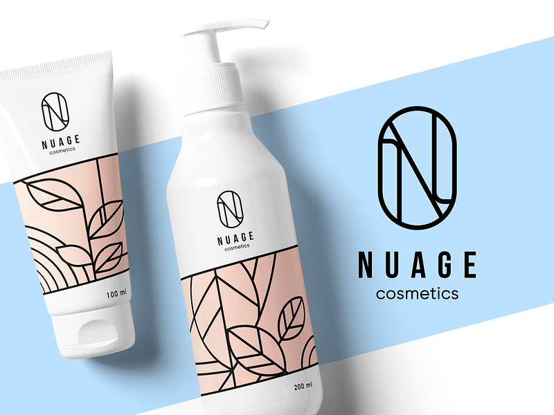
Use patterns to reflect your brand assets and not just your packaging. Custom patterns will add a lovely element to your packaging design by adding interesting colors, shapes, and other design trends to effectively showcase your brand’s unique visual style.
Icons
Use icons that are easy to recognize and intuitive. Take the guesswork out of complex ideas by using icons and symbols that simplify the story you’re telling.
Icons are a simple tool in a designer’s toolbox. They offer visual cues on what you’re supposed to do next. They pack a lot of punch and are an effective way to convey complex ideas quickly because they don’t require additional text or instructions.
Photography
Use photography when you want to show off product features such as color, shape or form, or to showcase who your ideal customer is.
A picture is worth a thousand words. Packaging serves to protect your product but it can mask the actual product inside the box. Buyers may have specific questions about how your product looks or functions. That’s where product photography comes in. If you have your product tucked safely inside your box, use photography to answer some of the questions your customers may have regarding color, size, or function.
Illustrations
Use illustrations to lighten the mood while still expressing helpful information about your product. Illustrations are perfect for demonstrating how to use your product. They add visual elements of surprise and can be a simple way to add fun and flair to your packaging. Vector illustrations are great because they can be scaled to any size which makes them always print-ready.
Final thoughts
Designing the right product packaging may seem like a lot of work at first but when you take the time to learn a few of the basics, you’ll be able to move forward with decisions on how the right materials can make a difference. With the right tools at your disposal, you don’t have even have to be an expert.
Remember to make your packaging not only beautiful but also functional. While designing product packaging, don’t lose sight of the fact that your packaging helps protect your product. At the same time, using the right colors, typography, copy, and visuals will add that extra wow factor to make your packaging truly special.
RELATED RESOURCES
- Perk up! A collection of beautiful coffee branding & packaging
- How to incorporate illustration into a branding project
- How to use color to evoke powerful emotions in your design
Find more Process stories on our blog Courtside. Have a suggestion? Contact stories@dribbble.com.
