In this post, our friends at Marketing Essentials explain how to design a new logo that stands out to today’s younger generations. Plus, why companies should care about millennials and tips on finding your authentic brand identity. ■
Is your brand struggling to stand out, sell more, and recruit millennials? Are you frustrated trying to get noticed in today’s very crowded social space?
If so, it’s time to take a look at what your logo design is portraying about your company. Start with a logo rebrand that grabs attention and gets the younger crowd talking about your company.
Why brands should care about millennials
Millennials (people born between 1981 and 2000) comprise 25% of the U.S. population and account for 21% of all consumer purchases. That amounts to $1 trillion + in purchasing power! This also means they have a significant influence on the buying behavior of their family, friends, and relatives.
The most important thing for a brand to relate to millennials is to be current with trends, authentic to the brand personality, consistent, and scalable. Millennials are quick to judge whether they want to interact with a brand because brands are in front of their face hundreds of times a day. Try to count how many ads pop up while scrolling your social media channels!
So, the first step to revamping a logo is to figure out your true brand.

Two steps to uncovering your true brand:
1. Know your audience
First things first, not all logos should be designed for a younger audience. You should evaluate your company’s audience (persona) before setting out on a redesign of your brand. If your company’s target audience is a middle-aged man, a logo geared towards millennials may not be the right fit.
However, if you look toward your future goals, and you’re looking to expand your services and/or products to try to reach millennials, a redesign could help you get there! Just don’t lose sight of your current audience in the process. (A repeat customer is easier than a new sale!)
2. Know your brand
Before you set out to design your logo, make sure that you have your brand identity nailed down. A logo is the first thing your customer may see, so you want to make sure you are hitting the right audience with your authentic brand. Authentic you may ask? YES!
Your customers want to work with an authentic brand. They want the same tone, personality, and feeling from the Facebook ad they might see, to the website where they can make the purchase, to the salesperson they speak with. Each interaction should give off the same brand personality.
In summary, make sure your logo communicates the most authentic you!

Quick test: Find your brand personality
This quick test can help you find your brand personality. All these should be chosen before a logo design. This information will help guide you on the right track for a logo redesign. From the type of typography used to the colors chosen, everything has a meaning.
Now that you have a path toward finding your true brand, you will know if your company is really meant to advertise toward a younger audience. If so, take these steps toward a logo redesign that gets you noticed.
4 Steps to a logo redesign
Step 1: Keep it simple
Millennials have a strong preference for minimalist design. They tend to desire clean, simplistic shapes over a busy overloaded design. You can see a lot of well-known brands taking time to clean up their logo to simplified shapes, flat lines, and bolder colors.
The viewers should get the message at first glance of the logo. But if there are too many confusing colors and fonts or a complex shape of the logo, then it will send a mixed signal to the viewers.
- Shape/detail: Are there unnecessary lines or shapes in your rough draft? Can you remove any extra detailed elements and still get the same message across? A trend from the past was extra detail and especially drop shadows. Now is the time to drop those extra details and focus on the main elements.
- Focal points: Try to focus on one to two elements. Too many elements compete for the viewer’s attention, making them feel overwhelmed and they will move on. If you have a strong icon and a strong typeface, the viewer will be able to digest the information quickly and will likely remember your logo. Brand recognition is key!
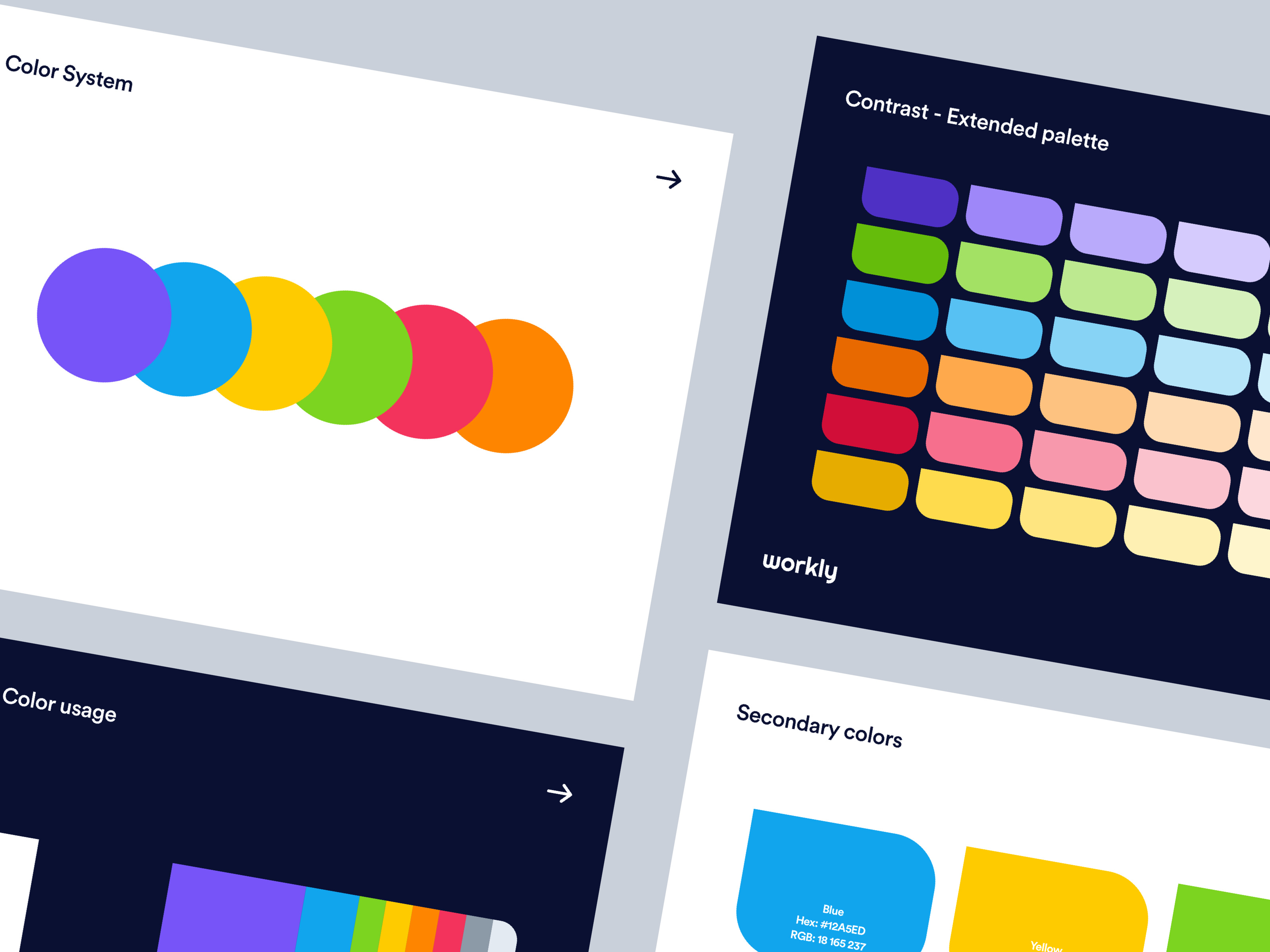
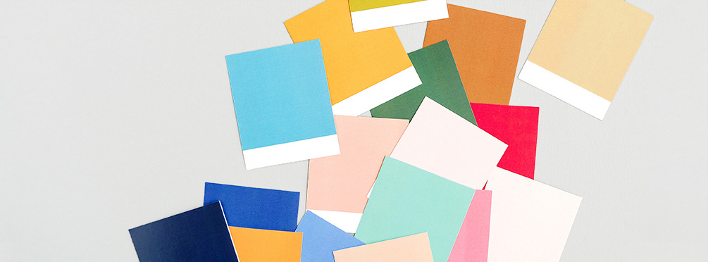
- Color: Bold hues go hand-in-hand with minimalist design. Don’t be afraid to try vivid colors. Having a striking color palette makes your brand stand out and easy to remember as well! A color scheme can either make a brand win or lose a sale. But don’t forget—your personality has to be reflected in your colors! For example, if you use red as the main color in your logo, it might send the message of being aggressive, passionate, and energetic. If your goal was to promote a calm feeling for your spa, red may not be the best choice because of the direct color psychology associated with red.
Quick color tip: Make sure your logo looks equally impressive in black and white. There are times when a logo needs to appear in black and white instead of color, such as for faxed documents, newspaper ads, stationery, and other items. To make sure your new logo will stand out without color, analyze it in the sketching stage where only a pencil is used.
Remember, a simplified design is not a bad thing. A simple logo can be a very memorable design. Think about how many global businesses are represented by their simplified logos. Nike logo is a simple swoosh logo. The Pepsi logo is made of two colors only. The Apple logo has a simplified symbol.
Note, the simplicity of a logo is not restricted to logos only. This should be applied to all the brand’s designed products such as brochures, websites, and so on.

Step 2: Typefaces matter!
Many designers don’t pay attention to the selection of typefaces and choose them randomly. The fact is that typefaces speak about the personality of a brand as well.
For example, if you are designing a logo for a children’s toy company, a hand-drawn typeface could be the best option as it would promote a child-like personality. Make sure that the choice of typeface speaks toward your brand or else the logo will send wrong signals.
Consider designing your typography to create a one-of-a-kind aesthetic for your brand. Millennials appreciate handmade and homegrown items. Having a unique typeface that was created specifically for your brand will communicate a sense of care because you took the time to use a font beyond just Futura. This alone will make your brand pop and could allow your logo to stand alone as a wordmark when needed.

Step 3: Understand your logo’s meaning
Every logo should have a meaning behind it. Beyond the meaning of the colors chosen, the shapes, icons, and layout should hold meaning to it all. If you don’t define the meaning behind your logo, someone else will find one. To prevent miscommunication behind your logo, make sure you put intention into every element.
Think about the FedEx logo. This logo has a meaning and hidden element beyond the logo mark. If you look closely, there’s an arrow between the ‘e’ and ‘x’ to communicate movement, delivery, and transportation. When designing your logo, make sure it’s not only well designed but also has a purpose to it.

Step 4: Scalability
A quality of great logo design is that it is easily scalable. Nowadays, a logo can go on almost every item possible, both in print and digital. Your logo will need to look impressive when it’s on your website, when it’s set as a social media profile image, on a large billboard, and even when it’s printed tiny on a promotional pen.
The biggest perk of a simplified logo design: It’s easily scalable in the multimedia world we now live in.

A new logo for a new generation
A good rule of thumb is to at least consider updating your logo once every 5 years. Before long, your target audience may shift to Generations Y and Z, or maybe you develop a new product or service that targets Baby Boomers. In any case, what was once modern and compelling loses its power over time. Be the brand that stands out, not the one that needs to dust off its logo.
About the author: Brooke Bader uses her talents to help people & businesses grow. She believes design should never be cookie-cutter; its purpose is to portray the passion of your brand. Catch her working as the brand and design strategist for clients at Marketing Essentials.
RELATED READING:
- How to not screw up a logo design: 6 tips from the experts
- Amazing brand color palettes of the Fortune 500 to inspire you
- How to incorporate illustration into a branding project
Find more Process stories on our blog Courtside. Have a suggestion? Contact stories@dribbble.com.


