 Visual designer & typography master Davide Baratta shares his favorite free typeface combinations and why they work. See the font pairs in action through Davide’s awesome visuals, and get inspired to try them out for yourself! ■

1. Mazius Display + Libre Baskerville
Elegant and brutal, Mazius is a high contrast serif typeface by Colletttivo. It comes in three styles which allow you to get creative with mixed weights. What sets this font apart are its prominent calligraphic features which really shine in the extra italic. Pair it with the timeless Libre Baskerville, and you’ll get a sophisticated look with an edge.

Mazius Display:
Designer: Alberto Casagrande | Download: Colletttivo | License: Open Source
Libre Baskerville:
Designer: Impallary Type | Download: Google Fonts | License: Open Source
2. Regina Black + Poppins
Friendly, bold, and funky, Regina Black is a heavy display font with two styles, solid and hilite. The low curvy shapes and the pointy serifs are what give this font its bubbly character. Modern and geometric, Poppins is perfect to balance out Regina’s curves. This combo is fresh and retro at the same time, ideal to evoke a 70s aesthetic.
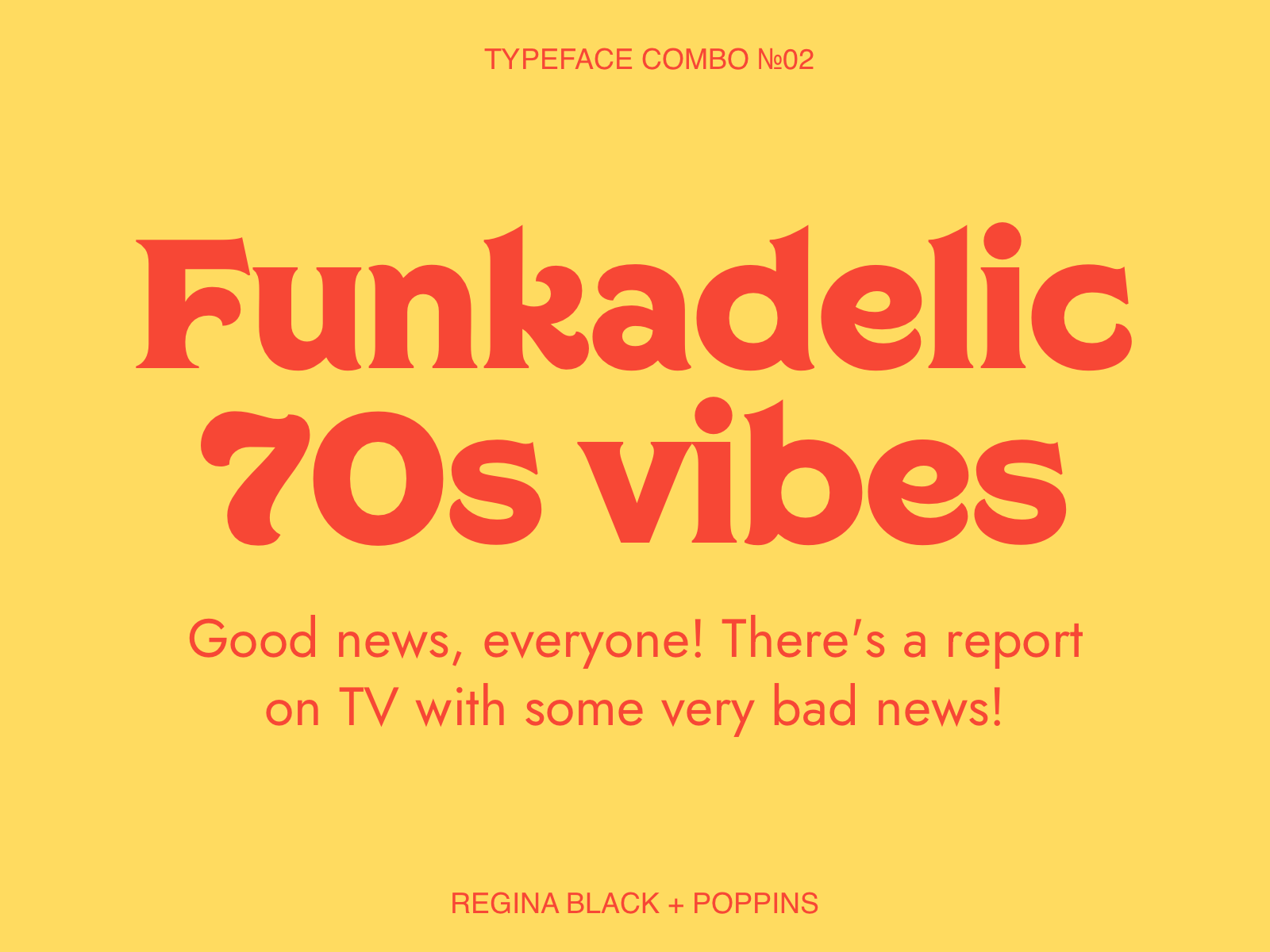
Regina Black:
Designer: Charles&Thorn | Download: Lost Type | License: Free for Personal Use
Poppins:
Designer: Indian Type Foundry | Download: Google Fonts | License: Open Source
3. Monument Extended + Sapce Mono
When it comes to bold, heavy titles, Monument Extended is an easy choice. A super modern, extended sans serif that comes in 5 weights, which makes it pretty versatile. I love to pair it with a lighter font to exaggerate the contrast. In this case, Space Mono dials up the techy, futuristic look, taking in to Mars.
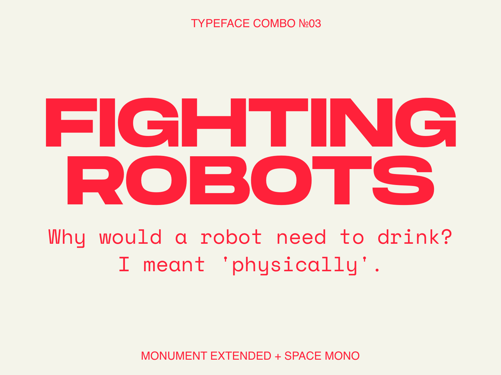
Monument Extended:
Designer: Mathieu Desjardins | Download: Pangram Pangram | License: Free for Personal Use
Space Mono:
Designer: Colophon Foundry | Download: Google Fonts | License: Open Source
4. Corben + Manrope
If you’re looking for a free alternative to Cooper then you’ll probably like Corben. It’s a 1920s-inspired display font with soft, rounded serifs and wide curves. With two weights, it can be used in both high-end and more relaxed executions and it’s great to create a warm, retro vibe. With a similar x-height, Manrope is a great pair, a modern grotesque with 7 weights plus a variable version also available on Google Fonts.
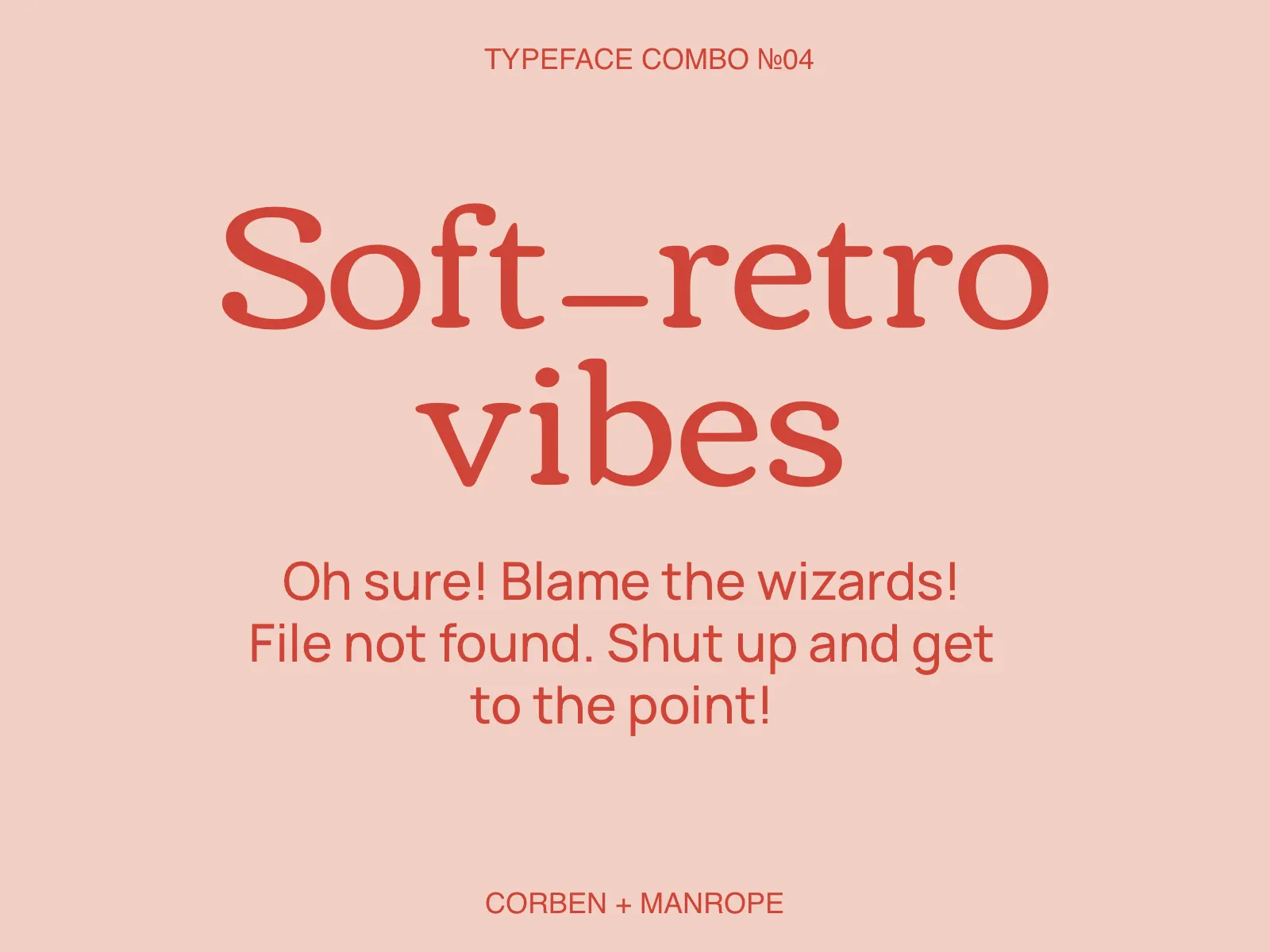
Corben:
Designer: Vernon Adams | Download: Google Fonts | License: Open Source
Manrope:
Designer: Mikhail Sharanda | Download: Google Fonts | License: Open Source
5. Sporting Grotesque + Agrandir
Sporting Grotesque is an old-school Grotesque packed with quirks. It features a strong thick to thin contrast, tight apertures, and calligraphic terminals. Confident and unconventional, it’s often used in brutalist designs or to inject personality into minimalist executions.
Agrandir features some similar shapes but compared to Sporting Grotesque, the apertures are wider and the contrast is less pronounced. Out of the 74 styles of Agrandir, I’ve picked a semi narrow version with geometric alternates to create a pair that has a seamless flow with a unique contrast.
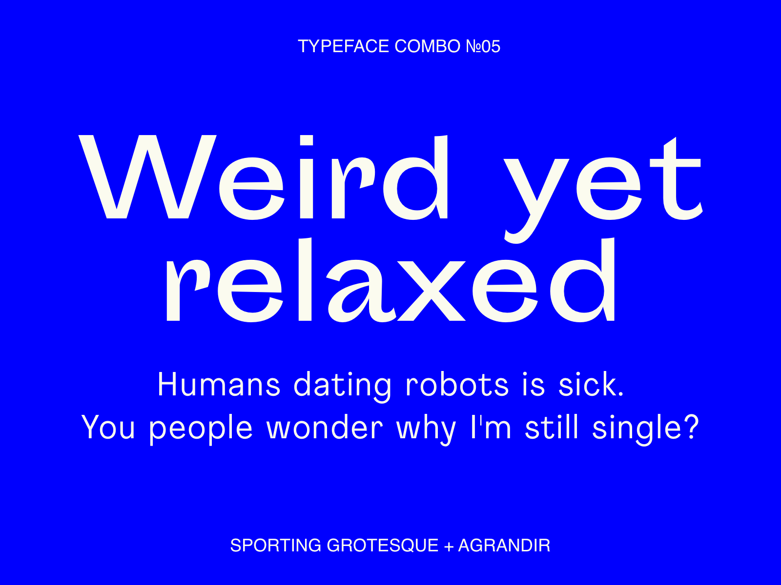
Sporting Grotesque:
Designer: Lucas Le Bihan, George Triantafyllakos | Download: Velvetyne | License: Open Source
Agrandir:
Designer: Alex Slobzheninov | Download: Pangram Pangram | License: Free for Personal Use
6. Millimetre + Mondwest
Millimetre is a geometric sans serif inspired by mid-century sans as Novarese’s Eurostile and Microgramma. This typeface screams tech and 60s and it’s ideal for retro-futuristic, technological executions. To contrast Millimetre’s rounded curves and wide shapes, I’ve picked Mondwest, a unique serif bitmap font specifically designed for high contrast pairings. This type combo creates a unique aesthetic where past and future meet and blend together.

Millimetre:
Designer: Jérémy Landes | Download: Velvetyne | License: Open Source
Mondwest:
Designer: Steve Marchal | Download: Pangram Pangram | License: Free for Personal Use
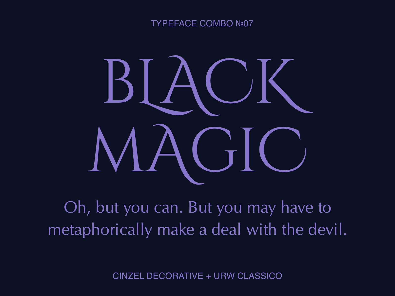
7. Cinzel Decorative + URW Classico
Cinzel is a typeface inspired by ancient Roman inscriptions with a modern twist. The proportions of the letters are classic but details like the open joints of the Bs add a contemporary feel that makes this font unique. With its decorative variants, Cinzel is perfect for creating typographic compositions and logotype. Similarly, URW Classico, an Optima-like free typeface, is inspired by Italian stone inscriptions and classic Roman proportions but the lack of serifs makes it modern and hard to fit in a box.
These two typefaces together create an ancient, almost magical aesthetic that can be exaggerated by using Cinzel’s flourishing decorations to alter its flow.
Cinzel Decorative:
Designer: Natanael Gama | Download: Google Fonts | License: Open Source
URW Classico:
Designer: original design by Hermann Zapf | Download: Font Library | License: Open Source
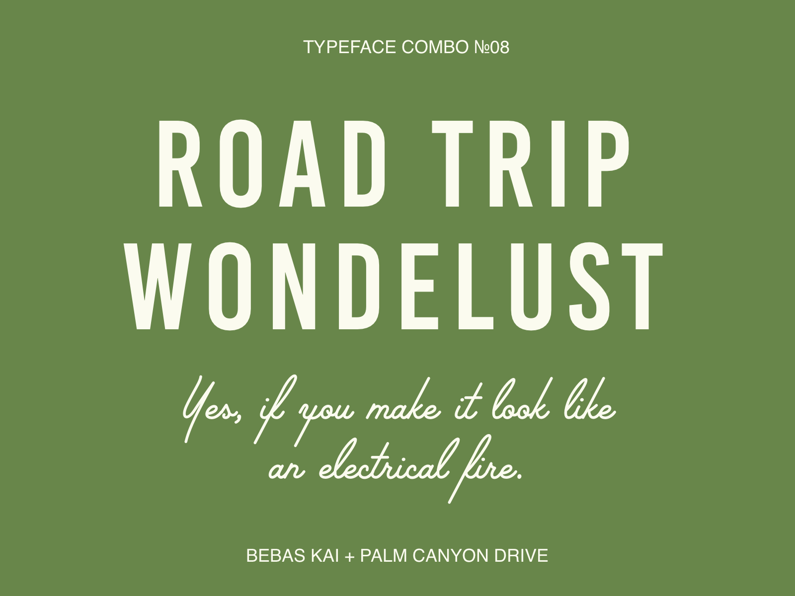
8. Bebas Kai + Palm Canyon Drive
Bebas Kai is an all-caps, condensed typeface that doesn’t really need much of an introduction. It’s very similar to its sister Bebas Neue but if you look close, you’ll spot details like the legs of the Rs and the joints of the Ws that make Bebas Kai more geometric and straight.
I’ve paired it with Palm Canyon Drive, a monoline script inspired by mid-century California. The contrast between these two typefaces make them perfect for anything holiday-themed, outdoorsy, with a classy and retro touch.
Bebas Kai:
Designer: Ryoichi Tsunekawa | Download: Dharma Type | License: Open Source
Palm Canyon Drive:
Designer: Hoodzpah Design Co. | Download: Retro Supply | License: Free for Personal Use
MORE TYPOGRAPHY RESOURCES:
- 10 excellent font pairing tools for designers
- 8 best free font resources for designers
- Bold & Groovy: Exploring 70s inspired typography & lettering
Find more Inspiration stories on our blog Courtside. Have a suggestion? Contact stories@dribbble.com.


