If you have ever created an illustration, chances are you had to choose some colors. It’s also likely that you’ve had a mental debate on choosing one color over the other. Should I go with orchid purple, or will my illustration look better with blood red? Maybe sky blue will do the trick? The possibilities are endless!
There are also times when you’ve chosen a color scheme and have already applied the colors to your illustration. But for some reason, the colors are off, and you couldn’t pin down the reason.
While colors can be tricky and time-consuming to get right, once you understand the fundamentals, you may find working with colors an enjoyable process. Below are some key principles that have helped me improve at working with color.
Think about the context of the illustration
While it’s important to consider how colors contribute to the overall visual appeal of an illustration, being deliberate about how colors can effectively communicate a message is equally important.
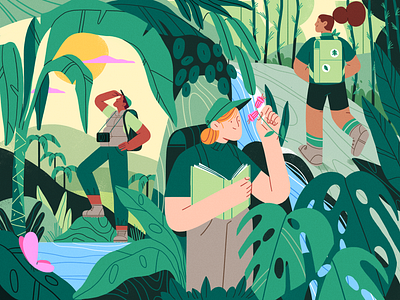
For example, if you’re asked to create an illustration for an editorial piece on the benefits of smiling, you wouldn’t want to pepper your illustration with blacks and grays. Instead, you’d go for happier colors like yellow or orange. Similarly, if you’re illustrating an enchanted forest at night, using colors like purple and blue, instead of the usual green, conveys the magical aspect of the forest more convincingly.
Choosing colors for an illustration may seem intuitive, but when you’re dealing with topics that you’re unfamiliar with, it’s safer to do some research. You can do this by scouring the internet and collecting images that you can use as references.
To help me make better color decisions, I also like to ask myself the following questions:
- Where is the illustration taking place? Is it on land or underwater? Is it in a bustling city or a quiet countryside?
- At what point in time is the illustration taking place? During the day or night? During the hip 60s or 10 years into the future?
- How does the setting of the illustration look like in the real world?
- Who are the main subjects of the illustration? If they’re people, what are their personalities? If they’re animals or inanimate objects, how would you describe them?
- What is the main emotion that I want to convey with my illustration?
Start with a limited color palette
When you’re just starting out, stick to a limited color palette first, and then explore more complex combinations as you go along.
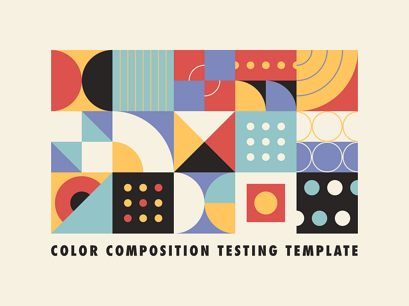
If you’re a beginner, working with 3 to 4 colors is recommended because it will help you see the relationships between colors more easily. With a limited color palette, you can quickly tell whether the colors work well or if they clash and make your eyes bleed. And when the latter happens, you’d know which colors need to be changed.
Once you’ve gotten the hang of working with 3 to 4 colors, you can take it a step further by experimenting with more complex color combinations. You can do this in two ways:
The first way is to increase the number of colors you’re working with. For example, instead of using 3 to 4 colors, you can challenge yourself by working with 8 to 10 colors. The second way is to explore unusual color combinations, like neon red, olive green, and powder blue. However, bear in mind that the more colors you add, the more difficult it is to achieve color harmony.
Contrast is key
Your chosen colors may be appropriate for the given context. Your illustration may work well with either a limited or more colorful palette, but when your colors don’t have the right amount of contrast, your audience will not know where or how to look at your illustration. Worse, your audiences’ eyeballs could get strained, especially if your chosen colors all fight for attention.
To check if your illustration has the right amount of contrast, add a black-and-white adjustment layer on your illustration in Photoshop. By converting the illustration to grayscale, you are focusing on adjusting the brightness and darkness or the value of your colors.
Once your illustration is converted into grayscale, look at the elements in your illustration and see if you can distinguish one part from the other. You’ll know when you need to fix the contrast of your illustration when some elements blend in with the background.
There are three quick fixes for areas blending in with the background:
- Simplifying the color palette
- Increasing or decreasing the saturation
- Bumping the color values up and down
If you’re wondering which of these three quick fixes you should use, I’d say it depends on your illustration and your chosen colors. While there’s no one-size-fits all formula for this, it helps to play around with the colors and see what works.
Don’t be afraid to explore and experiment!
The most effective way to improve how you work with color is to keep exploring and experimenting. Work with a limited color palette and then increase the complexity by using 8 to 10 colors. Mix and match weird color combinations, and figure out what works and what doesn’t. While you’re at it, make sure your colors align with the given context of your illustration. Adjust contrast when necessary so you don’t strain anyone’s eyes. Rinse and repeat. Your curiosity will take you far.
![]() Frances To is a Product Designer at First Circle, a FinTech startup ($28.5M Post-Series A), by day. By night, she’s a freelance illustrator who loves to blog. You can view her illustrations on Instagram or read her blog on Medium.
Frances To is a Product Designer at First Circle, a FinTech startup ($28.5M Post-Series A), by day. By night, she’s a freelance illustrator who loves to blog. You can view her illustrations on Instagram or read her blog on Medium.
Related Articles
- 6 handy color palette generators for designers
- The 5 habits of a great illustrator
- How to get started with Product Illustration
- 10 ways to develop your illustration style
Find more Process stories on our blog Courtside. Have a suggestion? Contact stories@dribbble.com.

