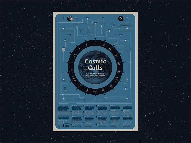
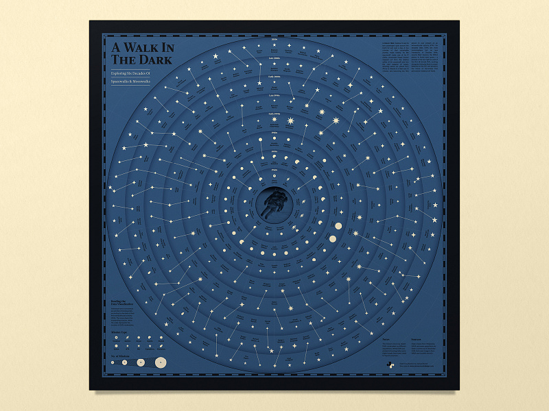
Data visualization design is challenging. Whether you’re working with complex data or large data sets, the design process can often feel overwhelming and messy. To help improve your process, we asked data viz design expert James Round to share his top tips for a smoother workflow. Check them out below and get inspired by beautiful examples of his infographic designs.
To learn more about James and his work, don’t forget to read our exclusive interview with him where he shares further into his process, storytelling tips, and data viz tool recommendations!
1. Keep things clean and tidy
A complex visualization is going to mean a complex file, so it’s essential to practice good housekeeping in your artwork. Place every part of the visualization on separate, clearly named layers. Never delete anything. Instead, make duplicates of any elements you start making big changes to and simply hide the layers you don’t end up using—you never know when you might need something again.
Make good use of text styles, global colors, and symbols so you can quickly amend and update the design. Frequently save new versions of the file in case things really start to fall apart. Doing this will allow you to quickly adapt and develop your design as you go, and focus on the best bit; making it look great.
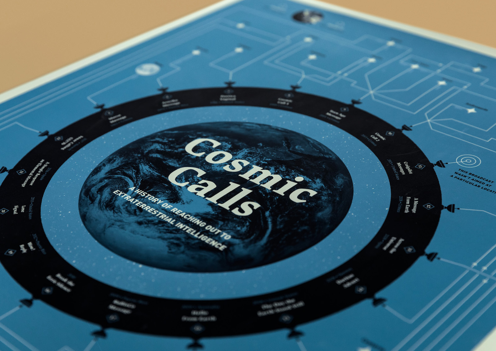
Cosmic Calls Data Visualization by James Round.
2. Use the grid
Grids form an important part of my process in any work, but for data visualization where clarity is key, grids are essential. These are the three different types of grids that help me create clean layouts:
- The document grid: Allows me to snap everything into place and ensure the structure of the data visualization is pixel-perfect
- A 12 column grid: Helps me to build an attractive overall composition
- A baseline grid: I’ll sometimes flow the artwork into InDesign and work with an additional baseline grid if there’s a lot of accompanying text.
3. Don’t be afraid to go back to the drawing board
As with any project, sometimes everything just falls into place and other times it can feel like a bit of an uphill struggle. I’ll often find that with my data viz projects, I have to work through a few concepts before I find the one that works, and this can feel frustrating if you’ve already put a lot of work in. It’s worth it in the end though.
For this project showing the history of spacewalks, I knew I wanted it to look like a constellation chart, but it took a couple of months of bouncing the idea around my head, and three different attempts before I figured out how to structure it in a way that looked good and was also easy to understand.
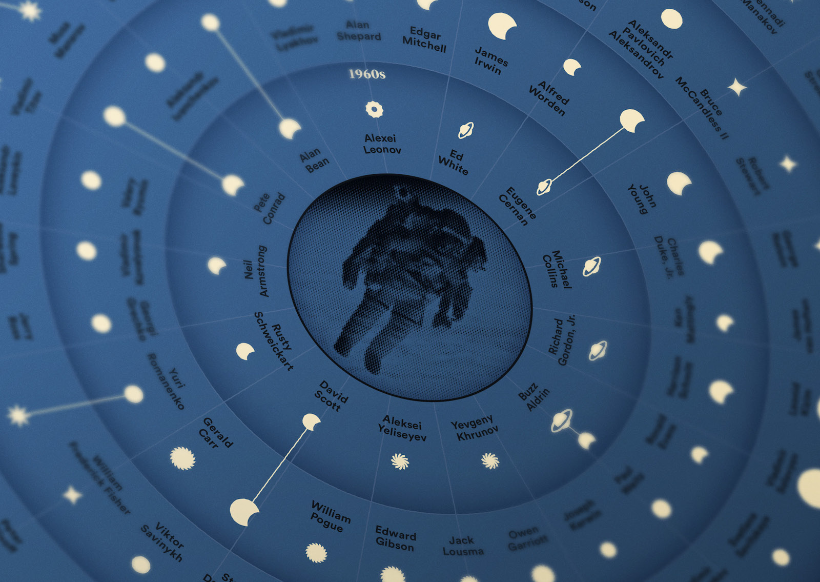
Spacewalk Data Visualization by James Round.
Bonus Tip: Learn to code
This final tip is pretty hypocritical because I can’t code (yet!). However, when I look around at the best work in the field, I can see how powerful of a tool coding can be in the creation of beautiful data-driven work. It can allow you to tackle projects that would otherwise be too complicated, help you explore data in new ways, automate parts of the design process, and add interactivity to give new depths to your work.
There are various coding languages that work well for data visualization, including R, the JavaScript library d3.js and Python. I started learning R recently—it’s a little bit outside of my comfort zone, but I’m excited to see where it allows me to take my work! ■
Want to keep up with James? Find him on Dribbble and at jamesrounddesign.com.
More Data Viz Resources:
- How to use data visualization to tell a compelling story
- When science meets design: Data visualization for outer space
Find more Process stories on our blog Courtside. Have a suggestion? Contact stories@dribbble.com.
