Ready for a musical dose of design inspiration? Get to know the talented graphic designer and musician Brent McCormick to see why his work really strikes a chord with us—(no pun intended).

Hi! I’m Brent. Richmond, Virginia is my home. John is my favorite Beatle. I often eat so much pasta I feel uncomfortable. I’ve been a designer for six or seven years now, since getting out of school—although I’ve only recently started running my own studio full time.


How did you get started in design?
From an early age, I was fascinated by logos. To me, It was cool that there were these symbols that existed and stood for things. It was cool that there was a thing on Batman’s chest that meant “Batman.” I remember being in the car and telling my mom “I can read!” when I actually couldn’t yet. I’d say, “There’s McDonalds! There’s Target!” I wasn’t able to read the letters, but I could understand the symbols as they passed by.

What project(s) are you currently working on?
I’m working on a logo for my friend Liam who is a musician in Massachusetts and some gig posters for concerts here in Richmond. I’ve also been designing some graphics for a Theatre company in the Shenandoah Valley for their upcoming season.
What else are you passionate about outside design? How does it influence your work?
Music is my other big thing. Nothing makes me feel alive like listening to a great album. I’ve been moved to tears listening to Nebraska by Bruce Springsteen. On sleepy days, Robyn is just as good as coffee for keeping me awake, focused, and productive.
I also play and write music—I’m in a band called The Wimps. Most of my friends here in Richmond are musicians too, so I find myself going to shows, playing shows, and being a part of that community.
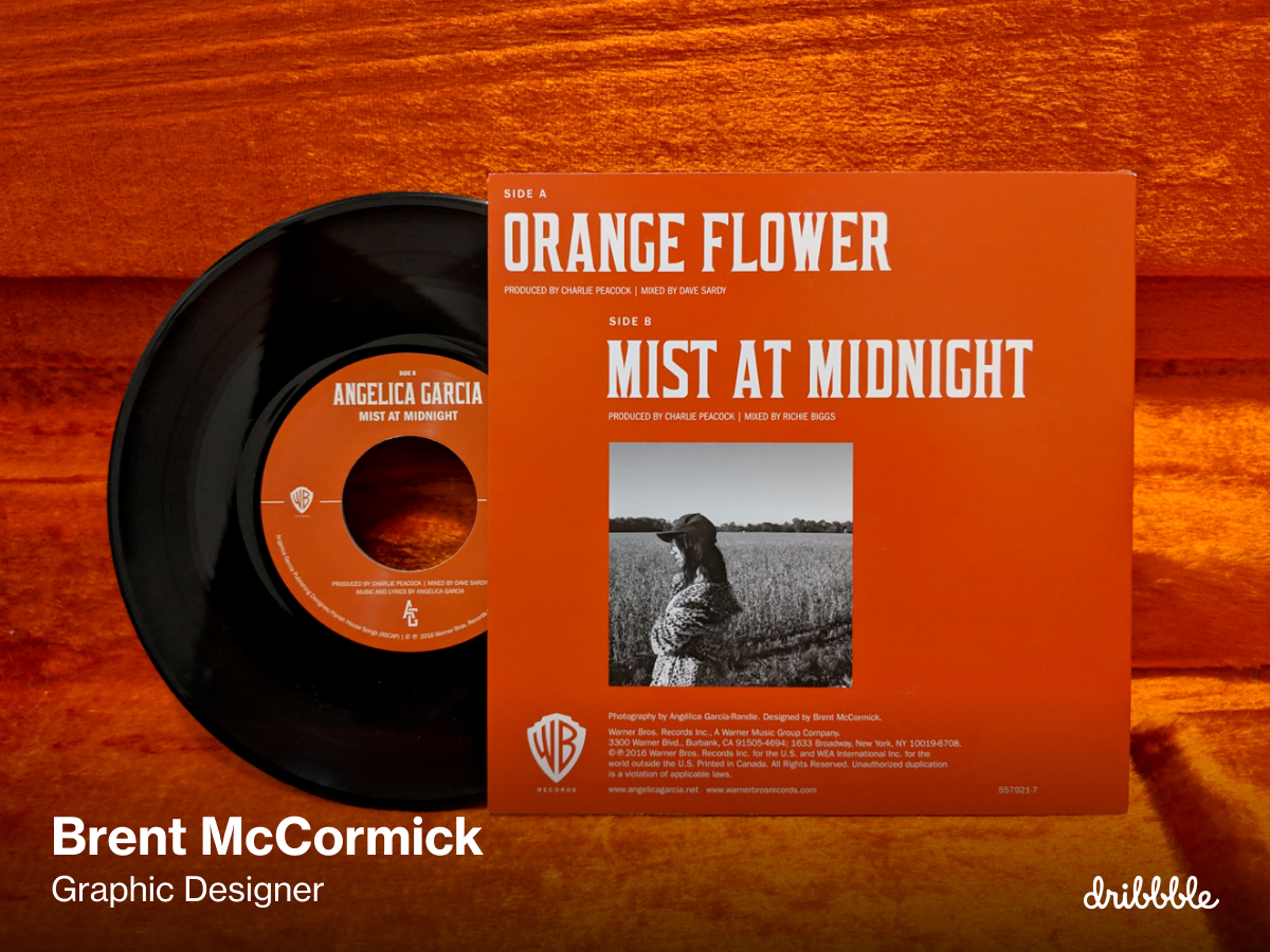
The bulk of my design projects are album art, gig posters, band logos, and t-shirt designs. Those projects are so fun because they’re about translating an auditory experience into a visual one. It’s my favorite kind of work to do, and my hope is to grow my studio doing more of it.


What’s your favorite piece of advice you’ve received as a creative? Why does it resonate with you?
“Keep moving.”
My professor Sandy Wheeler told me that once. It’s not the most revolutionary concept, but I’ve found it incredibly useful.
When you’re in the middle of a project and one aspect of it isn’t coming together, jump to another. If your type arrangement isn’t working out, take a look at color. Don’t dwell on anything for too long, especially if that thing is creating a feeling of friction.
Keep moving can also mean to actually move your body through space. Sometimes a walk around the block is the most productive thing you can do. Throughout the day, find ways to get out of your head by getting into your body.
Shout-out: Who’s another Dribbble designer you admire?
I love Ricardo Santos’ work. I don’t know the guy personally, but he definitely feels like a kindred spirit. (That’s what’s so cool about Dribbble! You get to discover people and work you never would have otherwise.) He has a great eye for color and texture, and his style feels distinct and ownable. Whenever I see his work in my feed I go, “Mmmm.” It’s visual umami.

Do you have any events, speaking gigs, merch, workshops, classes, or products you’d like to shout-out?
Nope, not really! I want to get a little online shop up and sell some prints—hopefully, that’ll happen in the coming year. I suppose you can buy my band’s new album if you need some studio music haha! If you’re ever in Richmond, come to a show! Say hi.
Want to keep up with Brent? Find him on Dribbble, Instagram, and at brentmccormick.com.
Find more Interviews stories on our blog Courtside. Have a suggestion? Contact stories@dribbble.com.


