
The reds and whites of Ezra Jack Keats’ snowy day. Robert McCloskey’s ducks, sketched in charcoal and waddling their way to Boston Common. Beatrix Potter’s watercolored scamp, Peter Rabbit. Maurice Sendak’s surreal wild things and Mickey who travels to the Night Kitchen, who dives into batter and speaks in cartoon bubbles, his words handlettered by Diana Blair.
Pictures in children’s books not only illustrate the simple narrative facts, but also set tone and deepen character. Images allow early readers to grasp plot points even if they’re struggling to decipher words, and expand simple storylines into entire worlds. Beautiful illustrations, the most clever and creative and different and lovely, stay with readers for years, long after they’ve crossed into adulthood.


 </a></li>
Tad Carpenter, Michael B. Myers Jr., after Maurice Sendak, Gaia Bordicchia
Dribbble’s full of talented illustrators, creating the images that will be remembered by today’s children in decades to come. We spoke with a few of them — Gaia Bordicchi, Tad Carpenter, Jeremy Holmes, and Glenn Thomas/The Fox and King — about the particular challenges and joys of illustrating books for children and teenagers. Today, we learn about those challenges and talk with Tad about writing and illustrating his books Sad Santa and Ninja, Ninja, Never Stop.
Tomorrow, Gaia talks about transforming a classic children’s story into a new book. Jeremy describes the two-years’ work that went into illustrating Poem Mobiles, written by poets J. Patrick Lewis and Douglas Florian. Glenn discusses translating an author’s word-centric vision into imagery.

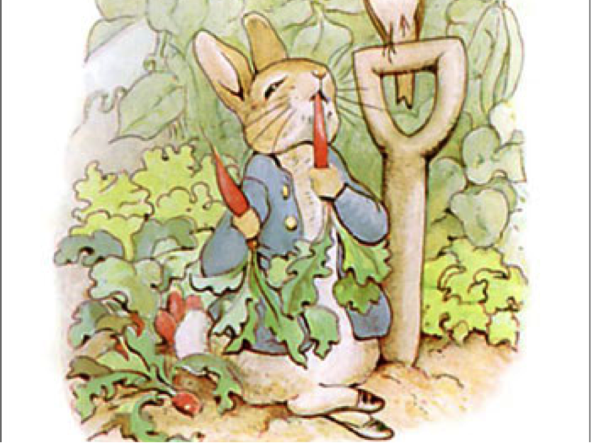

Glenn Thomas, Beatrix Potter (image in the public domain), Jeremy Holmes
The Challenges
Character traits are invisible. Concepts are invisible, too.
The trick for a designer, whether creating an iPhone icon or a storybook character, is to translate abstract into image in a way that users easily understand. “Visually representing a character’s personality is an art,” Jeremy told Dribbble. “What shape says confident? What color defines smart?”
Gaia said the mood and themes of a story also factor into how characters are portrayed. A reader must be able to intuit, from the illustrations and without much thought, the tenor of the narrative. “Some [stories] deal with difficult subjects like fears or losses and in this case, it is important that the characters are easily accessible. The feeling of empathy must be there and not forced, no matter what the style of illustration is.”
“What shape says confident? What color defines smart?”
The rules of the book’s universe are not always the rules of our universe.
This can be freeing, but first you must let go. Jeremy used his work on the young adult series The Templeton Twins to explain.
“A few summers ago I had an intern, Dan Lehman, a gifted young illustrator making his way through undergrad. At the time I had the Templeton Twins series in-house and needed some assistance with inventing random Rube Goldberg-like inventions. The inventions Dan brought back were well-thought out and drafted. Everything made sense.
“And therein lied the problem. With children’s books, the theory of relativity need not exist. The laws of existence lie literally in the artist’s mind and hands.” Jeremy told Dan to think like a kid. “Create non-sense that makes sense. Not easily done.”
The cover speaks volumes.
Flip the old adage and you arrive at something closer to truth, Glenn said. “You should judge a book by its cover. It should be an extension of the stories and characters contained within and a gateway into the book itself.
“You should judge a book by its cover.”
“I see the cover as the launching point for the reader’s imagination to take over.” The trick? Showing enough, but not too much. “I try to convey the mood of the book and visually set the scene but leave enough room for the reader to fill in the rest.””
So many people!
An illustrator must create not only their own vision for the narrative, but also take into account the author and publishing house staff. “There are so many different people involved in the process — the art director and the editors. Sometimes the author, too,” said Gaia. “I start from my own idea of the story and the characters, but before the book is all roughed out I will adjust my vision based on the directions I receive.” Gaia particularly enjoys working with authors, as she feels their character insights help her add detail.
Ideally, the collaboration leads to synergy between words and image; a fully realized book.
So little space!
Tad has illustrated books for other writers, and has also written his own books. He says one of the most difficult aspects of picture books, in particular, is the short format. “Keeping the story simple, clean and to the point is always a challenge.”
The Books: Part I
Sad Santa
Designer and illustrator Tad Carpenter runs Kansas City design and branding studio Carpenter Collective with his wife, designer Jessica Carpenter. After the couple spent a year planning their wedding, and after the wedding day came and went, Tad felt a little sad. “It was all over so quickly and I thought to myself, ‘Wow, this must be what Santa feels like every year. He spends all year planning for a big day and POOF, just like that, it is over.’”
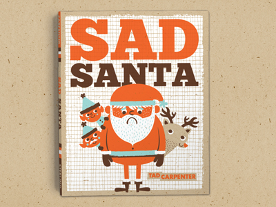
Empathy for St. Nick turned into “Sad Santa,” the first book Tad wrote and illustrated to be accepted by a publisher. When designing and illustrating the book, Tad wanted to not only reflect Christmas, but also the same vibe as the screenprinted goods he sells in his shop. How to create that small-batch feel in a mass-produced book? Fake it!
“I found the right paper, scanned it in, and designed each page on top of the fake paper. I pulled the speckles in the paper out and placed those on my vector artwork to give the appearance the entire book was printed on this nice craft paper when it was actually printed on white paper.”
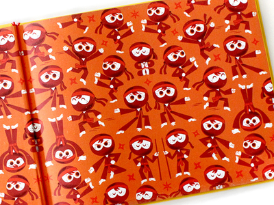
Ninja, Ninja, Never Stop
Santa = sad. Ninja = fun! “I got to draw ninjas jumping, ninjas running, ninjas crouching, ninjas kicking and chopping,” Tad said. Best part? End pages. “I got to show all those fun ninja poses on these fun end pages.”
Find Tad at Dribbble, on Twitter, and at tadcarpenter.com.
Read Part II: Gaia takes on Goldilocks, Jeremy tackles a two-year project, and Glenn re-imagines Victorian London.
Find more Process stories on our blog Courtside. Have a suggestion? Contact stories@dribbble.com.


