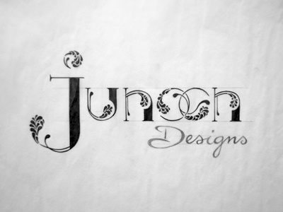
Junoon Designs_sketch

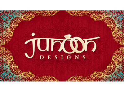
I have been contemplating changing my logo to adapt to my current style and modernise it a bit, also to break away from the rings I have in the previous one since my brand is not only about wedding invitations. Not sure if I should change it or what vision I have for it yet.
I want to have something modern with a touch of both eastern and western influence.
I've just been playing around with this idea, instead of the small tear drops going on, I know they will be too complex to even see when scaled down (or at a smaller scale it might look like a solid) I would just fill that area with a solid colour and use this one as an alternate. The lines may also be too thin so thinking to thicken them a bit.
Also wondering how the word 'Designs' fit in that's why I just filled it in with pencil or if I should use a serif font.
Think I will try a few more ideas.