Widgets design for a Payoneer FinTech platform | Lazarev.


Hey there, Dribbble crew!
Guess who's back with another dope redesign app concept for Payoneer 💵 That's right, it's us again. And we're hyped to share with you a revamped Fintech UI design as well as an enhanced user experience of the platform.
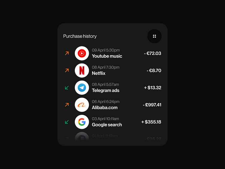
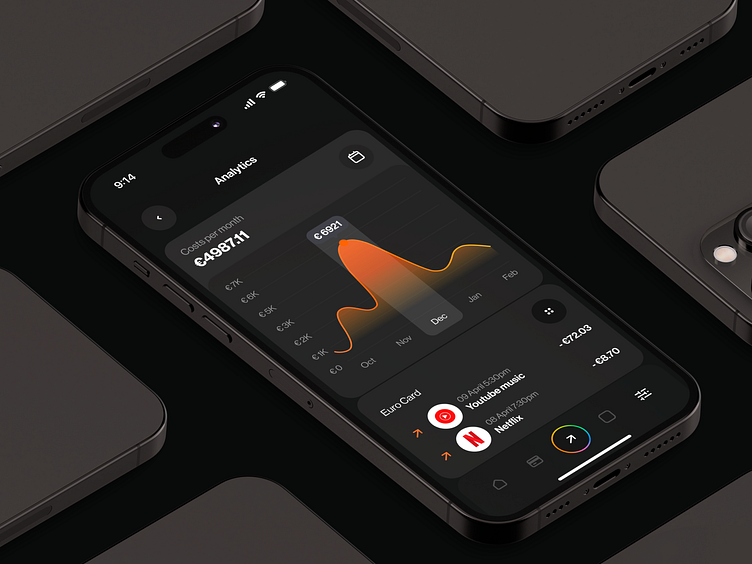
While we wait for the Payoneer guys to hit us up and make moves on this vision, we're bringing you some lit app widgets that enable users to crunch financial data like a boss.
We're all about making complex info easy to comprehend. To accomplish that, we developed widgets that's both intuitive and striking, incorporating bright colors, bold typography, sick gradients, and a dark theme.
We believe that clear visualizations help users make sense of harsh financial data, leading to better decision-making and more informed financial choices.
What do you think of our widgets design? We're always down to hear your thoughts and suggestions. And if you're looking for more design inspo, be sure to check us out on social:
Website | Facebook | Behance | Linkedin | Instagram | Twitter