


Sonos App Exploration

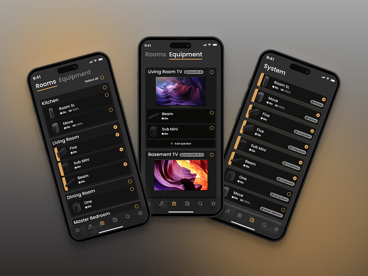
I'm a big fan of Sonos' products and have a few of their speakers in our house but I've come to learn that the ux of their app could be improved. For instance, when I want to try and temporarily add a speaker to our TV's setup it's a very clunky and confusing flow and doesn't work most of the time.
At first I was thinking "What am I not getting here" but I recently read Don Norman's excellent book "The Design of Everday Things" which I highly recommend to any designer. Anyways, in the book he mentions that in most cases when someone can't figure out how to use a product it's because the design has failed. People often blame themselves when they can't figure out how to use something when in fact the design of the product is the one to blame. So in this scenario I've realized I'm not the one to blame.
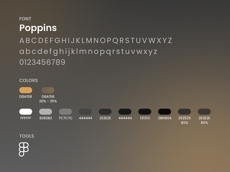
Sonos' current app is also very minimalistic and uses color very sparingly which I appreciate but I tinkered with adding more touches of the their 'Sonos Gold' color throughout my design.
I don't know if my solution is any better but I just wanted to give it a crack and was just an exploratory exercise.
Let me know what ya'll think!