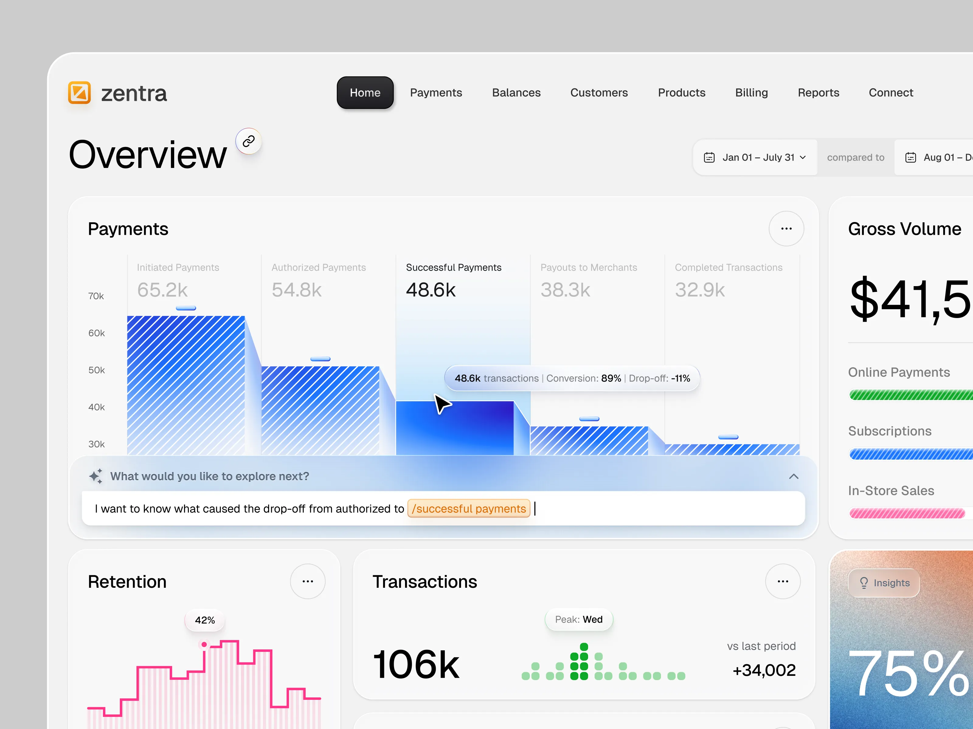
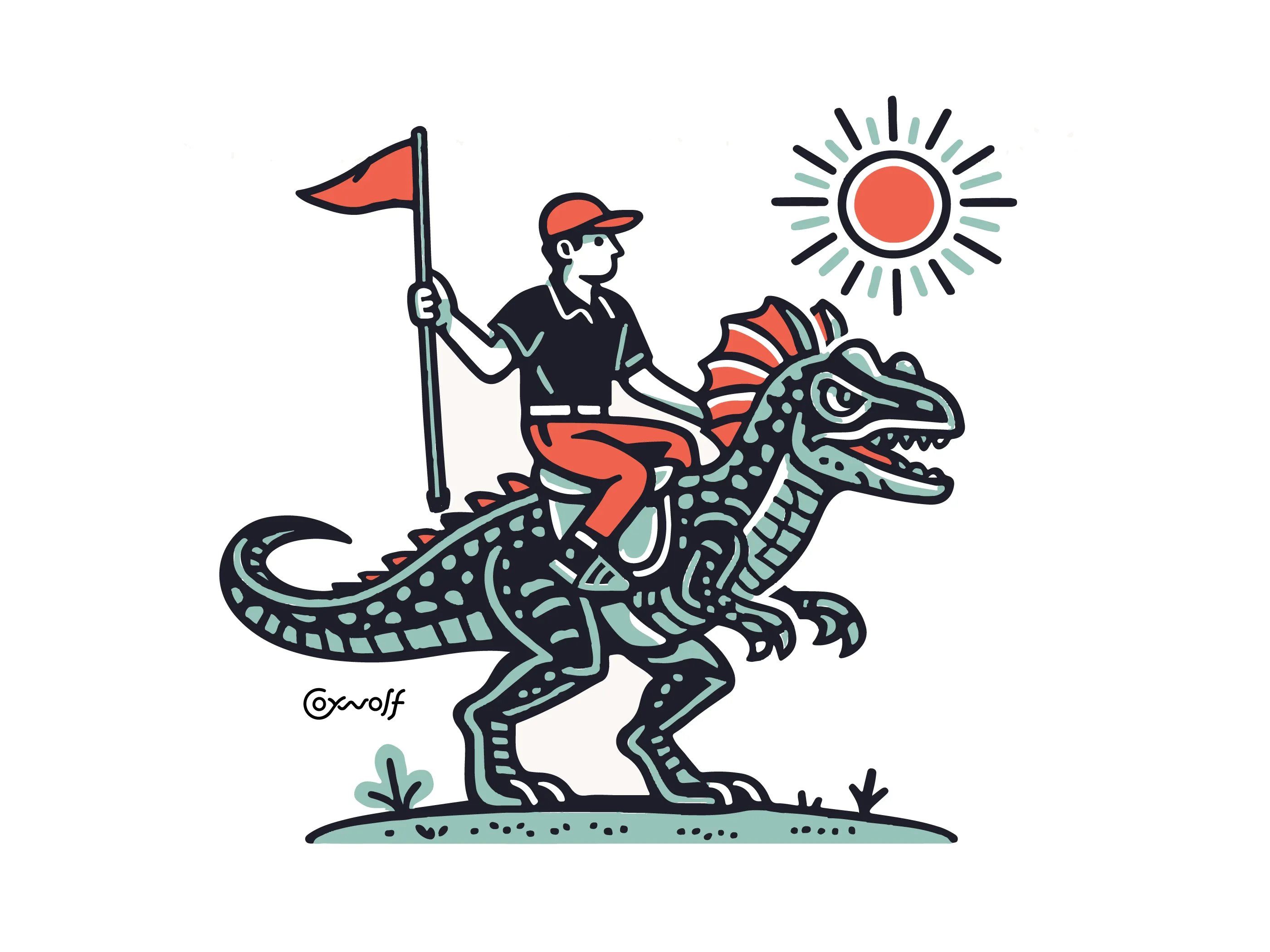
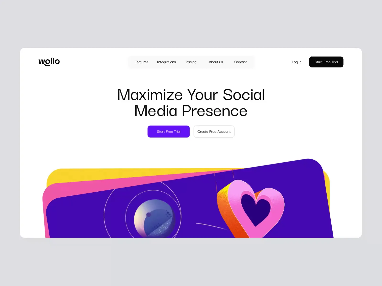
Your Black Friday offer is settled. Now decide what shoppers should notice first: the product, the savings, or why they should choose your brand. These 12 Black Friday ad examples and supporting campaign designs show how to make that choice, with lessons you can use in your own creative brief. The selection covers product promotions, …
Your Black Friday offer is settled. Now decide what shoppers should notice first: the product, the savings, or why they should choose your brand. These 12 Black Friday ad examples and supporting campaign designs show how to make that choice, with lessons you can use in your own creative brief.
The selection covers product promotions, sale graphics, illustrations, emails, and landing pages. Use it alongside the asset checklist below to plan the full campaign. If that list is more than your team can produce in time, Dribbble Studio shortlists vetted designers for your brief, lets you choose who does the work, and manages delivery.
Product-led Black Friday promotions
Lead with the merchandise when its appearance helps explain the purchase. Give the product a recognizable shape and useful detail, then decide how prominently the offer needs to sit beside it.
1. A product-and-offer layout that carries into Cyber Monday

Black Propeller gives each exercise machine its own space between the headline and offer strip. Matching layouts connect Black Friday and Cyber Monday, while the background color marks the change. For equipment promotions, preserve the product silhouette and keep ‘up to’ attached to the saving when adapting the campaign.
2. Fabric detail does the selling in a restrained fashion hero

SOLAR Digital makes the hoodie’s folds and texture the focal point, with a pale background that keeps the garment distinct. The sale label stays secondary to the merchandise. Use this approach when the product needs to justify attention, but keep essential offer wording outside the area the garment overlaps.
3. Product-led app offers built for different markets

ROY.L groups eufySecurity devices with explicit savings in German and English app promotions. Product cutouts identify the discounted range, while the shopping-bag variants separate the offer and button. For multi-market electronics campaigns, review translated copy, local discounts, and product eligibility together in the actual layout.
Typography-led offers and sale announcements
Use lettering to lead when the deal or event is the main message. Expressive type still needs a reading order: separate the sale name, offer, and action instead of making every line compete.
4. A dimensional discount with a separate, readable code

Ruslanlatypov turns the discount into an inflated-looking form that fills the lime-green page. The orange coupon ticket creates a separate focus for the code and instructions. The lesson is to separate expressive offer artwork from transaction details: let the number attract attention, but keep the redemption information plain and legible.
5. A sale headline that holds its hierarchy across paid formats

Kyle Wedemeyer stacks Apollo’s sale headline in bold white type beside the rider and scooter, then isolates the savings in a bordered box. Feed and Story versions retain that order. For consumer brands running several paid formats, preserve the headline, offer qualifier, and product relationship while rearranging the surrounding layout.
6. A bundle headline followed by evidence of what is included

Ibnu Mas’ud gives ‘Bundle’ its own purple label, then uses product previews below to explain the package. The headline attracts attention; the contents support the buying decision. For a multi-product offer, carry the same bundle name into the ad and landing page, and show exactly which items the price covers.
Illustrated Black Friday campaigns
Illustration earns its space when it connects the promotion to the product or brand. Choose a visual idea you can carry across the campaign, with room for the offer wherever it needs to appear.
7. A shopper gives the sale graphic a point of view

The shopper’s phone and receipt turn tubik.arts’ banner into a scene, while oversized cream lettering keeps the event name dominant. The illustration suits a fashion campaign with an expressive identity. Preserve that character across formats, but give the specific offer a clear position when the announcement becomes a sales ad.
8. The campaign artwork demonstrates the creative product

Emir Ayouni’s textured character artwork demonstrates the kind of graphic treatment that buyers of brushes and texture packs might create. Large orange lettering keeps the sale visible around the figure. For creative products, use the campaign as a sample of the aesthetic, while keeping eligibility and redemption details outside the illustration.
9. Software functions become an illustrated campaign world

Jhonny Núñez combines people with document symbols and file labels, giving an abstract software product a visible subject. Bright shapes stay distinct against black. This is campaign artwork rather than a complete offer ad: commission a simpler crop with space for the headline and price when adapting this approach to a small placement.
Black Friday email and storefront designs
The message should remain recognizable after someone opens the email or follows the ad. These examples show how to carry the promotion into places where readers can inspect the offer in more detail.
10. A food offer keeps the brand palette instead of adopting black

Hardik D’s Sweetgreen concept uses greens and food imagery to keep the promotion connected to the brand. Outlined discount lettering gives the photograph room, while a filled button separates the action. For restaurant email, retain that hierarchy, but keep eligibility easy to find and the sale action distinct from a loyalty-program invitation.
11. Early access leads directly to the plan being promoted

Sherif’s template follows its pre-sale headline with a plan card, putting the price, features, and upgrade button. Light and dark versions preserve the same reading order. For an early-access email, borrow that direct route to the offer, but shorten the introductory copy so the buying information appears sooner.
12. A sale module sits alongside the permanent product message

Craftwork separates its permanent product proposition from a temporary Black Friday module. The colorful gem draws attention to the promotion while the catalog remains visible below. Use this arrangement when a sale sits within an established storefront, and make the offer module removable without rebuilding the rest of the page.
Every asset to produce for your Black Friday campaign
Build the production list from the channels you will actually use. Include the launch, any genuine offer changes, and the moment the sale ends. A finished hero image does not cover the versions your email, paid-media, and website teams need.
Campaign master and offer variants. Approve a wide and a tall composition with the product treatment, headline, discount, qualifying wording, and action. Prepare versions for early access, launch, and final reminders where those phases exist. Keep the layout editable so an offer change does not require rebuilding the artwork.
Paid social and display ads. List each feed image, carousel card, vertical ad, and booked display size. Include alternate products or messages that you plan to test. For video, specify the opening frame, product footage or animation, captions, end card, and static alternative. Treat a new message as a version, not just a resize.
Website and landing-page graphics. Prepare desktop and mobile heroes, the sale-page header, category tiles, and any promotional bar or signup panel in your plan. Match the advertised product and offer on the destination page. Include replacements for sold-out products and the end of the promotion.
Email and organic social. Commission email headers, product or bundle blocks, and the graphics needed for launch and reminder messages. Add organic feed posts, carousel cards, and Stories where you will use them. Keep text and buttons editable in the email template wherever practical instead of embedding the entire message in one image.
Additional channels and sale transitions. Add app banners, affiliate graphics, retail signage, or printed inserts only when those channels are in scope. Prepare a separate Cyber Monday set if that promotion is planned. Change the event name, code, end time, and destination together, then retire the expired versions.
Handover files. Request editable masters, final exports, approved copy, and the linked artwork needed for later changes. Label files by product or offer, channel, dimensions, language, campaign phase, and version. Keep the approved set separate from superseded artwork.
For example, an equipment retailer could extend Black Propeller’s product-and-offer layout into individual feed ads, a carousel comparing machines, an email product block, and a sale-page hero. Keep the offer strip recognizable, but change the product scale and reading order for each format. These are suggested adaptations, not additional work shown in the shot.
What to include in your Black Friday design brief
A useful reference comes with a reason. Specify the decision you want to borrow, such as a visible product silhouette, a separate offer panel, or a bundle breakdown. Give the designer the approved commercial message before asking them to design around it.
- Goal and audience. Name the action the creative should prompt and who will see it. A first-time visitor needs to understand the product; an existing customer may need the new offer explained. Identify the landing page or purchase destination.
- Offer and timing. Supply the approved headline, discount or bundle terms, eligible products, exclusions, code, and start and end times with time zones. Keep qualifiers such as ‘up to’ with the relevant number. Mark unconfirmed offers or stock details before production starts.
- Deliverables and specifications. List each placement, exact dimensions or aspect ratio, file type, file-size limit, and language version. Specify motion length and static alternatives. Get final technical requirements from the publishing team and the relevant platform documentation.
- Brand assets and references. Provide logos, typefaces, colors, product photography, and packaging artwork. Explain which parts of the references matter and which brand details cannot change. Identify any new photography, illustration, or animation the assignment requires.
- Reviews and handover. Separate concept approval, adaptation review, final delivery, and launch. Name the person who consolidates feedback and the person who approves the offer. Agree on revision rounds, editable files, and the replacement visuals required when the sale ends.
Brief starter: Create a Black Friday campaign for our home-fitness range. Use a clear product cutout and a separate offer strip, with the same hierarchy across feed, vertical, email, and website placements. We will provide approved products, discount wording, dates, and brand assets. Prepare launch and final-reminder versions, plus a sale-ended replacement. The delivery sheet will list dimensions, languages, review dates, and required editable files.
Black Friday Ad Examples FAQs
Do Black Friday ads have to use black?
No. Use your brand palette and give the offer enough contrast to remain readable. A lighter or more colorful treatment can still identify the event clearly through the headline. Choose the background around the product and text rather than the event’s name.
Should the headline lead with a percentage or an amount saved?
Use the expression that makes the offer easiest to understand for the products shown. A fixed saving can be clearer for one item, while a percentage can describe a broader promotion. Choose one lead message and keep the original price, exclusions, and qualifying wording consistent across the ad and destination.
Can a portfolio concept count as an ad example?
A concept can demonstrate a useful composition or message hierarchy, but it cannot prove campaign performance. Identify it as a concept and judge the visible decisions against your own brief. A polished mockup provides no evidence of sales, conversions, or audience response.
How should you compare two Black Friday creative directions?
Put the same approved offer and product into the same placements before comparing them. Check whether readers can identify what is on sale, understand the offer, and find the action. Visual review can guide a design choice; performance claims require results from an actual campaign test.
Get every Black Friday asset made by designers you choose
Bring this brief and your asset list to Dribbble Studio. Within 3 business days, you get a shortlist of 7–8 vetted designers from Dribbble’s 100K+ community, and you pick who does the work. One account manager runs every format, from feed ads and HTML5 banners to email headers and Cyber Monday versions. If a deadline slips, a named backup steps in at no extra cost. Book a call with Dribbble Studio.