Get a brief history of the hamburger menu. Explore hamburger menu pros and cons and learn when to use them in your designs.

You’ve seen it, you likely use it, though you may not know its name. Those three dashed lines that adorn many apps and websites and often hide extra options and additional menu items make up the hamburger menu. Despite its friendly name and simplistic nature, this controversial icon sits at the center of many design debates.
In this guide, we’ll take a look at why that is. We’ll also go over when you should and shouldn’t use one by looking at the pros and cons of the hamburger menu.
What is a hamburger menu?
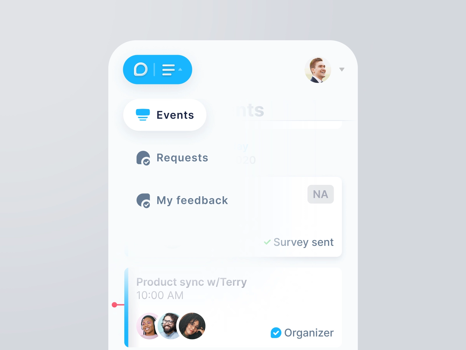
A hamburger menu is typically three stacked lines that indicate a hidden menu. When the lines are clicked or tapped on, a menu slides into view or a drawer appears. The menu holds a list of navigation items or other elements that users can access.
It’s not the worst design pattern ever, but there are a lot of controversies surrounding it. The most probable reason is that the hamburger menu has gained immense popularity over the last decade or so thanks to the explosive popularity of smartphones. It’s a decent design pattern for hiding complex menus on small screens.
But like most design elements that get popular fast, it started being overused. People started slapping hamburgers in places where other design choices would have been better. And that led to stark divisions and strong opinions on the pattern throughout the design community.
But how’d this contentious interaction with a culinary name come about in the first place?

Where did the hamburger menu come from?
A history of the hamburger menu
It’s actually been around for decades. The hamburger menu was created by interaction designer Norm Cox as an interface element for a range of personal computers designed by Xerox, way back in 1981. These are the same computers that famously inspired Steve Jobs to integrate GUIs and a mouse into the Macintosh computer.
Norm Cox designed the interaction to serve the purpose it does nowadays: The three lines communicate to a user that a list of items hides within. But it wasn’t very well received in its time, and the design slid into obscurity for nearly three decades.
The resurgence of the hamburger menu
In 2007, things began to change. Apple once again pioneered digital interfaces with the release of the iPhone, and other companies followed suit. By 2010, it was clear that touchscreen smartphones would be the new form of mainstream computing.
There was a problem, though. Websites and desktop applications were complicated, with a multitude of menus and navigation options. They were designed with much larger screens in mind. A small handheld device, even if it was all screen, wasn’t well suited to the complexities of modern websites and software. But if you could somehow hide menus and other list items behind a recognizable button, you could save precious screen real estate while maintaining complexity.
And the hamburger awoke from its long slumber to cement its place in interaction design history. Turns out, it wasn’t such a bad design — it was just ahead of its time.
Hamburger menu examples
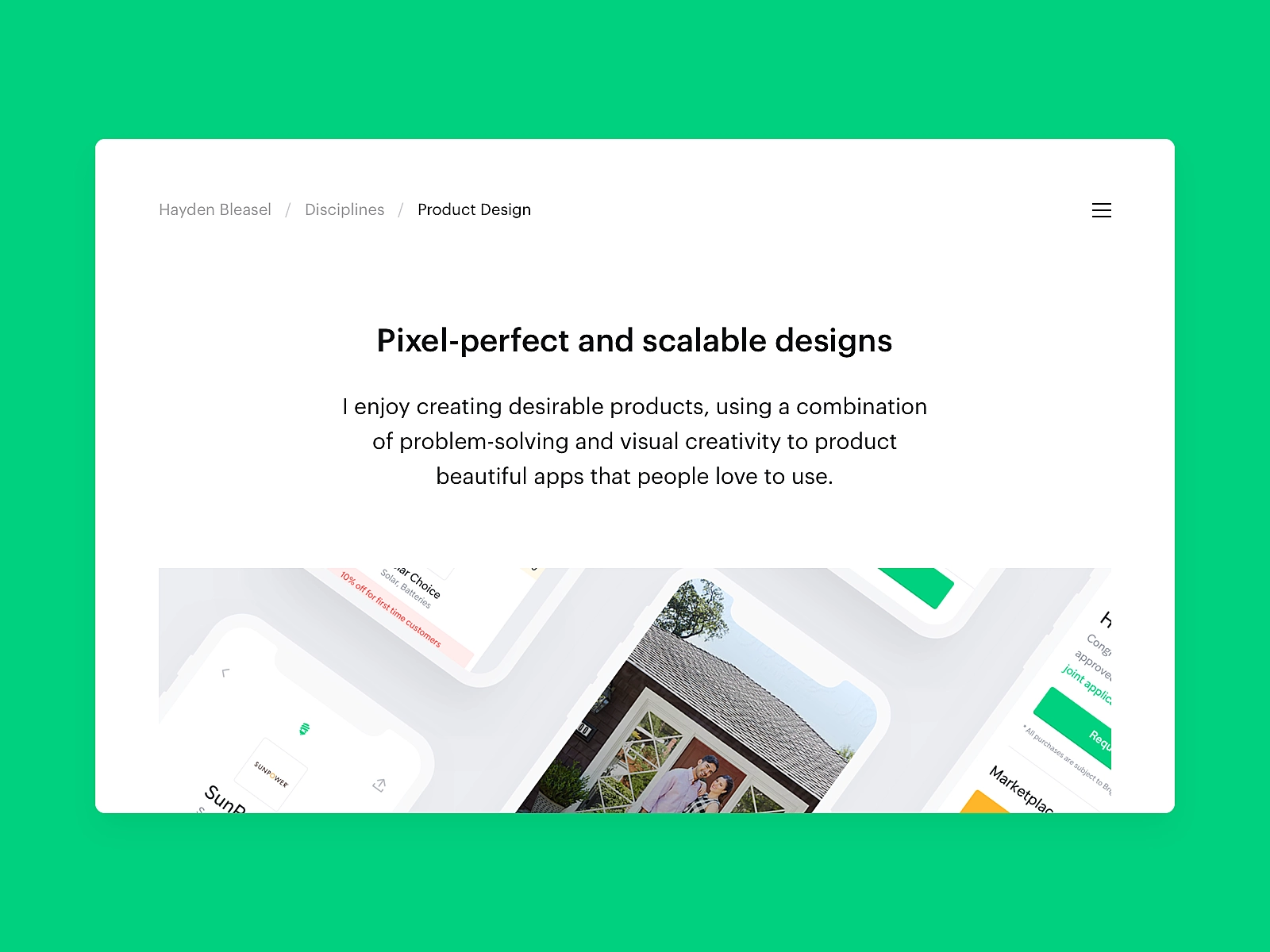
Despite design principles having evolved to target smaller screens, the hamburger has spread to nearly every kind and size of digital device. Nowadays, you’ll find the design pattern in various incarnations on everything from mobile websites to desktop software. It’s a common reference pattern in many UI kits and design libraries. And it’s even common on smart TVs and other connected devices.
To get an idea about where it’s been and where it’s going, take a look at these creative implementations of the hamburger menu:

When to use the hamburger icon
Despite it now being commonplace, the hamburger menu is a pattern with a lot of contention in the design community. For designers, it’s love or hate — and most of them aren’t shy about sharing their thoughts on the matter. As with most controversies, there are valid arguments on both sides.
The bottom line of this three-lined icon is that you should understand the pros and cons of using it. That way, you can make informed decisions about when, how and whether to use it in your own designs.
Pros of Hamburger Menus
Here are some of the benefits of using a hamburger menu.
- It simplifies screen layouts. The main benefit of the hamburger is that it enables complexity without creating clutter. Designers understand that user attention isn’t a commodity. Placing navigation behind a clickable button enables easy access to other screens and enables designers to do more with the limited space they have. This way, they can keep user attention focused on primary goals.
- It provides direct access to navigation. Without direct access to navigation on smaller screens, users have to navigate through content in the order it’s designed. That can be frustrating when users want to to peruse a site and find the pages that interest them most. Hamburger menus enable this behavior by giving users direct access to navigation.
- It’s even better for secondary access.The design of the hamburger menu really shines when it’s used to access secondary elements. Some of the most popular mobile apps use a bottom- or top-bar navigation for the primary elements while reserving one icon for a hamburger menu. Tapping the tasty icon reveals secondary navigation and other elements that usually aren’t accessed on a regular basis. But they’re still only a tap away. The Facebook mobile app is a good example of this interaction.
- It’s easy to recognize. Not everyone knows what a “hamburger icon” is, but by now, everyone knows exactly what clicking or tapping on three little lines does. It’s as ubiquitous as the (arguably outdated) save icon. If you’re designing for a small screen and need a way to hide a navigation list, you shouldn’t have any worries about user confusion with a hamburger menu.
Cons of Hamburger Menus
The hamburger menu design isn’t without its downsides, of course. Even Google, which makes liberal use of the pattern in its vast library of apps, ended up removing it from its Play Store.
Here are some likely reasons they did so:
- It makes menus less discoverable. Even though hamburger icons are generally well-recognized, they still prevent users from discovering navigation items and other elements. When users don’t see the important aspects of an app or website, they’re far less likely to engage with them. An element or link that might have moved them through the product is hidden behind a tap, and that could result in a lost customer.
- It makes inner pages less relevant. The biggest point of contention with the hamburger menu is that it diminishes the importance of the items within it. Rightly or wrongly, when a user sees a hamburger menu, they assume the options it hides aren’t really necessary to the overall experience. This is why they work better as secondary navigation: Users only tap on them when they’re looking for something specific.
- It has lower engagement with users. If a user isn’t immediately engaged by what they see on the main screen, they’re far less likely to click or tap a hamburger icon. Doing so entails using the menu, scanning for an item that interests them, and clicking or tapping a second time to get to where they want to go. A direct link or icon with clear intent requires far less cognitive load than a hamburger icon. Even YouTube recognized this fast and modified its design accordingly.
Hamburger menu alternatives
If not a hamburger menu, then what? There are some clever alternatives to the triple-dashed icon, especially if you’re designing for mobile screens. Let’s take a look at a few of them.
Floating menu
Floating a menu icon alleviates some of the concerns with the design pattern. For starters, it’s much more prominent. Most users will see it as a primary feature of the product rather than secondary navigation. Keep in mind, though, you probably won’t want to dump every possible navigation option in the menu.
Pros
- Signals to the user that it’s more important
- Can save screen real estate
- Depending on the placement, is easier to reach on mobile devices
Cons
- Still less discoverable than direct navigation
- Menu items are still hidden behind a tap or click
Check out the floating menu example below by Maximillian Piras.
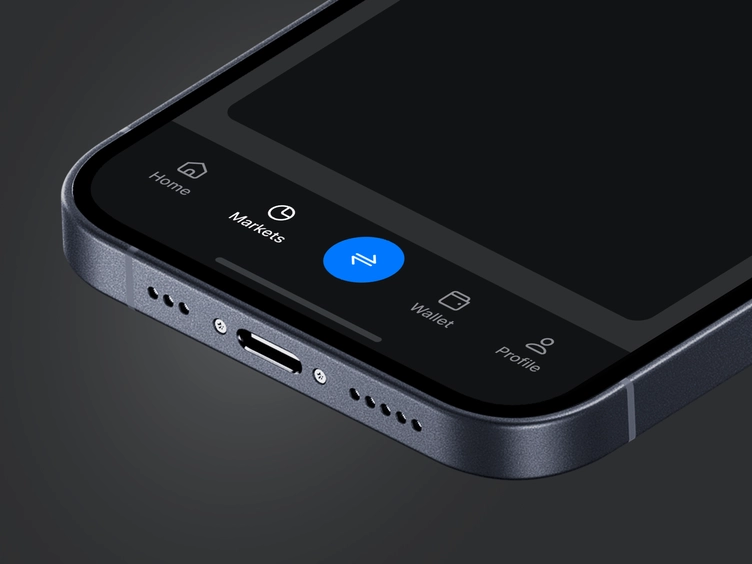
Bottom tabbed menu
Tabbed menus placed at the bottom of the screen are the go-to design paradigm for mobile apps. Just about every big player on the App Store and the Play Store implements some form of this navigation. It enables users to understand quickly what they’re looking at and what’s available to them. When it’s designed well, it increases engagement by encouraging users to discover the app’s features.
Pros
- Quick interpretation of features on the main screen
- Easy for users to track where they are
- Drives more engagement and feature discovery
- Full direct access to the most important features
Cons
- Can only use four or five options at most
- Requires extra design work and iconography so users can discern what the tabs are
Sliding top tab menu
Sliding tabs at the top are great alternatives when you need navigation that won’t fit in four or five buttons. Amazon’s mobile app uses them well, giving users easy, scannable access to different shopping categories. Another good example is YouTube, where you can slide through video categories on the main home screen.
Keep in mind, these are often better as secondary menus to complement a product’s main navigation. Since they’re placed at the top, they aren’t quite as accessible on mobile devices. And scrolling means they require a little more work on the user’s part.
Pros
- Can hold far more options than other menu designs
- Relatively direct access to navigation options
Cons
- Not as accessible on mobile devices
- Requires a little more effort and exploration from the user
Check out the sliding top tab menu example below by Zeynep Kurt.
Conclusion
For designers, creating intuitive and accessible navigation that encourages engagement is one of the most important decisions to make when designing an app or website. So it’s important to get it right. There are certainly times and places for the hamburger menu, but it shouldn’t be a given or go-to for every scenario. Like any other design pattern, it’s important to take the time to understand its pros and cons and use it accordingly.


