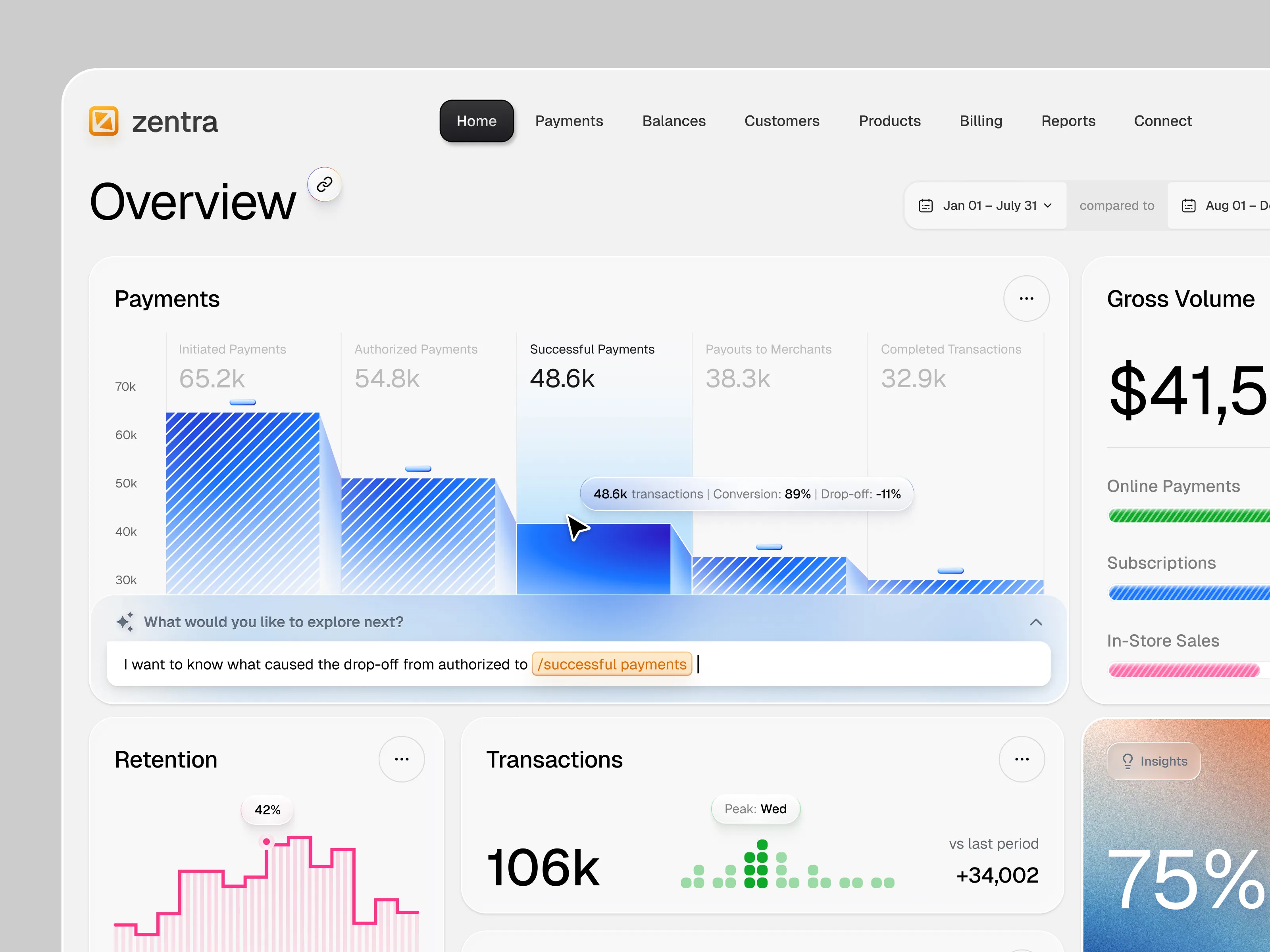
Responsive web design companies exist because one-size-fits-all websites are practically a joke in today’s day and age. If your site looks perfect on a desktop but turns into a jumbled mess on a phone or tablet, your users notice—and they don’t stick around for long. These teams don’t just rearrange elements; they craft fluid, adaptable designs that work seamlessly on every screen, from giant monitors to tiny smartphones.
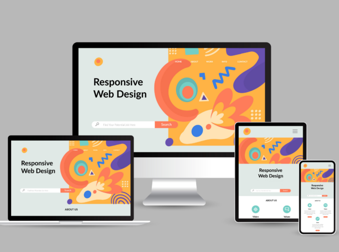
Responsive web design companies build websites that adapt across desktop, tablet, and mobile screens without losing usability, speed, or functionality. The strongest firms combine responsive layouts with mobile-first web design, performance optimization, accessibility, and cross-device testing.
We reviewed 10 responsive web design companies based on their relevant portfolio work, technical capabilities, testing practices, and experience with multi-device projects. Each profile explains what the company does, where it stands out, and what type of project it is best suited for.
Table of Contents
Best Responsive Web Design Companies at a Glance
Use this comparison to build a shortlist before reviewing the full profiles.
| Company | Best for | Key responsive strength |
|---|---|---|
| Americaneagle.com | Enterprise websites | Responsive builds across major CMS and commerce platforms |
| Spinutech | Conversion-focused marketing sites | Responsive design paired with research and CRO |
| Coalition Technologies | SEO-focused websites | Mobile UX, performance, and search optimization |
| 1Digital® Agency | eCommerce websites | Mobile-first storefronts across major eCommerce platforms |
| Promodex | Custom portals and connected platforms | Responsive design combined with custom development |
| Orbit Media Studios | Accessible WordPress websites | Accessibility, reusable components, and browser testing |
| UX 4Sight | Complex application interfaces | Research-led responsive UX |
| ScienceSoft | Existing apps that perform poorly on mobile | Responsive audits and UI modernization |
| NEWMEDIA.COM | Content-heavy websites | Responsive Drupal and WordPress development |
| Thrive | SMB lead-generation websites | Responsive WordPress design paired with mobile SEO |
How We Selected the Best Responsive Web Design Companies
The best responsive web design companies need to demonstrate more than general web design experience. We prioritized firms that show how they approach mobile layouts, testing, performance, accessibility, and complex responsive interfaces.
Our selection criteria included:
- Responsive-specific portfolio work that can be tested across screen sizes
- A clear mobile-first or multi-device design process
- Cross-device and cross-browser testing
- Website performance and page speed expertise
- Accessibility considerations during design and development
- Relevant case studies or documented client work
- Experience with websites of different sizes and technical requirements
1. Americaneagle.com
- Location: Des Plaines, IL
- Best for: Scalable enterprise websites and applications
- Notable clients: John Bean Technologies, Verra Mobility, Packers, NYC Department of Education
Americaneagle.com designs and develops responsive websites across platforms including Sitecore, Optimizely, WordPress, BigCommerce, and Shopify. Its platform-agnostic approach makes the company particularly relevant for enterprise projects where the CMS, commerce platform, or technical stack may already be established.
Designers and developers work together throughout the build, with browser and device testing included in the development process. This makes Americaneagle.com a strong fit for organizations managing large websites, complex integrations, or several digital properties.
Its work for PinMart involved consolidating two separate websites into one responsive BigCommerce store with an integrated video content system. Americaneagle.com reports increases in both traffic and revenue following the launch, providing a concrete example of responsive design supporting a broader eCommerce transformation.
2. Spinutech

- Location: Cedar Falls, IA
- Best for: Lead-generation focused digital experience solutions
- Notable clients: Thunderbird Supply Company, Albaugh, Kalsec, Everglades Boats
Spinutech combines responsive web design with user research, accessibility, page speed optimization, digital marketing, and conversion rate optimization. This makes the agency particularly relevant for businesses that need a website to function as an active marketing and lead-generation channel.
Its design research process includes user interviews and analysis of the existing website before major layout decisions are made. Rather than treating responsive design as a final development task, the agency considers how users navigate and interact with the site across different devices.
Post-launch CRO and A/B testing can also help businesses identify differences between desktop and mobile conversion behavior and continue improving the experience after the initial redesign.
3. Coalition Technologies

- Location: Los Angeles, CA
- Best for: SEO-driven digital marketing and conversion-focused websites
- Notable clients: Swimspot, Mirabella Beauty, Hopkins AG, Koral Los Angeles
Coalition Technologies combines responsive web design services with SEO, development, performance optimization, and conversion strategy. Its mobile audits examine areas such as indexing, mobile and desktop content consistency, tap and scroll behavior, page speed, and mobile conversion paths.
That combination makes the agency particularly relevant for businesses whose responsive problems extend beyond visual layout. A website can display correctly on a phone and still struggle because of slow loading, difficult navigation, or weak mobile conversion paths.
For Love Her Shop, Coalition rebuilt an outdated eCommerce experience using a mobile-first approach. The agency also reports improved organic conversion performance following redesign work for Villas & Apartments Abroad, showing how responsive design can support search and conversion goals at the same time.
4. 1Digital® Agency

- Location: Philadelphia, PA
- Best for: eCommerce full-service digital marketing and platform development
- Notable clients: Everything For Offices, Ladivine, Hitachi, Kate Spade, Steinway & Sons
1Digital® Agency specializes in responsive eCommerce design across Shopify Plus, BigCommerce, Adobe Commerce, WooCommerce, and headless environments. Its focus on commerce platforms makes it a stronger fit for online stores than for businesses looking for a simple marketing website.
Responsive design is handled within the store’s broader theme and platform architecture, alongside services such as Core Web Vitals optimization, accessibility, development, and SEO. Businesses comparing specialist eCommerce web design partners can therefore keep design, development, and optimization within one engagement.
For Perfectly Priscilla, 1Digital® migrated a content-heavy BigCommerce store to Shopify Plus while preserving important URLs, redirects, and content relationships. The project illustrates the agency’s ability to combine responsive redesign with a technically sensitive platform migration.
5. Promodex

- Location: Cheyenne, WY
- Best for: eCommerce stores and complex web platforms
- Notable clients: Steelwest, Still Cool, Elmira Medins, Goodlike
Promodex combines responsive web design with custom development across Laravel, WordPress, OpenCart, and other web technologies. Its work includes corporate websites, eCommerce stores, portals, and platforms connected to CRM or ERP systems.
This makes Promodex more relevant for projects where the responsive front end needs to work with custom business logic or back-end infrastructure. Companies comparing web development companies rather than pure design studios may find this broader technical scope useful.
The agency also provides ongoing development and support, which can matter for responsive websites that continue to add new pages, functionality, integrations, and content after launch.
6. Orbit Media Studios

- Location: Chicago, IL
- Best for: Premium web design and digital marketing
- Notable clients: Smoothstack, Bear Claw, James Drury Partners, TRC Global Mobility
Orbit Media Studios has focused on custom WordPress websites since 2001. Its in-house team covers strategy, design, development, and QA, allowing responsive issues to be addressed throughout the project rather than handed between separate vendors.
Accessibility and browser testing are integrated into the development process, and the agency designs toward WCAG 2.1 Level AA standards. This is particularly useful for organizations that need responsive behavior and accessibility requirements addressed together.
For Equisure, Orbit created a reusable page-block library that allows the internal marketing team to build and update pages while maintaining consistent layouts across screen sizes. That type of component-based approach can reduce responsive problems as a website grows after launch.
7. UX 4Sight

- Location: Chicago, IL
- Best for: UX-driven website or application design
- Notable clients: AT&T, SeaWorld, Verizon, Disney
UX 4Sight focuses primarily on UX research, strategy, and interface design. Its work overlaps with the services typically provided by UI/UX design agencies and is particularly relevant for dashboards, enterprise applications, banking interfaces, and other products where large amounts of information need to work across different screen sizes.
The agency uses research and observed user behavior to guide interface decisions. That becomes especially important on complex responsive applications where simply stacking desktop elements vertically can make mobile screens difficult to use.
UX 4Sight is a more specialized choice than most responsive web design companies on this list. Businesses should confirm whether front-end development is included in the engagement or whether the agency will deliver research, prototypes, and a design system for another development team to implement.
8. ScienceSoft

- Location: McKinney, TX
- Best for: eCommerce, AI & IT solutions
- Notable clients: GlamRush2U, Dot It, Deyarat Trading, The Beauty Interactive
ScienceSoft provides responsive design for both new and existing web applications. Its services include auditing an existing interface, identifying usability and responsiveness problems, and redesigning the UI without necessarily rebuilding the underlying application.
That makes the company useful for organizations whose web application already works technically but delivers a weak experience on phones or tablets.
Its approach considers content scaling, navigation, touch interactions, and other device-specific behaviors. ScienceSoft also works with accessibility requirements and complex B2B and B2C applications. On one meeting-room booking application, the company adapted an existing desktop interface for mobile use rather than replacing the entire product.
9. NEWMEDIA.COM

- Location: New York, NY
- Best for: Full-service, integrated digital marketing
- Notable clients: Ford, PostNet, Delta, Stanford University
NEWMEDIA.COM builds responsive websites across platforms including Drupal and WordPress. Its experience with large content libraries and complex site structures makes the agency relevant for publishers, organizations, and businesses with websites that contain large numbers of pages or content types.
The company also takes over unfinished or existing projects, which can be useful for businesses dealing with a stalled redesign or responsive problems in code produced by another development team.
For American Salon, NEWMEDIA.COM delivered a responsive publication website designed to work across desktop, tablet, and mobile screens. The agency has also worked on projects such as the Delta Sky Club digital platform, combining design and development within the same engagement.
10. Thrive

- Location: Dallas, TX
- Best for: Lead generation via web, SEO, PPC
- Notable clients: Seismic Audio, Restoration 1, Ready Seal, Sierra Group
Thrive Internet Marketing Agency combines responsive WordPress design with SEO, development, PPC, and digital marketing services. Its model is particularly relevant for small and mid-sized businesses that need a lead-generation website rather than a highly specialized web application.
Mobile SEO is offered alongside web design, allowing responsive layout, usability, search visibility, and website performance to be considered within the same strategy.
Thrive is best suited to businesses that want a structured WordPress build with ongoing marketing support. Companies requiring unusual application behavior or highly custom responsive interfaces may be better served by a development-focused agency.
How to Choose a Responsive Web Design Company
Choosing between responsive web design companies requires more than comparing screenshots. Buyers should look at how each agency handles real devices, performance, accessibility, testing, and the website after launch.
1. Test their portfolio on real devices
Open several live client websites on your own phone, tablet, and desktop rather than relying only on portfolio screenshots.
Check navigation, forms, buttons, images, menus, filters, and calls to action. Look for content that extends beyond the screen, awkward spacing, tiny touch targets, broken menus, and forms that become difficult to complete on mobile.
A strong responsive website should remain easy to use as the screen changes.
2. Ask how they approach mobile-first design
Responsive web design and mobile-first web design are closely related, but they describe different parts of the process.
Google uses the mobile version of a site’s content for indexing and ranking and recommends responsive web design as an easy configuration to implement and maintain. Ask the agency when mobile layouts are considered and how content priorities change between smaller and larger screens.
A clear answer tells you whether mobile usability is being designed intentionally or simply checked near the end of the project.
3. Ask how they test responsiveness
Do not accept “we test on mobile” as a complete answer.
Ask which browsers, screen sizes, and devices are covered. Testing should include major desktop and mobile browsers, tablets, orientation changes, forms, menus, touch interactions, and different viewport sizes.
Also confirm when testing happens. Responsive QA is more useful when it occurs throughout the project rather than only immediately before launch.
4. Look beyond appearance
A responsive website can resize correctly and still provide a poor user experience.
Ask the agency how it handles page speed, Core Web Vitals, accessibility, navigation, responsive images, content hierarchy, and conversion paths on smaller screens. For accessibility-sensitive projects, confirm which WCAG standard the team works toward.
These details help separate visually polished web design companies from teams that also understand technical performance and usability.
5. Clarify post-launch support
Responsive problems can appear after launch as new pages, plugins, content, browsers, and website features are introduced.
Confirm whether post-launch responsive fixes are included, how long the support period lasts, and what happens when a problem is caused by new content or third-party software.
Also establish who owns ongoing browser and device testing if the agency remains involved after launch.
Responsive Capabilities to Look For
The strongest responsive website design companies should cover the following capabilities somewhere in their proposal or project scope.
| Capability | Why it matters |
| Mobile-first design | Prioritizes important content and interactions on smaller screens |
| Flexible layouts | Keeps pages usable as screen width changes |
| Cross-browser testing | Reduces inconsistencies between major browsers |
| Cross-device testing | Checks how the site behaves beyond a desktop emulator |
| Performance optimization | Helps pages load and respond quickly on mobile connections |
| Accessibility | Makes interfaces usable for a broader range of visitors |
| Responsive images | Prevents oversized media from slowing mobile pages |
| Touch-friendly controls | Makes buttons, forms, filters, and menus easier to use |
Wrapping Up Responsive Web Design Companies
It’s simple: if your website can’t adapt, your users will bounce faster than you can say “mobile-first.” The teams, such as the ones from our esteemed list, know how to take a messy, clunky site and turn it into a fluid, responsive experience that works across every device and browser without breaking a sweat.
Browse our responsive web design companies directory, reach out to them directly, or submit a Project Brief—and we’ll InstantMatch you with teams ready to make your site look good, perform flawlessly, and stop embarrassing itself on mobile screens once and for all.
Responsive Web Design Companies FAQs
How much does responsive web design cost?
Responsive web design costs depend on the size and complexity of the website, whether the project uses a template or custom design, and how much development, content migration, testing, and integration work is required. A small marketing website can cost far less than an eCommerce store, enterprise site, or custom web application.
When comparing quotes, confirm that responsive layouts, device and browser testing, performance work, and post-launch fixes are included in the base scope rather than treated as unexpected extras.
How long does it take to build a responsive website?
A small responsive website may take several weeks, while custom agency projects can take several months. Larger eCommerce websites, portals, and applications generally require more time because they involve additional templates, integrations, content migration, development, and testing.
The clearest estimate should come after discovery, once the agency understands the page count, technical requirements, content status, approval process, and number of QA rounds.
What should I look for in a responsive web design company?
Look for live responsive work that you can test on your own devices, not only screenshots in a portfolio. The company should also have a clear process for mobile layouts, cross-device and browser testing, performance optimization, accessibility, and post-launch support.
Experience with websites similar to yours in size and technical complexity is generally more useful than choosing an agency based only on industry experience.
What should I ask a responsive web design agency before hiring?
Ask which devices and browsers the agency tests, how mobile layouts are designed, who is responsible for responsive QA, and whether testing happens throughout the project. You should also ask about page performance, accessibility standards, post-launch fixes, and examples of live responsive websites built on the same CMS or technology stack you plan to use.
Specific answers are more useful than general assurances that every website will be “mobile-friendly.”
Is responsive web design the same as mobile-first design?
No. Responsive web design describes the finished behavior of a website, where the layout adapts to different screen sizes. Mobile-first design describes a design process that begins with smaller screens and expands toward larger layouts.
A company can create a responsive website without using a mobile-first process, although many responsive web design agencies use both approaches together.