About the Author:
Zlatina Petrova has spent 13 years shaping brands and digital products across Silicon Valley and Europe. As Founder and Design Director of Brandly, she works with tech startups, VCs, global brands, and government institutions, including work on Bulgaria’s national design system. Her work sits between branding, product design and UX/UI, with a belief that design should do more than look good: it should help businesses grow, products work better and brands mean something to people.
Imagine you run a hotel. You open your phone in the morning and see the work is already done: the corridors are clean, guests have been welcomed, and deliveries are sorted. You didn’t chase anyone or micromanage a single shift. You weren’t even in the building. For the first time in a long while, you feel something close to relief. That feeling became the starting point for our AI and robotics branding work with NEXA.
NEXA deploys and operates fleets of service robots for hotels, restaurants, hospitals, and office buildings across Bulgaria and the Balkans. The robots do the physical work. AI agents monitor operations, spot what slows them down, and recommend changes. The result is a system that gets smarter the longer it runs.
When NEXA came to us at Brandly, they had the technology, the partners, and the business model. They needed a brand that could explain it all to a hotel manager who has never worked with a robot.
B2B brand discovery: why we took the robot out of the story
The obvious brand for a robotics company puts the robot at the center of every frame. Our brand strategy process pointed us in the opposite direction.
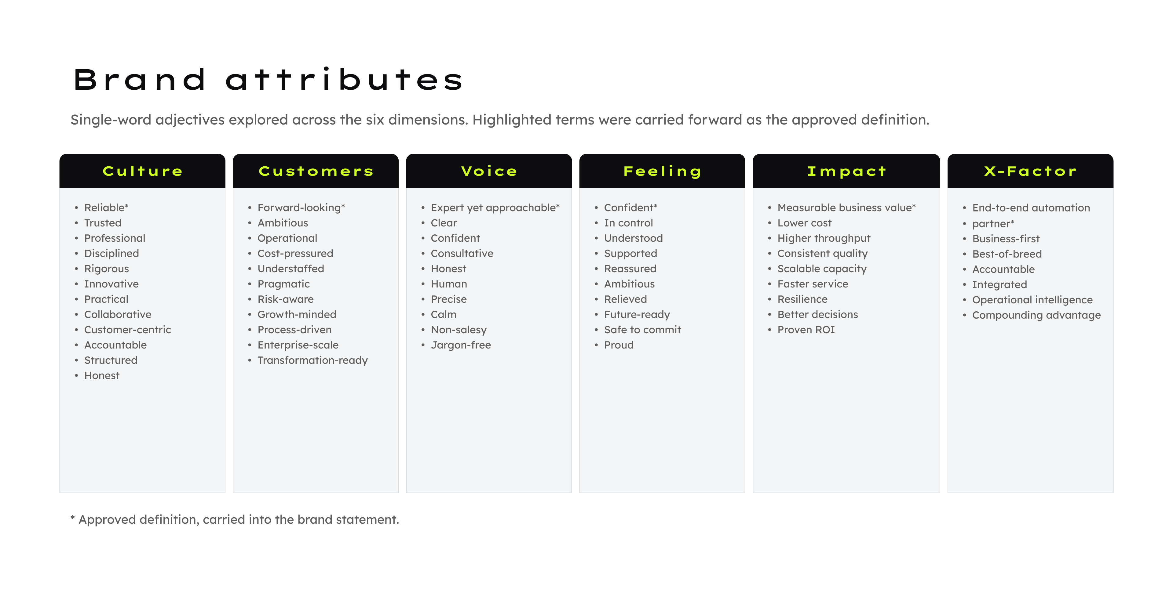
We started with an attributes workshop across six dimensions: culture, customers, voice, feeling, impact, and the X-factor. Each column began with dozens of adjectives and ended with one:
- Culture: Reliable
- Customers: Forward-looking organizations
- Voice: Expert yet approachable
- Feeling: Confident
- Impact: Measurable business value
- X-factor: End-to-end automation partner
Read together, the six words describe a partner. None of them describes a machine.
NEXA’s customers have staff they can’t hire, costs that keep climbing, and operations that can’t grow without adding people. When a company introduces itself as “robotics and AI,” buyers start comparing specifications and prices. When it starts with the problem, the conversation moves to their business, and NEXA can win that conversation.
So NEXA presents itself as an enterprise automation company. Its messaging follows one rule we wrote into the guidelines: no adjective survives without a number behind it.
Brand frequency: designing for freedom and relief
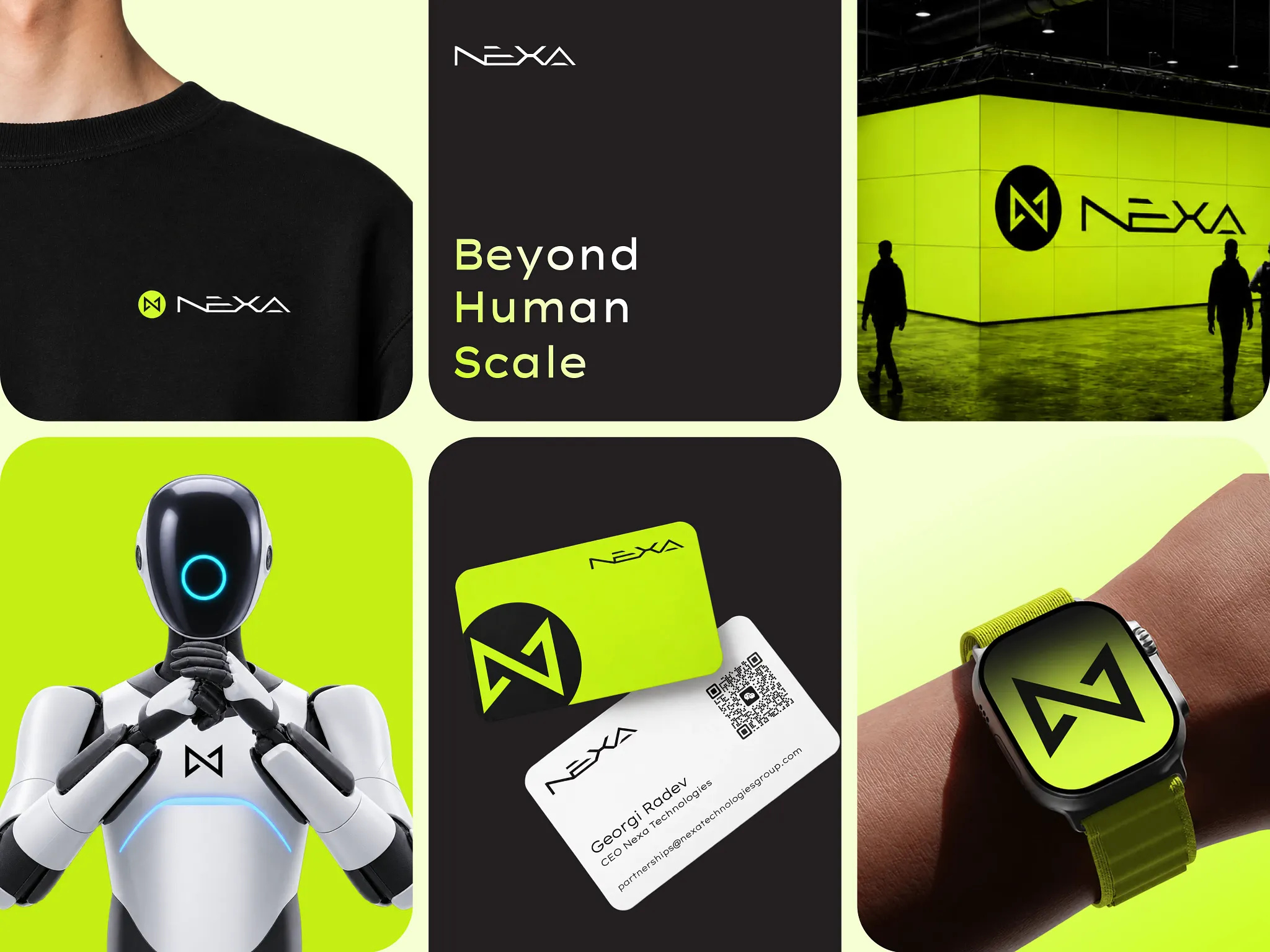
In a previous article, I wrote about brand frequency: the emotion a brand consistently evokes, so people remember it. To find it, we look for the peak experience, the emotional high point of using the product.
For NEXA, the peak experience is that morning moment on the phone. The work is done, and nobody has to chase it. The emotion is freedom and relief. Every decision that followed, from the slogan to the way the logo moves, had to serve that feeling.
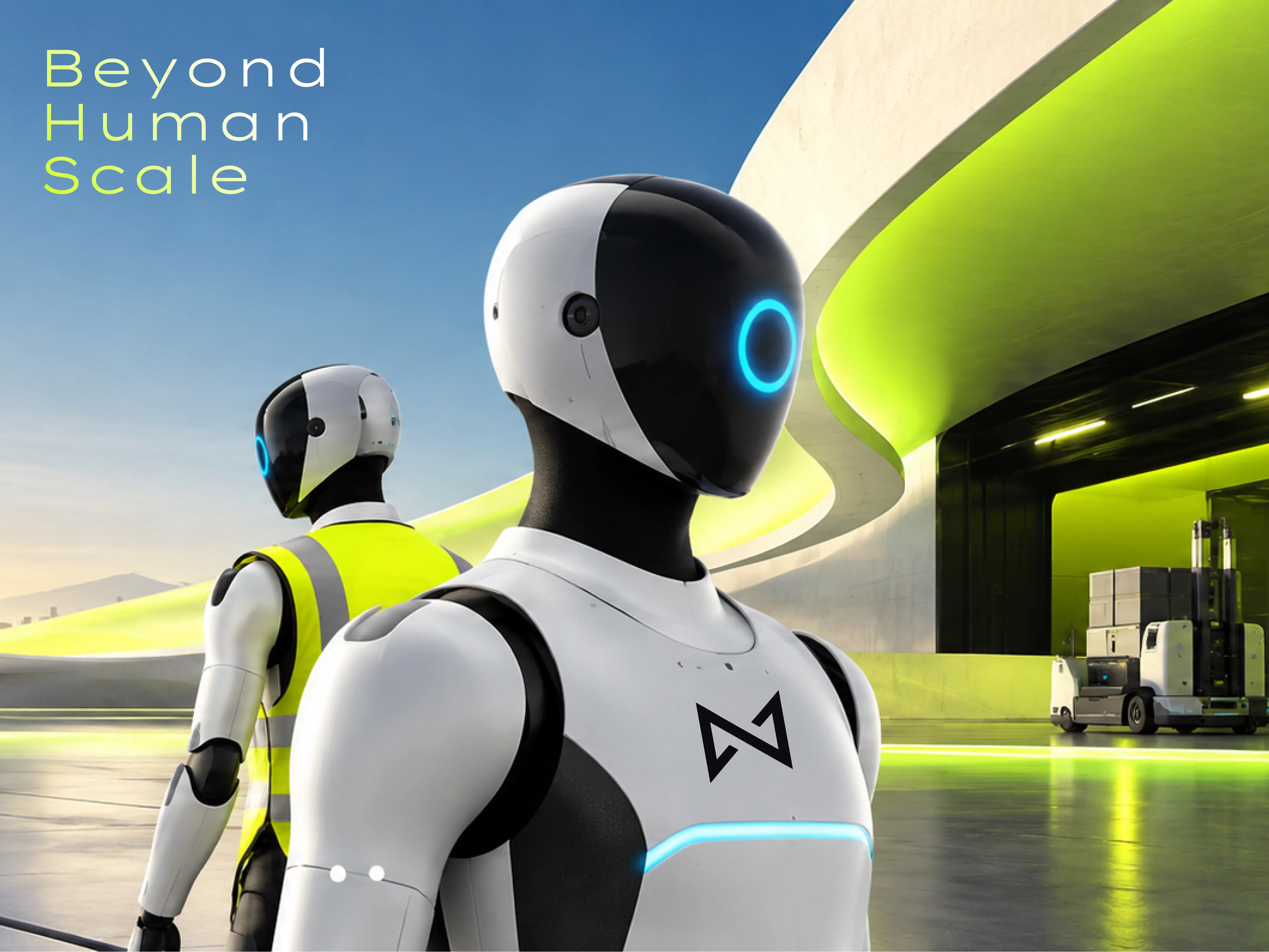
The brand promise is the cognitive part: NEXA simplifies business operations by solving workforce limitations. The slogan is the emotional part: Beyond Human Scale.
The line presents technology as an extension of human capability, letting a business operate beyond its natural limits. It talks about what becomes possible and leaves replacement out of the story. It also works in Bulgarian: Отвъд мащаба на човека.
Visual identity: breaking the blue-gradient formula
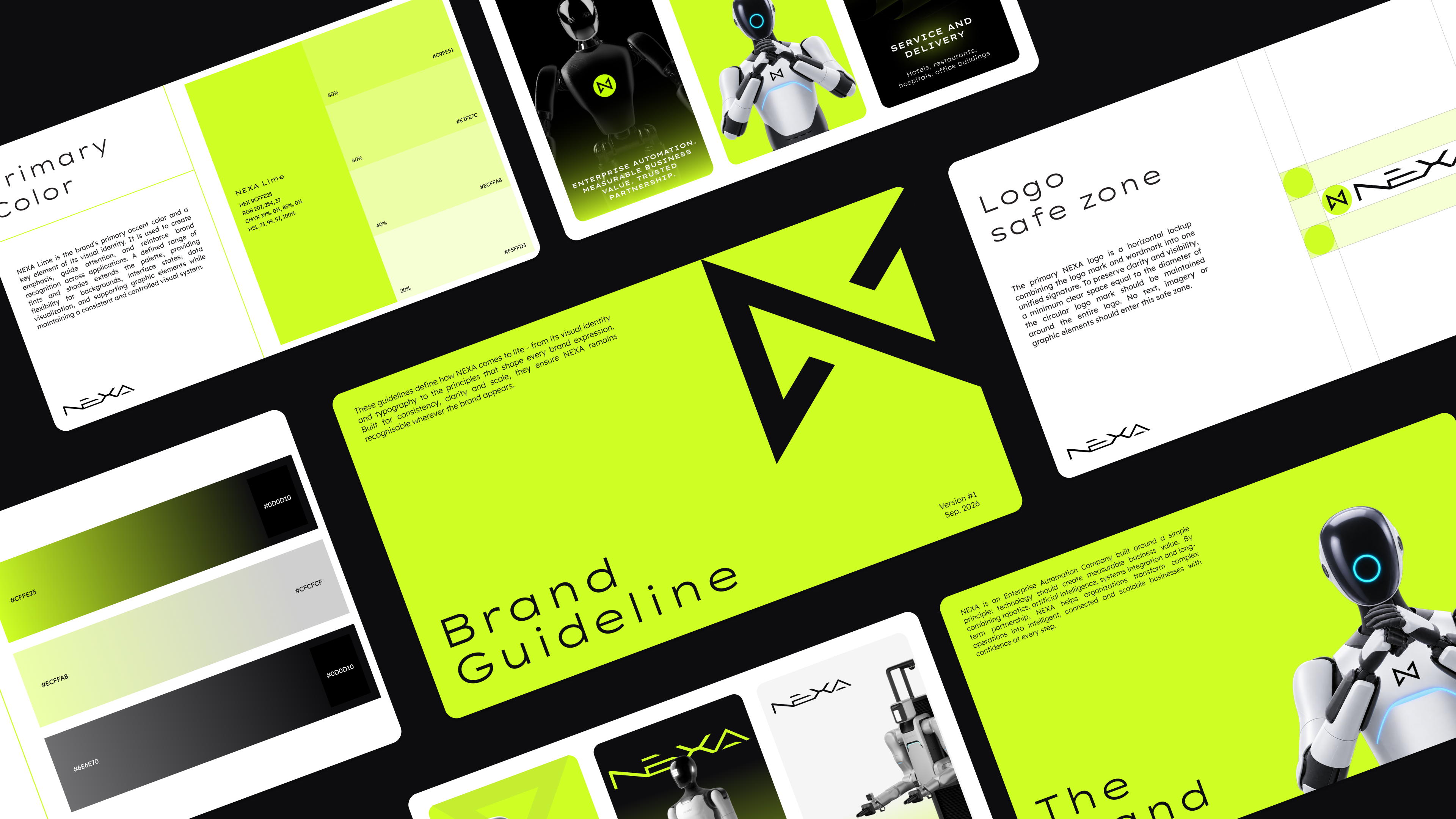
We’ve all seen it: blue gradients, glowing circuits, abstract neural networks. Those conventions work, and every AI company uses them. If competitors can swap your logo for theirs and nobody notices, you don’t have an identity yet.
NEXA’s strategy asked for a calm, honest voice that never sounds salesy. So we made a deliberate split: the restraint lives in the words, and the confidence lives in the visuals.
The logo. The symbol is an angular N built from two mirrored strokes that cross and lock into each other, like two systems connecting. We constructed it on Golden Ratio proportions, so it feels engineered. Our logo designers relied on that geometry to make the same mark work as a tiny app icon and as a backlit wall at an exhibition.
The color. We wanted NEXA to feel deployed in the field. Instead of a soft tech green or the usual blue, we chose a sharp hi-vis lime: the green of safety vests, hazard markers, and the “system active” light on a working machine. Paired with heavy near-black, it feels industrial: hard hats, job sites, equipment running in low light.
That is what Beyond Human Scale looks like: automation built for the places, conditions, and hours a human workforce can’t cover. For an enterprise technology company, it is a bold choice. A loud color only stays loud if it is rare, so the guidelines keep lime for emphasis and let black and white do most of the work.
The typography. Lexend Zetta carries the headlines. It belongs to the Lexend family, created in 2019 by educational therapist Bonnie Shaver-Troup and type designer Thomas Jockin to reduce visual stress and make reading easier. Zetta is the widest cut, and its geometry follows Futura’s tradition.
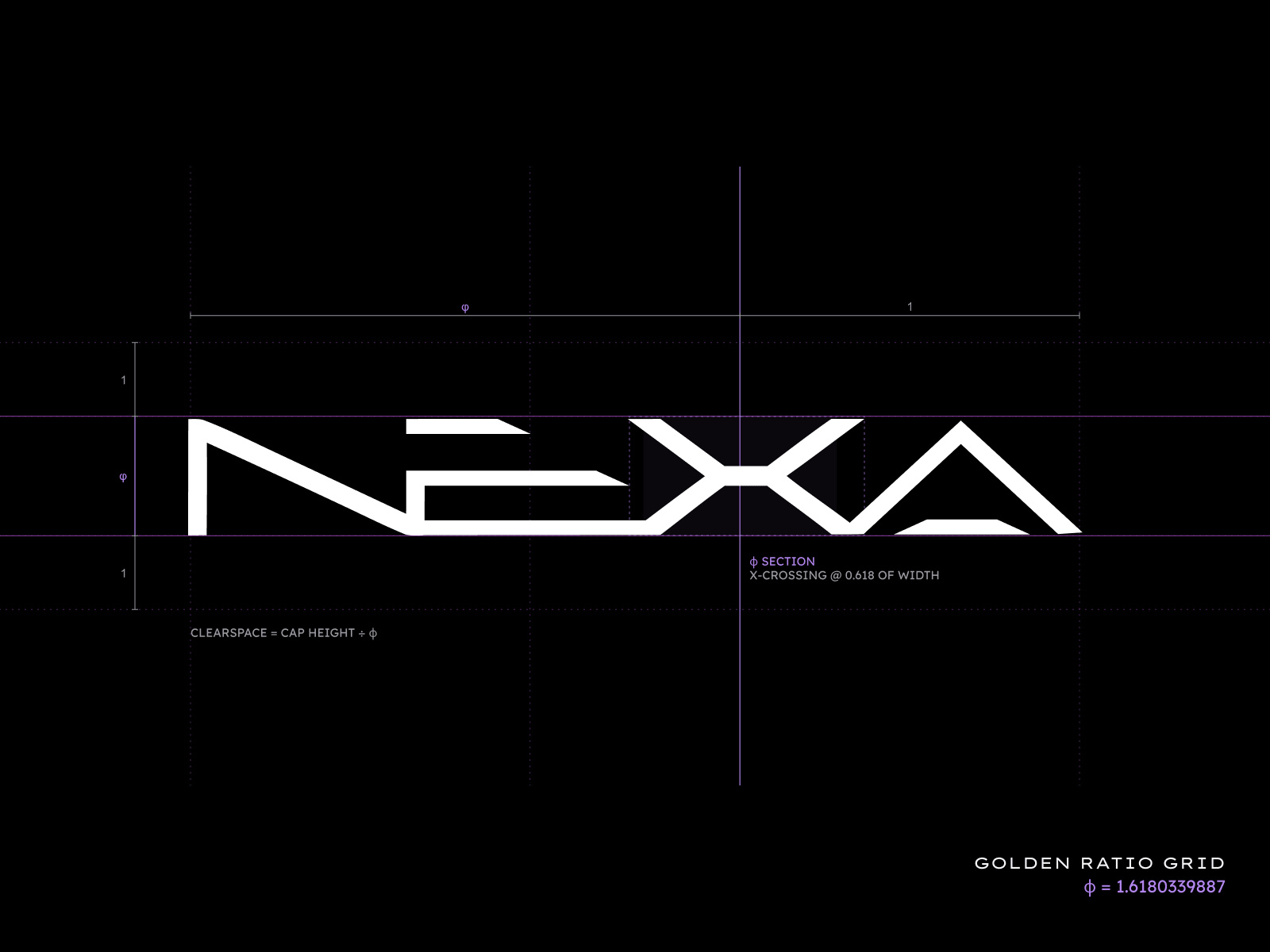
That lineage is why I chose it. In 1927, Paul Renner designed Futura to feel engineered. Most typefaces carry traces of a hand holding a pen. Futura almost erases them, with near-uniform strokes and pure circles and triangles, as if the letters were stamped from sheet metal. Its capitals still keep the proportions of ancient Roman monuments, and the plaque Apollo 11 left on the Moon in 1969 was set in Futura.
A typeface designed to make reading easier, built on a machine-made look, felt right for a company that brings machines into human workplaces. Body text steps down to regular Lexend, so longer reading stays comfortable.
Interactive branding: a brand that responds to you
NEXA’s business is about people and machines working side by side. A brand that only sits still and looks good felt like the wrong fit.
So we gave the identity behavior. The logo animation moves in precise, deliberate steps, like a machine at work.
Then we asked a bigger question: what if visiting a website felt more like communicating with a machine than clicking through pages?
For the website, we built gesture-based interactions with in-browser hand tracking, so visitors can move elements with their hands. The gestures sit on top of a site that works fully with a mouse, so usability never depends on them.
Presentation design: comparing robots to wages
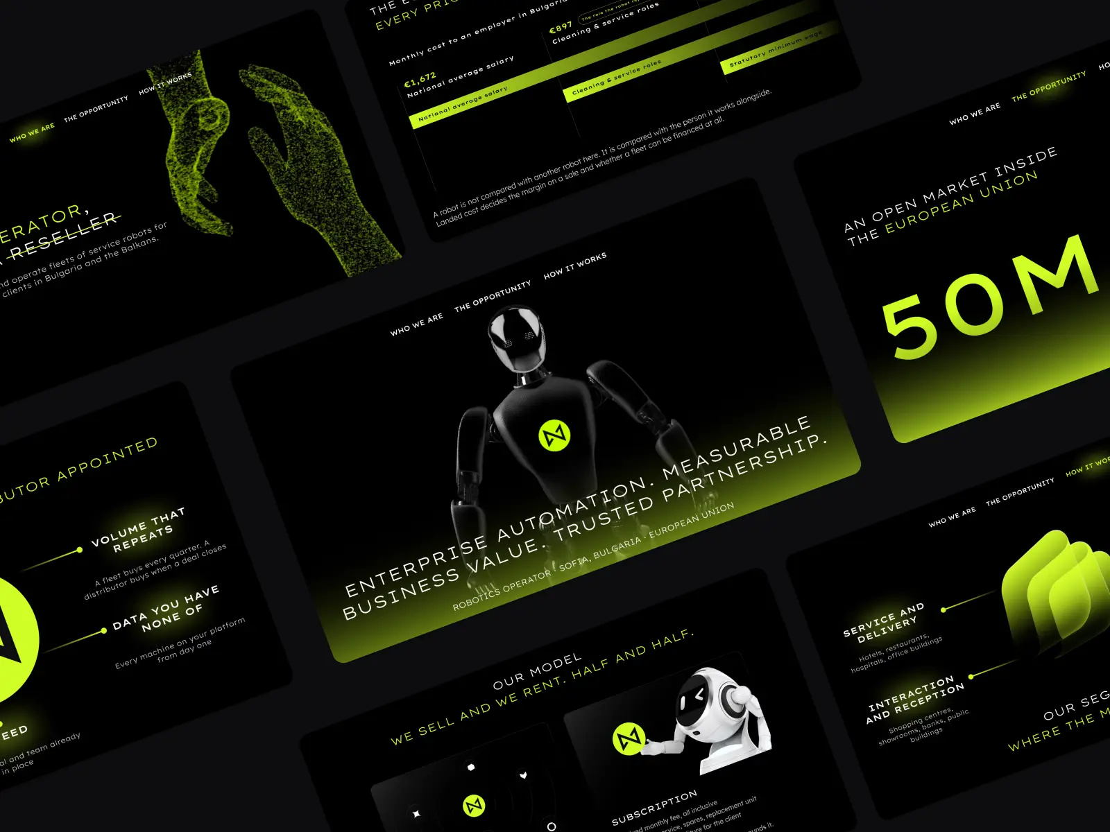
Enterprise technology presentations share a familiar problem. Architectures, integrations, and unfamiliar terminology compete for attention, and the audience leaves with plenty of information and little sense of the bigger idea.
We built NEXA’s deck around three questions that stay in the navigation on every slide: who we are, the opportunity, and how it works. The first slide states the positioning with one struck-through word, presenting NEXA as an operator instead of a reseller.
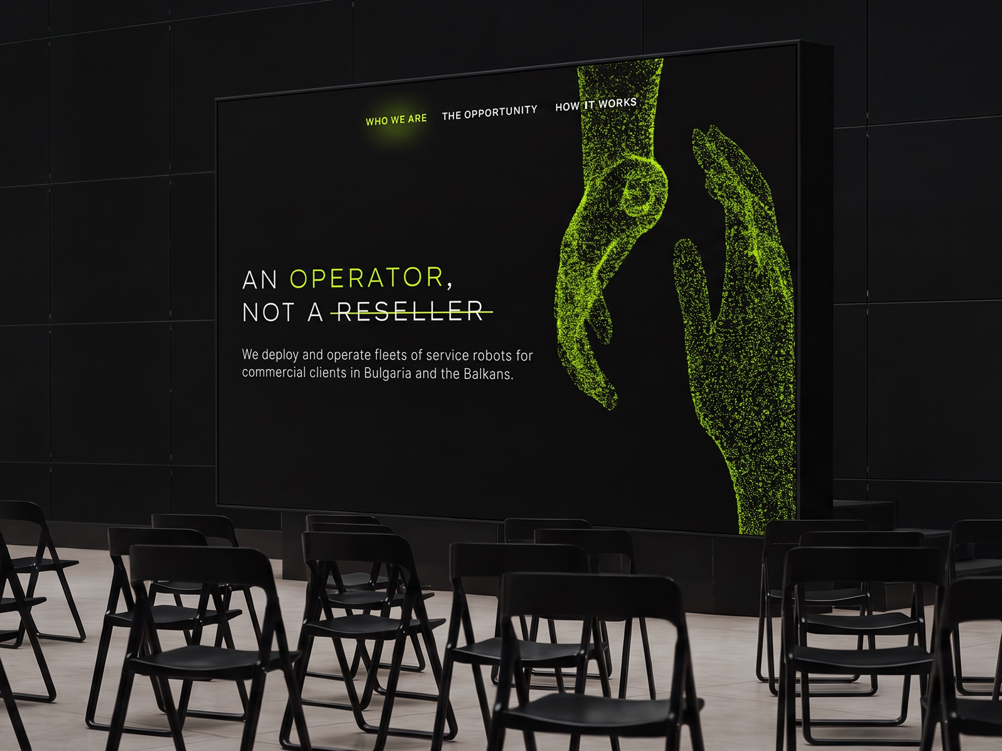
The most persuasive slide compares a robot’s monthly cost with what an employer pays for the work it takes on, using Bulgarian salary data. A buyer doesn’t need to understand the technology to understand that.
From there, each slide carries one large number or one clear idea, with point-cloud imagery and lime gradients keeping the rhythm consistent.
Event branding: from a badge to a wall of light
At events, the lime changes its role. In a dark venue, it becomes a light source: a backlit wall carrying the full logo, and a tall light box where a NEXA robot stands beneath the words “Autonomous Workflows.” On stage, the deck runs in the same dark-and-lime rhythm, so the room and the screen feel like one space.
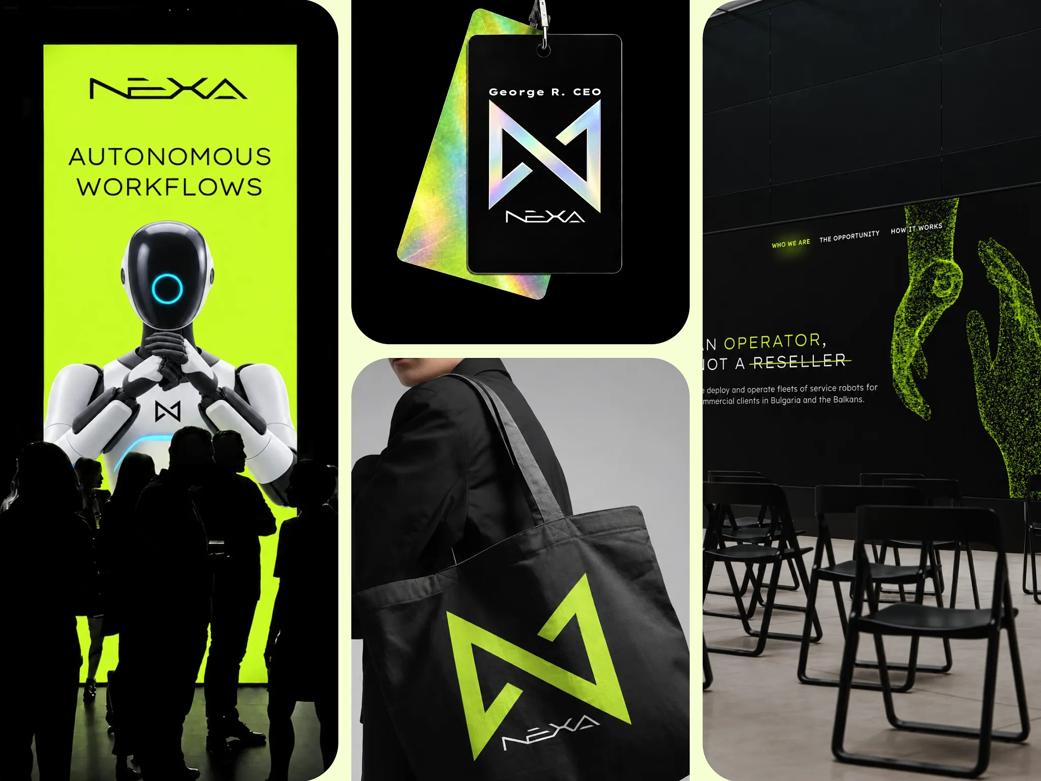
Badges show the mark in holographic foil that shifts color as people move. The system extends to tote bags, apparel, business cards, and even a smartwatch face.
This is the part of building a brand identity I enjoy most: watching one geometric idea stretch from a wrist to a wall and keep its character. If an identity works on a favicon and on an exhibition wall, it will work everywhere in between.
Giving the future a character of its own
Looking back, the two sides of this project seemed to pull in opposite directions. Strategically, we had to make a complex offer feel clear, relevant, and safe to buy. Creatively, we wanted to challenge how enterprise technology usually presents itself.
I see no contradiction between those goals. Clarity can coexist with bold visuals, and creativity can strengthen credibility. Interesting brands appear when strategic discipline creates enough confidence to explore something unexpected.
As AI and robotics become part of everyday business, futuristic aesthetics are already becoming familiar. The next challenge for brand designers may be giving the future its own character.
Find more Community stories on our blog Courtside. Have a suggestion? Contact stories@dribbble.com.