Let’s clear something up first—the difference between a landing page and your website. In this article, we’ll be talking about the landing page, a standalone web page created specifically for a marketing or advertising campaign. We’ll define the goal of a landing page as converting users into leads or customers by encouraging them to take a specific action, such as filling out a form or making a purchase.
When it comes to landing pages, your users often come from an external source, either email marketing, social media, or a paid ad—something that entices them to find out a little more and ultimately take action.
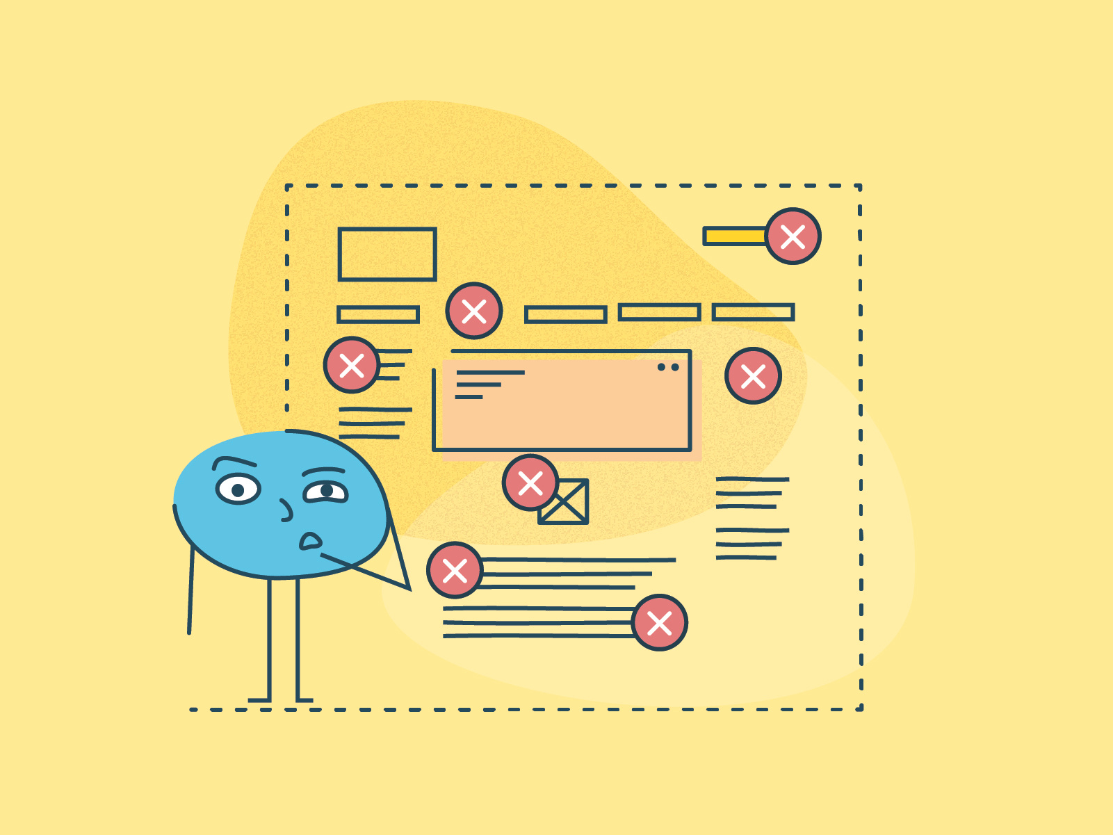
Designing an effective landing page is no easy feat. There’s a lot you need to achieve with a simple but effective landing page. In this post, we’ve lined up 7 mistakes you should AVOID when designing a landing page. Let’s dive right in!
Thanks to our friends at Optimal Workshop for sponsoring this blog post!
1. Lacking a clear call to action
The call to action (CTA) is key to an effective landing page. When working on the call to action ask yourself: What is the main task we want our user to do when they arrive on the landing page? A compelling CTA is really as simple as making sure what you want them to do is clear, concise, and easy to find. It’s like a signpost or directive that is clear and impossible to miss. Some common CTAs include “Buy Now,” “Subscribe,” “Book a Demo”, “Get Free Trial” or “Download”.
If a user has “landed” on your landing page the lead marketing has done the job to get them there. Now the landing page needs to grab their attention. If your landing page doesn’t have a clear CTA, your user will likely become confused and leave. The hard work put into capturing their attention just fell through the cracks. A clear and concise call to action is essential for guiding users toward conversion.

2. Poorly written headlines
The headline is the first thing users will see, and it should be compelling enough to grab their attention and encourage them to keep reading. If your headline is dull or misleading, your users are likely to lose interest and leave your page without taking any action. Users have already taken some action to arrive at this landing page (via social, advertising, or email)—don’t let them down now.
Your landing page headlines should tie into where your users have arrived from. What led them here in the first place? Did they come via a social campaign? What was the tone, language, and wording used in the campaign? The headline can match, or should at least marry seamlessly. The user should feel that they have landed where they expect, hand-held by you on the next step of their journey. The headline needs to address their needs and point to the next step.

3. Information overload
Don’t overwhelm users with too much. Too much copy and too much information without a clear CTA can confuse and discourage action. Remember your user’s time is valuable. Providing key information in a clear, simple, and appropriate way will meet your users’ needs quickly, keep them engaged and provide the key next steps to complete their task.
Keep your landing page focused on its main goal by ensuring your design is clean and uncluttered, and delete all of the fluff. For example, if you are offering an e-book download, give a short synopsis of what users can expect to find in the book, a picture of the cover, a short CTA of “download now” and a catchy headline. That’s all you need. Give the user exactly what they want and not much else.

4. No landing page testing
Test, test, and test again. Testing your landing page is crucial to make sure it’s performing as you and your client expect. Without testing, you won’t know what’s working and what’s not, and you won’t be able to make data-driven decisions to optimize your landing page for better results.
First-click testing is a great way to understand what and where users are landing and being driven to on the landing page. Understanding where users click in the first instance can be incredibly helpful in knowing how your landing page is performing. If it isn’t hitting the mark, how can it be fixed? What will make it clearer?

5. Poor mobile optimization
A major mistake designers make is to focus on designing a gorgeous desktop landing page that is not compatible with mobile devices.
With more and more people browsing the web on their mobile devices, it’s crucial to optimize your landing page for mobile users. While most websites and landing pages are automatically ‘optimized’ for mobile, understanding the state of mind of a mobile user can be vital to the design. Mobile users are on the move, their screen is smaller, and they are time-poor.
Ensure your landing page is clear, concise, and quick to load (avoiding images, complex transitions, and videos). Make it easy for users to find what they need to do and to do it. Make sure they can fill out that form, and quickly!

6. Misunderstanding your user
If you don’t know who your user is or what they want, you won’t be able to create a landing page that resonates with them. Do your research, understand how your users think, and create a landing page design specifically for them. Your client can help you understand who they are targeting and what action they want them to take. Don’t cast the net too wide. Designing your landing page for key users will help you hit the mark and meet the conversion goals.

7. Misunderstanding your client’s purpose
Lastly, it’s important to understand your client’s goals and purpose for the landing page. What do they want to achieve? What action do they want users to take? If you don’t understand your client’s purpose, you won’t be able to create a landing page that meets their needs.
Take the time to ask the right questions, to understand your client’s needs, and the needs of your end user. Questions to your client might be:
- What is the purpose of the landing page?
- Are we gathering email addresses or making a sale?
- Is this a time-bound offer?

Start designing landing pages that convert
In short, creating an effective landing page takes a clear brief and a strong understanding of your client’s and users’ needs. It is important to build a design that is clear, concise, attractive, and easy to follow. Your landing page should look and behave like your client’s brand. Avoiding these 7 common mistakes that are made when building a landing page can mean the difference between a landing page that hits the mark and one that has a higher bounce rate than conversion rate.
If you need help with understanding your user better or learning how to make your landing page as effective as possible, check out Optimal Workshop—the expert in user experience research. We help designers like you create a compelling user experience that delivers conversions and revenue for your clients. Learn more about us! ■
Find more Process stories on our blog Courtside. Have a suggestion? Contact stories@dribbble.com.


