
For the majority of us, our smartphones are the center of our universe. We use them to communicate with one another, watch TV, capture memories, pay bills, order food, keep up to date with the latest news, run businesses; the list is endless. During the COVID-19 outbreak, handhelds were a necessity. We’ve come to rely on these devices quite heavily.
In 2020, there were almost 7 billion users of mobile devices, and this statistic is expanding.
Almost 67% of the world owns a mobile device, but most importantly, over 50% of all website traffic comes from smartphones (and this doesn’t even include native mobile apps!). This means that UX designers should be focusing a little bit more on mobile when designing interfaces. But, focusing on what exactly? Let’s take a look.
Thanks to our friends at Editor X for writing and sponsoring this blog post! Editor X is the advanced website creation platform made exclusively for designers & agencies.
Recommended design approach: Mobile-first design
So, how do we ensure that we’re designing terrific user experiences for the majority of users—those being, of course, mobile users—without negatively impacting our desktop user experiences?
Answer: By taking a mobile-first approach to UX design. This approach caters to the majority of users first and comes with two major benefits that make the overall UX design process much easier to deal with.
The benefits of a mobile-first design
Firstly, taking a mobile-first approach to UX design makes responsive design easier—i.e. it’ll be easier to cater for devices of all types, screen sizes, and screen resolutions. The two main reasons for this are that designing for the smaller screen requires that we reduce feature bloat by removing any feature that isn’t absolutely necessary. In turn, this also reduces cognitive load for users, so that there isn’t too much ‘happening’ all at once.
After designing a minimal, no-more-than-what’s-needed mobile experience, moving onto larger screens is then way, way easier.
Secondly, with a smaller feature roadmap and a less cluttered user interface, it’s both easier and faster to design, test, and ship, making mobile-first the better option for conducting user testing, where we test our solution.
Let’s dive into the practical side of things.
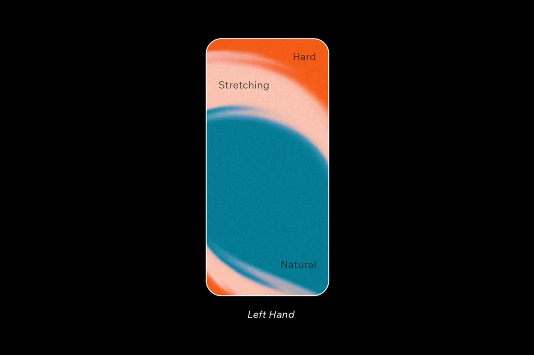
1. Design for one-handed use
The most common user type is the user that uses their mobile device with only one hand. As a user, this isn’t a monumentally difficult task, but there are a couple of instances where this can get quite tricky and lead to users becoming frustrated.
The image below indicates the reachability of various tap regions on an averagely-sized mobile device. Teal areas are the most accessible and redder areas are the least accessible. This problem is accentuated with larger screens, since our thumbs haven’t evolved to enlarge with them (unfortunately!).
Whenever you’re able to, design tap targets within these accessible regions. Specifically, that’s towards the lower-middle region of the screen. Your main navigation should be fixed to the bottom so it’s accessible without getting in the way.
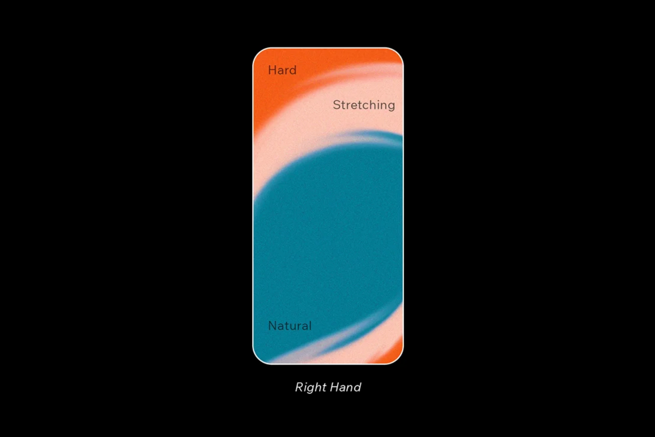
2. Design for left-handed users
Perhaps you’ve noticed that in the image example above, the left-hand side of the screen is slightly more accessible. That’s because the heatmap illustration represents that of a right-handed individual. 10-12% of users are left-handed; which, if there are a lot of users, means that a great number of them are lefties.
Considering the fact that there’s no way to programmatically adapt an app or website for left-handed users, the only solution is to place important or contextual tap targets towards the vertical middle, and not so much the left or right.
3. Design for everybody through accessibility
19% of the world has a disability of some sort. Not only is this a significant portion of users, but designing with accessibility in mind can also benefit everyone—not only those with disabilities.
Color contrast
First, let’s talk about color contrast. Color contrast defines how easily users can distinguish between two different visual elements. An optimized color contrast ensures that everyone can see our interfaces clearly, regardless of the device used, size of font, and visual impairment.
The appropriate amount of contrast, as defined in the WCAG 2.0 Web Content Accessibility Guidelines, differs depending on whether we’re talking about icons or we’re talking about text. When it comes to text, then the amount differs depending on the size of the font.
There are various tools available that can check color contrast for us, some of which integrate directly with UI design tools (such as Stark , while others are standalone web apps (such as the classic WebAIM Contrast Checker )
Optimizing for the right amount of color contrast ensures that everybody can see our interfaces clearly regardless of the device, size of font, and visual impairment.
Tap target design
Tap target size: Some users, most notably those with motor disabilities, experience physical difficulty interacting with technological devices, especially when it comes to activating small targets. For this reason, the WCAG 2.0 and the Google Web Fundamentals advocate for a minimum tap target size of 44px² and 48px² respectively to ensure optimum clickability.
Tap target spacing: In addition to being the right size, tap targets shouldn’t be too close to one another. Although this issue very rarely crops up, it can be very frustrating when it does. An example of this is when links are used in a list and the line spacing is too small.
Pro-tip: Run a Google Lighthouse audit to check tap target sizes and spacing (this only works on live websites).
4. Consider landscape optimization
Landscape orientation is most common in tablet devices. Examples of where tablets are often used include: PoS (Point Of Sale) apps, SaaS (Software as a Service) apps, sketching apps, and more.
When optimizing for landscape orientation, be wary of elements that take up too much vertical space, forcing important elements outside of the viewport, either partially or completely. This one is quite easy to overlook, so be sure not to test for it.
5. Tablets
Continuing on the topic of tablets is that the thumb reach is obviously different here than in mobile, especially with landscape orientation).
Tablet use is mostly handheld, similar to mobile devices. While users do sometimes use tablet apps and websites on a flat surface (for example, when using the Apple Pencil), often this is as a last resort because the design isn’t hand-friendly.
Ensure that you have a variety of devices at-hand to test with, and always test for edge cases. Emulated or simulated tests are fine for responsive design testing, but real devices are better.

6. Device hardware
Another important feature about designing for mobile devices is that the hardware capabilities are different from desktop. This is because mobile devices come with a unique set of usability-related challenges. For example, typing on a mobile device is naturally much more difficult than it is on a desktop device.
Designers should leverage these capabilities to help users overcome these challenges. Here are a couple of comparisons:
- Online forms — Desktop: Filling out address forms / Mobile: Auto-filling addresses using GPS
- Credit card information — Desktop: Typing credit card information / Mobile: ‘Scanning’ cards using the camera
There are many more mobile functionality use-cases available—GPS functionality, QR code functionality, camera functionality, and so on. These are all super useful in a wide variety of use-cases where traditional interactions, like using the keyboard, aren’t mobile-friendly.
Usability testing with mobile prototypes
The topics covered here may all sound great on paper, but what’s the best way to ensure that their implementation can quantifiably improve the user experience of our designs?
Measuring performance not only shows that we’re on the right track, but also proves to stakeholders that certain demographics (such as left-handed users, users with disabilities, or simply even mobile users as a whole) are worth catering and advocating for.
Clickability testing
Clickability testing is crucial when designing for mobile devices, especially because some features behave on mobile, such as hover states. This can be done either via clickmap testing or visual affordance testing:
Clickmap testing: A clickmap is a type of heatmap that specifically shows what users are and aren’t clicking on. While this type of usability test isn’t rock-solid, it can reveal tap targets that don’t appear to be very clickable. If this happens to be the case, then follow up with a visual affordance test, which is more reliable.
Suitable user/usability testing tools include:
Visual affordance testing: Visual affordance testing involves asking users to circle the elements that they think are clickable, and then, the elements that they think aren’t clickable. Pretty much any tool that enables usability testers to sketch over static mockups of our designs (for example, Miro or InVision Freehand ), will work fine here.
Remember, hover states don’t quite work the same way on mobile devices, so clickability testing either via the use of clickmaps or visual affordance testing is super important when designing for mobile devices.
Functional salience testing
Functional salience testing involves asking users which tasks and features they consider to be important. This is instrumental for finding out which visual elements to prioritize when screen real estate grows scarce on mobile devices.
Functional salience testing is usually conducted early on in the design process. However, we can also use it to identify feature bloating issues with designs that already exist and aren’t working all that well.
Design a seamless mobile experience with Editor X
It’s safe to say that in 2021, designing for mobile devices is just as important as designing for desktop devices (if not more so). To help you build and launch powerful websites with a seamless mobile experience, we built Editor X—the advanced web creation platform made exclusively for designers.
True to our brand’s mission, Editor X creators can experience total design freedom on the most intuitive and flexible canvas. With the help of custom breakpoints and flexbox technology, creators can bring their vision to life for any screen size imaginable.
If you’re ready to start designing beautiful and functional web and mobile experiences, visit EditorX.com. ■
Thanks to Daniel Schwarz for writing this article and Shai Samana for designing the graphics.
Find more Process stories on our blog Courtside. Have a suggestion? Contact stories@dribbble.com.


