
This blog post was written and sponsored by our friends at Creatopy—the intuitive visual production platform that delivers a well-crafted creative experience.
We’re more than delighted to announce that Bannersnack is now Creatopy.
I’ll briefly walk you through the main reasons for our total rebranding to offer you a little bit of context on what will follow in the article.
We started back in 2008 as a simple banner maker, founded and developed over time without any external funds.
Bannersnack grew, and we kept developing features to improve the customer experience. Still, we realized that people perceived us only as a platform to create banners (given the product’s name) when in reality, we offered so much more.
Also, after careful analysis, we concluded that our long-term dream—to be leaders in the graphic design tools market—couldn’t be carried out without a fresh start.
So, we went through a total rebranding to bring a new product with a different approach, a crystal clear brand positioning, and a personalized customer experience.
If you’re wondering what elements you need for a successful rebrand, keep reading.

1. The values
The values you set for your company will always guide you in picking the right people and keep them in sync and engaged. On top of that, they will reinforce your company culture and represent the foundation for the type of team you want to put together.
Creatopy was built and made to work around a set of well-defined values. I’ll list them here exactly as they are in our brand manual, with a side note for each of them.
I belong to an A-team of beautiful minds and open hearts, allowing me to think sharp, to glow bright, and to stay agile.
Everything works better when all the company’s team members work together in the same rhythm. This means sharing opinions, feedback, constant support, and ultimately, being fully committed to the company and the team we’re working with.
I mean technology. I am passionate about… no. I actually live and breathe technology. That’s it!
Being in the digital industry, and more precisely, in the graphic design tools market, we have to keep up with the latest technology and trends in design, marketing, or programming.
This is the only way to deliver the best features to our clients and be confident in ourselves. You know what they say about knowledge.
I care about delivering the best CX because I’m seriously going to knock our clients’ socks off with a state-of-the-art journey on our platform, pleasant and productive.
Creatopy’s epicenter is the client. Our journey began and continues to grow with a precise focus on every client’s needs. Our platform is intuitive with a straightforward process because our users need a fast yet complex creative solution for their design necessities.
I create beautiful design content because the best quality collection of designs always wins.
Glow baby, glow! We’re referring to creativity—yours and ours. The platform offers templates as a starting point, but this doesn’t mean you can’t take and personalize them using your glowing creativity.
I love Oradea, the city which provides the necessary magic dust for me. And because Transylvania sounds awesome.
Oradea is the city that offered us the right vibration to create everything Creatopy is today. It’s a city that continually evolves and improves, so this is a constant motivation for us too.

2. The vision
When employees can relate to a company’s vision, that’s when they are more likely to acknowledge their role and feel like they’re part of something bigger. The vision serves to inspire and always helps you in planning the next steps. Every decision propels you and your teammates closer to the company’s goal.
Like I said earlier, the goal we had in mind when we rebranded was to conquer the graphic design tool market.
It’s called vision for a reason: our product owners pictured the way the product has to be and saw the clear limitations we had with Bannersnack.
So, we needed a fresh start to reach it.
This target goal worked like a guiding light throughout the rebranding process because, together with the feedback we got from our clients, it showed us what features needed to be included in the platform.
3. The brand positioning
Brand positioning is key to making sure you’re standing out in your audience’s mind by showing how you are different. With a precise brand positioning, you’re more confident about the improvements or new features that need to be added to your product. Your company stays in the same niche, growing stronger while inspiring trust.
With Bannersnack, the brand position wasn’t clear enough. After careful analysis to determine it, we realized we had a combination of CMS with GDT features.
But, since our background offered us enough knowledge about product marketing and graphic design tools, we knew exactly where our potential lives. So, the focus shifted towards creating a unique and competitive platform on the GDT market.
An excellent graphic design tool manages to cover all of our clients’ needs even if they work individually or as part of a team.
And Creatopy was created to shine in both areas.
With this in mind, I present to you the official brand positioning statement:
Creatopy is the efficient and intuitive visual production platform, delivering a well-crafted creative experience for communicators and teams.
4. The personality and tone of voice
Maintaining the same tone of voice throughout your communication and content forms (blog, email, social media, etc.) is crucial for brand consistency. This will go a long way, as your audience will get accustomed to and resonate with your brand style.
The tone of voice we use when communicating brand-related messages is in perfect alignment with Creatopy’s personality and the product’s long-term goal.
Because we represent Creatopy, we’re confident, with a tint of boldness. assertive, but keeping our cool and always trustworthy. That’s because we want to help and inspire everyone that reaches out to us.
5. The logo
Needless to say, the logo is one of the essential components of a brand’s identity. It not only distinguishes you from the competition, but it also helps people figure out what you sell, the industry you’re in, and even the type of audience you’re targeting.
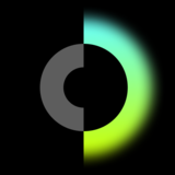
Creatopy’s logo design is composed of a C monogram, a sphere (representing the idea of a utopia), and a bright glow (symbolizing creativity). All of these elements express the core idea of our graphic design platform.

Together with these elements, we have the product’s name.
Creatopy derives from Creation/Creativity and Utopia. It represents the idea of a perfect creation, happening in a place where creativity has no limits.
6. The color palette
Colors trigger emotions and influence people to perceive your brand in a certain way. Make sure the logo color combinations you choose showcase the right feelings and are in perfect harmony with your brand’s personality.
Creatopy’s color palette is as vivid and joyful as the product itself.
Let’s break it down.
A) The logo’s main color
You’ll mostly see Creatopy’s logo with its green-cyan gradient (a.k.a FreshKryptonite Green to aRGeeBee Cyan), which can be static or dynamic, expanding its glow in size.
B) The logo’s secondary colors
The secondary gradients are called the Northern Lights Gradients, and there are four:
- HotHot Red to BurningChrome Orange
- BurningChrome Orange to LaserLemon Yellow
- ExoPlanet Blue to PurpleRain Violet
- PurpleRain Violet to Aerosmith Pink
When applied to digital media, the C-Beams Logo can change the glow color and become even more dynamic. It can go from green-cyan gradient to next-in-line hues in the colors circle: blue-to-indigo, violet-to-magenta, red-to-orange, and orange-to-yellow.

7. The font
The font is also an essential part of a brand’s visual identity. Just by looking at a headline’s font or the body text, you can get a sense of how playful or formal a message can be.
To match Creatoy’s energetic personality, we needed a font just as good. So, for all the headlines, we’re using the Ping Font, with its glyph substitutions.
This means that for extra character, we will use the alternate lower-case ‘g’ glyph instead of the default one, and the straight upper-case ‘I’ will be used instead of the slab-serif-looking uppercase ‘I’ glyph.
Or, we can even extend the glyph set and turn it into a unicase for extra spiciness.

In other types of communication, where an extensive body text is needed, therefore great readability, we’ll use IBM Plex Sans and Arial.
Key takeaways for a successful rebrand
Here are the main learnings from this rebranding project:
- Doubting the process is normal. There comes a point when inevitably, you’re going to doubt yourself and the process you’re going through, but it’s not something to be scared of. It’s OK to feel this way because, ultimately, it’s a massive change that you and your team are working on. It helps to focus on the bigger picture and not on minor roadblocks.
- Hiring the right talent will get you far. A company is built by its people, not just by one person. So if you want to build a strong organization, focus on attracting the right employees who believe in your vision and will work together towards the same goal.
- Starting fresh is sometimes necessary. Most companies will go through a rebranding process at least once during their existence. Perhaps not a total rebrand like us, but certainly a change of logo and visual identity elements. The key here is to know when that moment has arrived and what needs to be changed.
With that being said, Creatopy aims to deliver the best solutions in terms of graphic design tools, offering a smooth experience for individuals and big teams that need to stay connected even in the digital realms.
With this rebrand, we wanted to take everything good from both worlds: the highly digitalized features paired with a human touch so that every client can visually communicate with their teams and share emotions through their materials.
Give Creatopy a spin and see all the glowing features it has to offer. ■
Amalia Madalina Pop is a Content Marketing Specialist at Bannersnack. Passionate about content creation and all things cinematic. I love discovering anything that makes my eyes full of wonder. Favorite snack to eat during a movie? Olives.
Find more Process stories on our blog Courtside. Have a suggestion? Contact stories@dribbble.com.


