They say to never judge a book by its cover, but books—and podcasts—need eye-catching cover art if they’re going to capture the attention of people browsing for new content. Your podcast’s cover art should be immediately recognizable and stand out from the millions of other podcasts out there.
It should also create an impression of what your podcast is about and who it’s for. Like with any good piece of design, cover art should follow the basic principles of design and create an impact on those who view it. Beyond that, though, there are certain things you need to consider in addition to those basic principles of good design.


Row 1: Mark Johnston, Mariel Abbene, Andy J. Pizza. Row 2: Lucie Bajgart, ctcher, Matt Worde.
Pay attention to image requirements
As with any standardized design format, there are certain requirements you’ll need to adhere to when designing podcast cover art. Podcast covers are universally square (a 1:1 aspect ratio).
There are also minimum resolution requirements. Typically, the bare minimum is 1400 x 1400 pixels, though some podcast aggregators and distributors recommend 3000 x 3000 pixels. Regardless of how large the image is required to be, remember that most of the time your cover art will be displayed at a relatively small size.
You’ll want to check on any restrictions regarding things like image content (such as adult imagery) or text usage before finalizing your art, too. Some aggregators won’t distribute your podcast if “obscene” or objectionable content is included.
Look at your competition
There are over 1.5 million podcasts currently out there, with more than 34 million episodes. In other words, there’s a lot of competition.
It’s smart to look at what that competition is using for their cover art for two reasons. First, you want to make sure that your cover art won’t get lost in a sea of similar covers. Second, you want to see if there are any established conventions that most of your competition is using. If there are, you can then make an informed decision about whether to adhere to those conventions or do something entirely different.

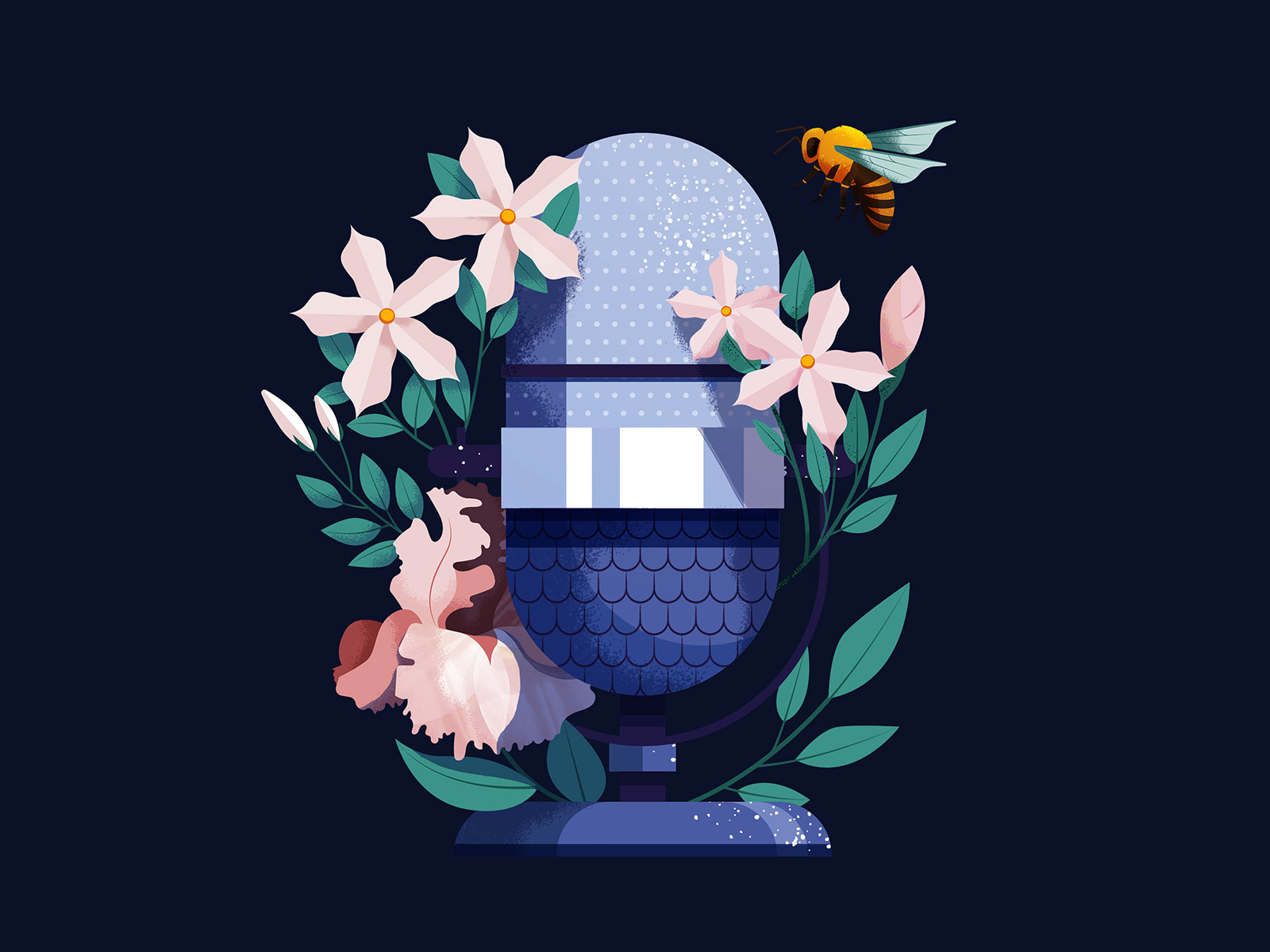
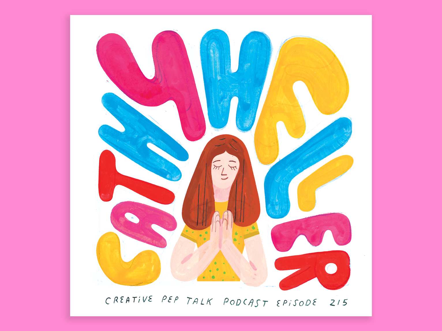
Photo or illustration?
While some podcasts feature purely text-based covers, most generally feature either a photo or illustration in their cover art. This is a decision that should be made based on a few factors:
- Is the person hosting the podcast well-known? (You’ll probably want to use a photo of them in the cover art.)
- Is the person hosting the podcast using it to build their personal brand? (Again, a photo is probably best here, though a caricature illustration could also work.)
- Is the subject matter easily captured in a photo? (If not, an illustration becomes the obvious choice.)
Regardless of whether you choose to use a photo or illustration, make sure that it’s high quality and looks good at both large and small sizes.

How will your cover be used?
Is your cover art going to be used to promote the podcast in places other than podcast aggregators? Will you use it in ads, blog posts, social media posts, as promotional stickers, or other ways?
Where your cover art will appear can direct you to how complex you should make it, as well as how large the original version should be. This becomes particularly important if you’re going to use your cover art on any printed matter. Creating it large enough for print from the start will save you from expensive redesigns later.

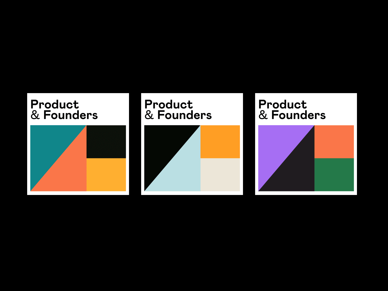
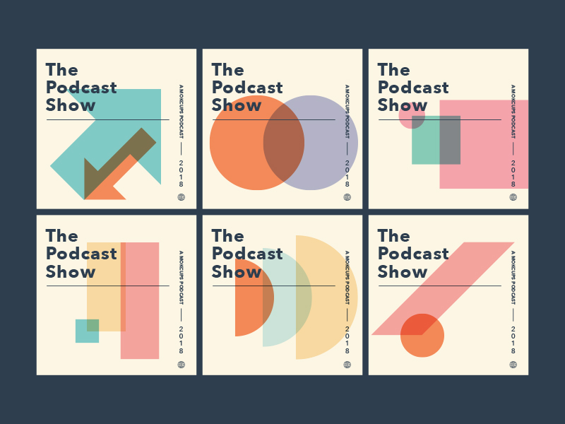
Use eye-catching colors
Since podcast covers are often seen for the first time at small sizes, the impression the cover’s color palette gives is vitally important. An eye-catching color will be more likely to make someone stop and check it out when browsing a large list of podcasts.
If you use a unique color, it can make your cover easy for listeners to spot, too. That becomes valuable when they’re looking for new episodes within their list of podcast subscriptions.

Typography is key
Your title is a vital part of your podcast’s brand. For that reason, it’s important that people be able to read the name of your podcast regardless of how large or small the cover art is being displayed.
You’ll want to stick with highly legible, thicker typefaces for your cover art. That doesn’t mean you can only choose blocky type, but it does mean whatever typeface you use for your title should be readable at font sizes as small as 10 or 12 pt.
Less important lettering on your cover art doesn’t necessarily need to be legible at the smallest sizes the cover will be displayed. However, make sure they’re legible at the sizes displayed on the detail pages for your podcast.
While readability is key, your typography should also reinforce your overall brand and mood of the podcast. For example, don’t use whimsical typefaces for a serious podcast, and vice versa.

Branding is key for podcasts
It’s important that your podcast has its own distinct branding. If it’s for a company or existing brand, it should reflect that brand while still being recognizable as its own product.
Creating a cover that can be used to promote your podcast far and wide means that one piece of design work can pull double duty for you. And it makes sure that your brand is reinforced everywhere your podcast is discussed or promoted. That’s key for growing a broad audience!
Find more podcast cover art inspiration by searching our full catalog on Dribbble ■
 About the Author — Cameron Chapman: Editor. Blogger. Author. Designer. Copywriter. Marketer. Entrepreneur. Speaker. Consultant. Coach. I wear a lot of hats. What most of them have in common, though, is storytelling.
Find more Process stories on our blog Courtside. Have a suggestion? Contact stories@dribbble.com.


