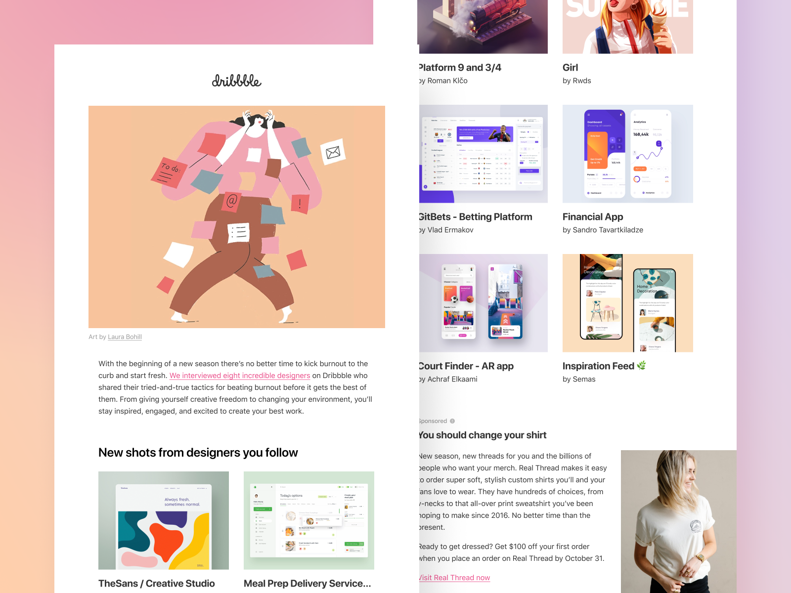
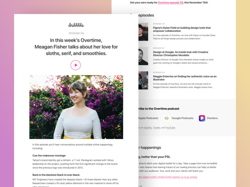
It’s a new year, and we’re doing a little self-reflection here at Dribbble. We took a good, hard look at our emails and determined that it’s high time to sweep away the cobwebs and double down on giving our vibrant community something exceptional in their inboxes each week.
We reworked our emails with you and your success in mind. These new emails not only look the part—they’re bolder and cleaner—but they also let the content you love shine even brighter. Whether it’s keeping you up to date on new work from designers you love or sharing visual trends and industry news, we’re committed to being your go-to design and inspiration destination.
If you’re showing off your work, connecting with fellow designers, or looking to land a new role, we want to be your one-stop-shop to level up your design practice—and revamping our weekly emails is just one step on that path, but it’s one we think you’re really going to enjoy.
Today, Dribbble’s Product Designer Ryan Johnson and Software Engineer Nour El Din take us behind the scenes into the design and development process for our new emails.
Aesthetic & functional goals of the redesign
Ryan: As we move into the next evolution of Dribbble, we’re trying to find more ways to highlight our amazing community’s work. One of the areas we’ve started this is through our email designs. Large attributed Shots make up the meat of our email mastheads, accompanied by the title of that week’s email. What follows is a combination of strong typography, beautiful whitespace, and a refined grid. No room for clutter anymore, just the straight goods.
Nour: We wanted to offer flexibility in the new functional redesign of these emails. Previously, emails were embedded and fixed in our application, hindering any ad-hoc changes or customization when it came to showcasing and featuring exceptional designer content. With this extensive email redesign, we can now make those changes, truly showcasing designer work and providing a tailored Dribbble experience.
Unexpected challenges
Ryan: We have a bunch of different content—from new Shots, podcasts, interviews, blog posts, jobs, the list goes on. So finding a way to show off all of this content in a meaningful way while still on brand and using the same aesthetic was an important goal of ours. We went back to the “less clutter” notion and focused on clean typography to achieve these goals.
Nour: With any major change comes challenges. The old static emails had no method of access and therefore no method of change. We not only re-skinned our email templates but from a backend perspective, also provided a new tool that will allow us to make those tailored changes on a weekly basis.
Ready to peep our fresh new look?
Check out the new designs in all of their glory by subscribing to our newsletters! Our revamped emails are ready to get you inspired and help you stay up to date with your daily dose of design—you won’t regret it.
Find more Updates stories on our blog Courtside. Have a suggestion? Contact stories@dribbble.com.


