Meet Seattle based designer and illustrator Isaac LeFever. Isaac has the pleasure of designing for Willie’s Reserve, a cannabis brand by Willie Nelson. On the side, he tries to improve as an artist by honing in on his illustration skills. Take a peek into his life and work!

Who are you?
Howdy, I’m Isaac LeFever, a designer and illustrator living in Seattle, Washington. I’m self-taught and always looking to learn new things and push myself further creatively. My day job is designing the packaging (and a lot of other stuff) for Willie Nelson’s cannabis company, Willie’s Reserve. I’ve been helping to craft that brand since 2016 and it’s been a fun challenge navigating the cannabis industry.
What are you working on?
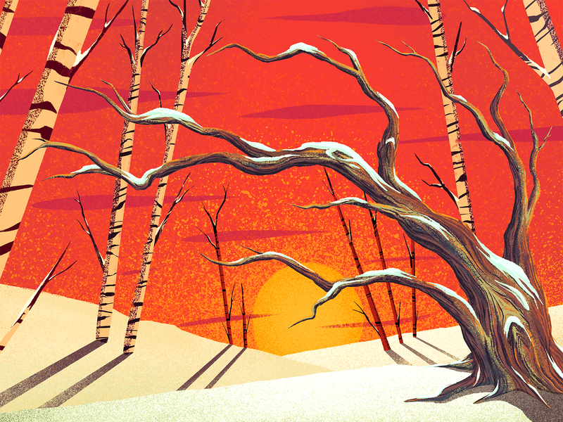
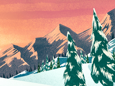
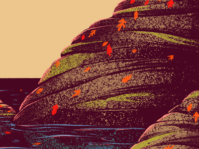
I’m very passionate about my work for Willie’s Reserve, but I spend a lot of my free time these days on illustration. I drew all the time as a kid and obsessed over the golden age of animation. I wanted to be an artist, but life happened and I let that goal fizzle out for a while. Design has done a good job of scratching the creative itch, but now I’m working to pick back up with my artwork.
I’ve been having a great time over the last year building up my illustrative skills. A big part of that is working to find my own voice that feels like a natural extension of who I am. Illustration and design can be very personal if you put yourself into it. It’s great seeing how that continues to shake out for me.
Choose a favorite shot of yours. Why is it your favorite?
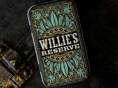
I was going to pick an illustration, but I recently got to post this project from Willie’s Reserve. This project was two years in the making, and I love how it came out. It’s this sweet little joint tin. I started working on it back in October of 2016, but the project got shelved for a year. That’s when they asked me to dig the design back up and breathe some new life into it. That was cool with me because I felt I could do the project more justice and so I came out with a second iteration. Then, we ended up shelving the project another six months before it resurfaced again.
For the last time, I made some improvements to the design and we were off to production! The final result is something I’m very proud of. It features two levels of embossing and some really nice printed detail. It’s a great item to hold in your hand and is easily my favorite packaging design to date.
Tell us about your setup. What tools do you use regularly to create your work?

I use a Mac laptop and I’m an Adobe user. My daily driver at work is Adobe Illustrator and I even have a nerdy pen tool tattoo. I spend about 80% of my time in that app at work, but also know my way around InDesign and have designed a few hundred-page books. Photoshop was the first thing I ever learned, but these days I tend to just use it for painting and retouching.
On top of that, I have fallen in love with the iPad and Apple Pencil. My favorite drawing app is Procreate, but I’m also excited to give Photoshop for iOS a spin when it comes out this year. For the joint tin, I did a lot of pencil sketching and finished it all up in Adobe Illustrator.
Choose a favorite shot from another player. Tell us why you dig it.
It’s hard to pick, but I’m going to go with Joe White’s design for Nordic Lights Cold Brew. I’ve been a big fan of his work for a while now. I’m so impressed with his eye for composition coupled with what is clearly an obsession over the details. Everything he puts out into the world is a treat for the eyes. I think this piece of packaging design is a nice showcase of what he does.
What’s especially crazy to me is that Joe designs most of his stuff in Flash. He could have switched to Illustrator at any point in his career, but he said, “Nah, I’m gonna do this how I want.” Good for him—he gets all my respect.
Find Isaac on Dribbble, Instagram, and at nicetriangle.com.
Find more Interviews stories on our blog Courtside. Have a suggestion? Contact stories@dribbble.com.
