
I’m Matt May, head of inclusive design at Adobe. As someone who has spent the better part of my career advocating for more accessible products and processes, I’m passionate about celebrating the work of creative professionals that accurately represents and includes everyone to achieve a more equitable future. Below I’ve selected some examples that do a great job at showcasing the power of inclusive design.

The International Symbol of Access (ISA), which you may know as the wheelchair or disabled symbol, just turned 50 years old in August. It’s as common an icon as you can name, which brings with it no small amount of criticism. One detail is the depiction of a human form being inseparable from the chair itself—if you were able to see it all. Even the backward-leaning posture suggests a lack of personal agency among wheelchair users, as though they were inert objects. This led to a community-led redesign of the symbol in 2011, highlighted in this shot by Chris Grooms. The form above the chair is leaning forward, coupled with a nifty racing stripe on the wheel. My home state of Washington has adopted this symbol on its disabled placards, and you can expect to see more of this symbol replacing the old one (sometimes, uh, via crowdsourced embellishment?) in the future.

I like a good depiction of a badass, as seen in this shot by Mario Jacome, and Erin Hawley is one. Erin runs a blog called The Geeky Gimp (a word which is in reclamation territory, so don’t get any ideas), streams on Twitch, and talks about gaming and tech on her Twitter account as well.
Did you know that many wheelchair users can stand for some amount of time? It’s true! A campaign led by some folks who are tired of being harassed by passersby for the act of standing up surfaced on Twitter recently. This shot from Kalina Ivanova depicts an individual with and without visible mobility aids. Notice anything else? That’s right! People with disabilities can also be people of color! They can also be different sizes, wear heels, spike their hair, be seven years old, you name it. Representation is good for everybody. Give folks their right to be seen.

Pretty much everyone in inclusive design talks about OXO, the brand behind Good Grips kitchen gizmos. A recent New York Times article by Liz Jackson titled “We Are the Original Lifehackers” talks about architect and OXO co-founder Betsey Farber, and her true role in the creation of kitchen tools which, by focusing on use cases such as her own arthritis, make things easier to use for everyone.
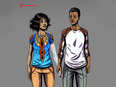
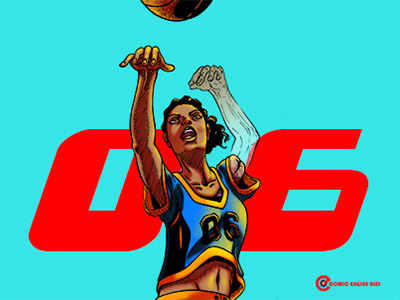
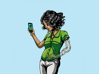
Shots by Alex Lanei from the Phantom Limb series.
Alex Lanei produced a beautiful series illustrating phantom limb. Alex’s character, Nya, is shown in action, shooting a basketball, doing push-ups, taking a selfie, and holding someone’s hand with her phantom limb. I like seeing characters’ disabilities being visualized, without it being the only thing worth talking about, and in my opinion, Alex pulls this off well.
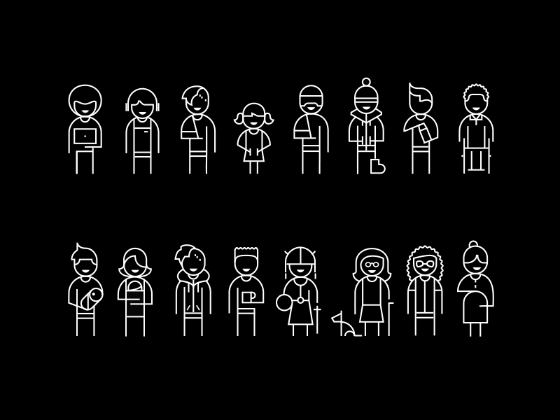
I spend the bulk of my time teaching and mentoring designers, and the first thing I suggest they look at is Microsoft’s Inclusive Design Toolkit featured in this shot by Kris Woolery. Kat Holmes led a team at Microsoft to build a design system showing people with permanent, temporary and situational disabilities (including at least one Viking—ever try to play a VR game with a Viking helmet on?) to help drive home the scope of human diversity. So that’s the “why. “
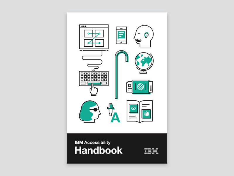
IBM’s accessibility handbook, featured in this shot by Evan Maeda, is a good walkthrough of the what and how. Maeda contributed to the handbook, which covers a lot of territory in a relatively short document.

Finally, a campaign I really think brings inclusion home. Dropbox Design’s Pride 2017 campaign, featured in this shot by Lori Novak, uses their colorful new identity system to center LGBTQIA+ people, complete with a call to “recognize, accept and celebrate” differences. That’s the heart of inclusive design.
Find Matt on Dribbble, on the AdobeXD team, and on Twitter.
Find more Inspiration stories on our blog Courtside. Have a suggestion? Contact stories@dribbble.com.


