

Who are you?
I’m Laura Worthington, a typeface designer, living in Bonney Lake, Washington, about 40 miles south of Seattle. Before becoming a typeface designer, I was a graphic designer and a calligrapher. I see my current career as an amalgamation of the two. I also teach hand lettering workshops for SVC Seattle, Type Camp, Adobe and Amazon—brush, pointed pen and built up/sketched lettering. However, my primary income stems from royalties received on my fonts which I sell through online distributors and my own website. Every now and then, I embark on a commissioned typeface which always poses interesting challenges and is a big change of pace from the self directed work I usually create.
What are you working on?
I’m in the process of finishing up a hand lettered script created on the iPad Pro with the Apple Pencil. I never thought a digital device could work as well as the real thing, but this is pretty amazing. It doesn’t replace traditional tools which I will always love, such as a brush or a pointed pen, but it’s a wonderful addition to them. The only thing that’s left to do to finish the font is kerning and programming of features. It should be released in May. Sneak peek here!
Choose a favorite shot of yours. Why is it a favorite?

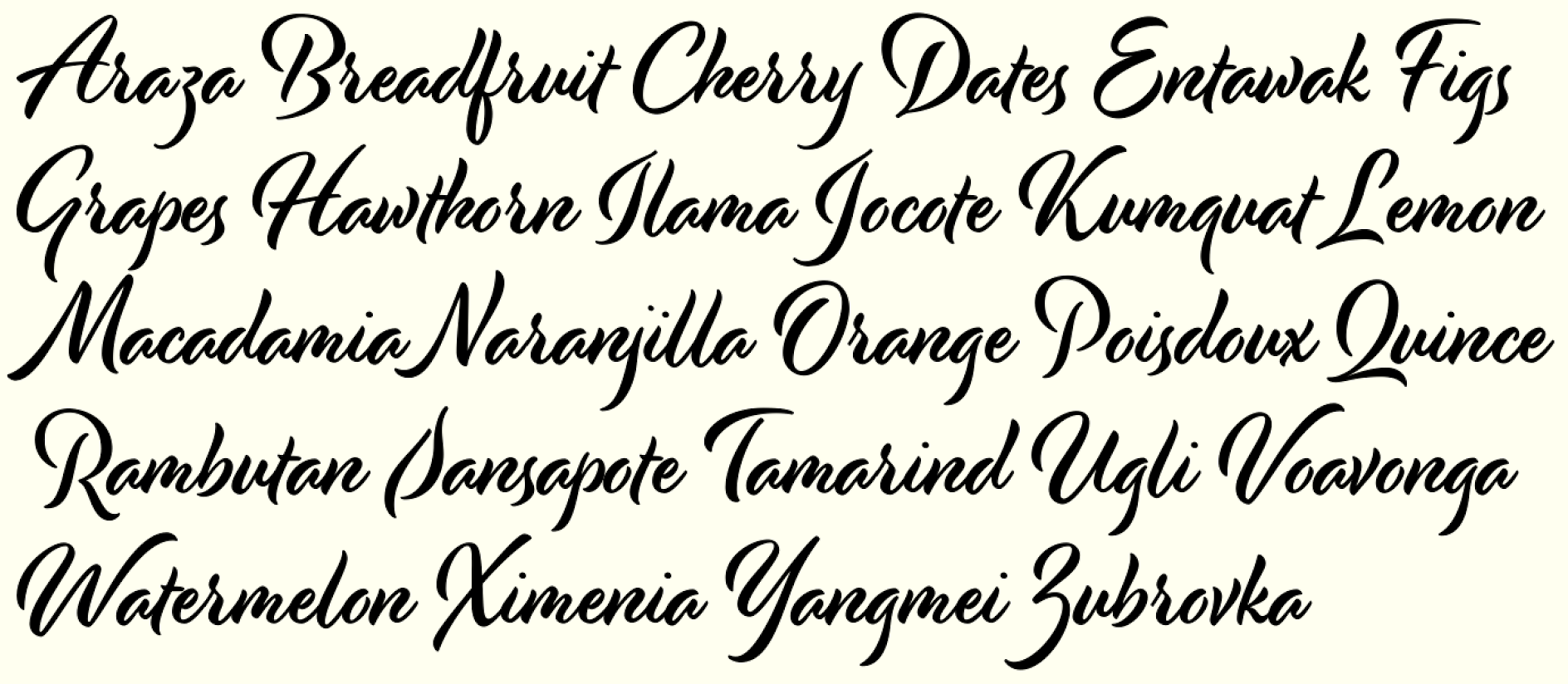
So first off, I have to say that I didn’t design this type specimen/promo image, that was Joe Newton, but I designed the fonts and ornamentation used in it. Every single design element and font can be found in this font collection. It shows some of the frames I’ve designed in the font, which is one of my favorite parts - there are corner, top, bottom and side pieces in the frames font that can be used to easily construct a frame of any size and dimension and as thin or as thick as you want. The main script is Adorn Pomander and the other fonts used are Adorn Roman, Serif and Sans Condensed. They were all designed with the same tool, my favorite wet noodle fountain pen. Using the same tool to create all of these and doing the lettering for all 20 styles in the same time frame culminated in a collection that works well together in any combination. A cohesive toolkit for designers to play with!
Tell us about your setup. What tools did you use to create the shot (e.g. hardware, software, pens, paper, blowtorch)?
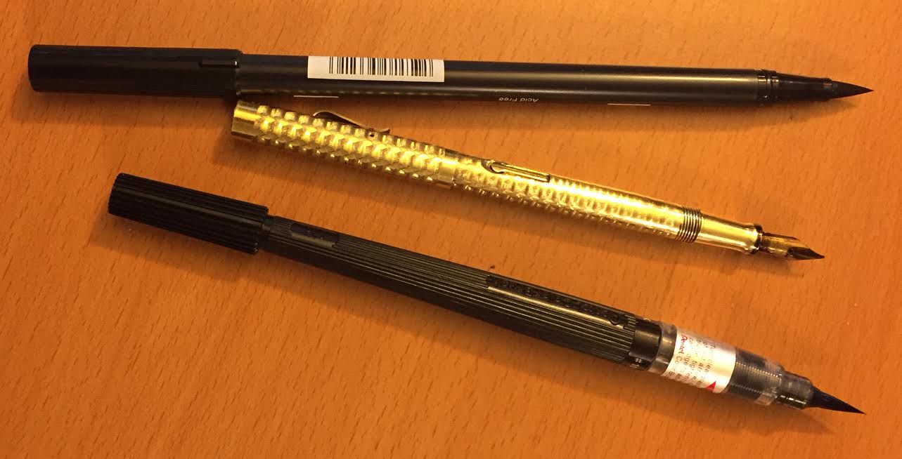
The original lettering started with my vintage 1920s Waterman Ideal #2 wet noodle fountain pen. I also use steel nib dip pens from time to time, but I love the wet noodles (defined as such by their ability to be both flexible and responsive) as they’re so smooth, so forgiving for someone like me who is heavy handed! I’d say about half of my hand lettered fonts use pointed pen, the other half I use a brush, either a Pentel Colorbrush or a felt brush. For designing the fonts themselves, I use FontLab and a handful of Python scripts.
Here’s a short video showing some of the original lettering and sketches used to create the Adorn collection.
Laura Worthington - In Their Shoes from Paige Kwon on Vimeo.
Choose a favorite shot from another Player. Why do you dig it?
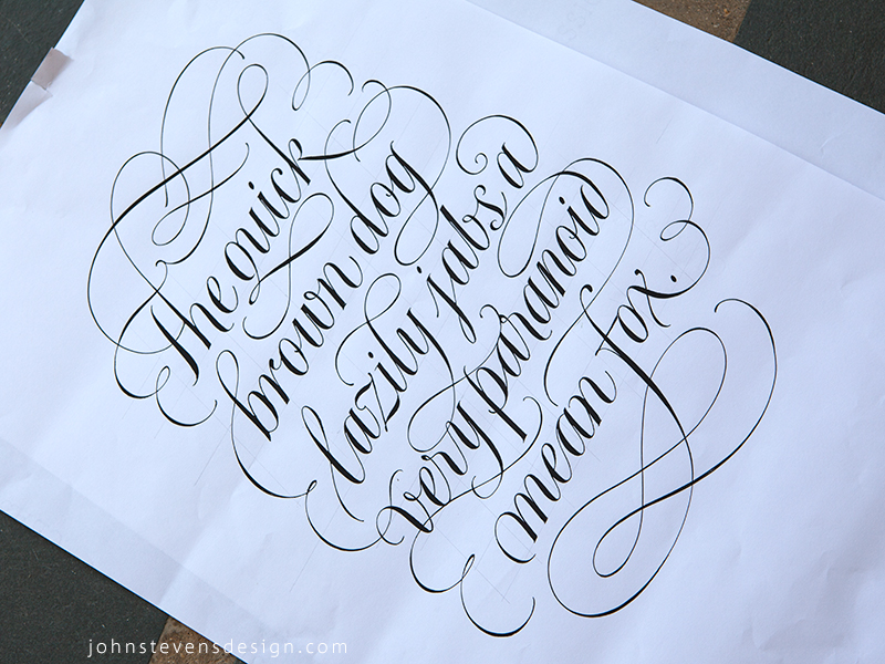
This one by John Stevens—one of the best lettering artists of our times and perhaps ever. I’ve been following his work for about 20 years now and it never ceases to amaze me how many different styles he’s covered and with such elegance and precision. I like this one because it’s one of his “original” letterings for the final piece which reminds me that I need to spend more time with pen and paper and less time on the computer.
Find Laura on Dribbble, on Twitter, and at www.lauraworthingtontype.com.
Find more Interviews stories on our blog Courtside. Have a suggestion? Contact stories@dribbble.com.


