Timeouts are lightning-quick interviews. Five questions to help you get to know the players holding court at Dribbble. Many thanks to Sarah for being today’s interviewee.
Who are you? Let us know where you hail from and what you do.
 I’m Sarah Mick! Designer, Illustrator and wannabe-photographer. I’m currently chillin’ in Milwaukee, Wisconsin, but will be moving to the West Coast in August. I work with the amazingly talented folks at MetaLab crafting interfaces, and I also freelance making print-y stuff whenever a great project comes along.
I’ve got a double major in design and media studies, so I’m a lover of all forms of media—especially horror movies, the Internet and the Kardashians. Oh yeah, and I’m a connoisseur of mexican food, vodka/soda/lemon, and dancing (but only after the previous).
What are you working on?
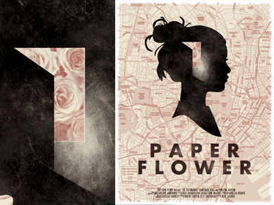
Aside from MetaLab work, I’m in the process of completing a limited run poster series with Christopher Paul for the band Death Cab for Cutie. We’ve got a poster inspired by each of the songs on their new CD. They’ll be released by the label one week at a time and given as prize merch to the band’s fans.
I’m also working on a major redo of my personal website. www.sarahmick.com is in the works and nearly complete.
Lastly, Christopher and I are brewing up a freelance combo for picking up projects like the posters I mentioned above under the name The Art Dept. Website will be launching in the next month!
Choose a favorite shot of yours. Why is it a favorite?
There are two that are variations of each other:
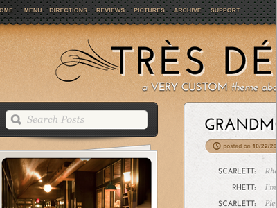
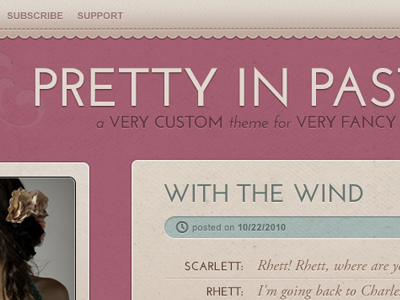
They’re both Tumblr themes for Pixel Union, and I like them because they showcase my favorite style to work with. I love texture, soft colors, and traditionally feminine stylings. I’m also into colors that are muted and tend to vibrate with eachother.
Tell us about your setup. What tools did you use to create the shot(s)?
I’ve got a super mobile setup right now, because I don’t have a studio space at the moment. My coffee table is my desk and NPR or X-Files are the soundtrack of my work-life.
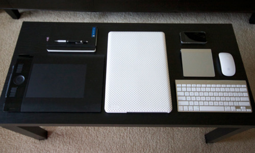
I just upgraded to a 15” quad core MacBook Pro, and I’ve got plans to grab a 27” monitor pretty soon. Other than that, it’s all about sketching on paper, digitizing with the Wacom, and quite often, muddling through with the laptop trackpad.
Choose a favorite shot from another Player. Why do you dig it?
This is nearly impossible! :)
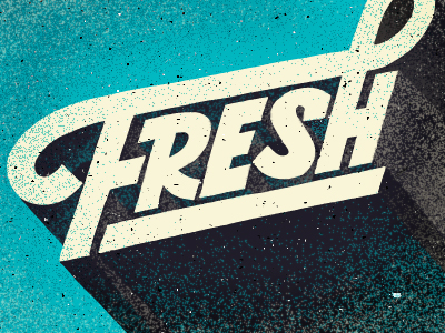
I adore this older shot by Scott Hill:
Love the muted pink, silhouette, sort of antique vibe. Looks a bit different than his more recent stuff. I would say that most of his stuff blows my mind.
I also die for this shot from Friends of Type:
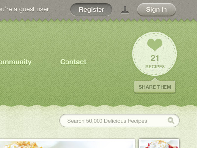
Lastly, one of my most recent UI favs because of its soft, textured look while maintaining the “traditional” web-y elements (by zee7):
Find more Interviews stories on our blog Courtside. Have a suggestion? Contact stories@dribbble.com.


