Personal Logo Ideas

Seeing Thomas' new logo inspired me to create my own personal logo.
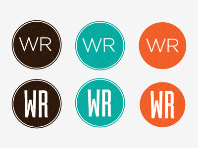
Since my initials are WR I wanted to keep those initials as they are timeless (unless I decide to change my name!).
My only concern is that the W kinda throws out the alignment and is usually wider than the r, making it hard to find a good font. Here are two I kinda like but are quite different -Gotham and Industria.
The reason why I have different colours is because I wouldn't mind having different colour logos for different areas of my website, e.g. the portfolio can be brown, the blog be orange etc.
So which one is your favourite? (I think the top left and top middle are growing on me the most). Am I on the right track?