


New navigation

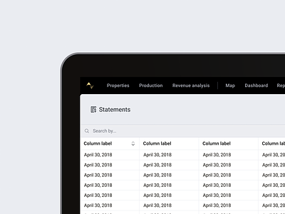


I've iterated on our navigation design several times before, but, coming back to the project with fresh eyes, I felt like the last variation (attached) still missed the mark. The fat black bar on the left kept the page feeling out of balance, and we still were seeing feedback that the first impression felt too complicated.
This update is an attempt to fix that, with groupings of pages under three primary sections (properties, production, revenue analysis), and special pages instantly accessible. Testing this prototype on Monday. 🤞