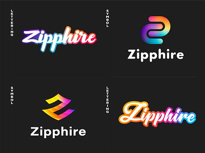
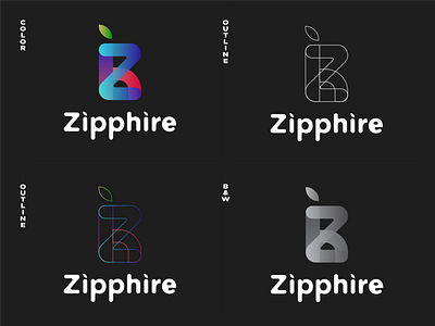
Geometric gradient shapes in logo design for finance insurance
Someone can say that in recent years graphic design has focused only on flat, minimal aesthetics in particular when looking at branding, with the use of effects like gradients being viewed as outdated. We don't think so, there is still a place for good color blending, it gives the impression of movement and speed towards the edge of the logotype.
Today, we are presenting a good case of creative logo design that contains gradients. In this showcase, you can find some of our best examples of logo designs, which were created especially for our client. His main challenge is to engage brand awareness to his fintech startup of a modern banking application for young generation - millennials.
What do you think is better to attract attention to a new brand?
Be sure to follow the @Extej team for regular updates. Do you have a project you’d like to collaborate on?
Feel free to contact us by: Email or Telegram
Dribbble | Instagram | Behance | Facebook
Please, don't be greedy with the cookies & likes ❤️ if love this design plus style.
Feel free to leave feedback and comment.


