


Pied Piper Landing Page

Hi Dribbble!
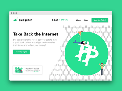
This is my submission for Daily UI #003. It's a landing page design for Pied Piper's PiperCoin/PiperNet. I'm not affiliated with either Pied Piper, Silicon Valley or HBO, I just enjoy the show!
The biggest challenge here was the actual crypto symbol, and I don't think I was able to pull off my design (I was aiming to imitate the BTC logo but with 2 P's for _P_ied _P_iper).
For the buttons, I experimented with using less rounded rectangles with a drop shadow of similar hue. I also tried to stick to design standards by having a left aligned CTA and right aligned picture, with bold text followed by lower opacity paragraph text. I also believe the website should be much simpler and easier to use, so I scrapped most of the pages in favor of simply keeping "About" and "Blog". The FAQ, whitepaper, and some other information would go below this on the same page.
I also tried experimenting with adding elements for user retention. A common technique is to have a small notification modal in the bottom left that contains a new blog/article, a discount/sale, etc.; I placed a blog article for now, the most recent addition to Jared's blog from piedpiper.com. For ICO's, another technique is to show the current price, volume, and market metrics to try to show prosperity and create a sense of FOMO. I threw out including the volume and other metrics as it felt cluttered and unnecessary, and instead included the price as well as percent growth, and placed it on the middle-top as on piedpiper.com (minus the cluttered banner).
Since PiperNet is intended to be private, I also left out the GDPR banner as it is assumed that they would not collect information from their visitors to begin with.
Please let me know what you think!