The Roaming Dough idea development

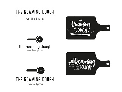

Suzanne was really drawn to the pizza board and the pizza cutter marks but was torn between using handwritten inspired typefaces and clean and simple typefaces.
To help develop the design, I stripped the colour out to regain some focus and experimented with different pizza board shapes. At this point, it was clear the final logo would either have clean typography or be handwritten, rather than a combination of both.