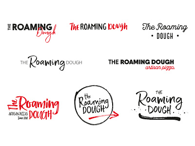
The Roaming Dough Ideas 2
I usually work in black and white when I'm developing ideas so I can focus on the design and not be distracted by colour. However, I wanted to create a series of concepts that layered up type so I needed a contrast and accent colour to show how these ideas could come alive and pop!
I feel these ideas represent the handmade and artisan element of Suzanne's pizzas, reflect well the indie business the Roaming Dough is and fit in with the independent markets Suzanne will sell at.
artisan
brand
brand and identity
branding
calligraphy
ideas
identity
indie
logo
pizza
startup
startuplogo
type
typography
wip
View all tags
Posted on
Aug 31, 2018
More by Katherine Cory View profile
Like

