Unused Logo/icon

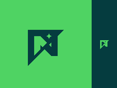
Here is a second logo that didn't make the cut, focused on transition and balance. This one was one of my favorites, just how all of the pieces fit together and the negative space balanced it all.
See more of my work on my | Instagram