


Involve Inc. brand identity - case study, part 1

First part of upcoming case study: creative brief and visual concept behind brand identity.
_____
Personal reflection (aka “let's get more emotional”):
of course, CX is interesting - you get know how business or industry works. But what I LOVE in creating brand identities is that you dig deeper to the culture, emotional values, trying to find second/third-line visual associations to make concept not “flat” or too obvious.
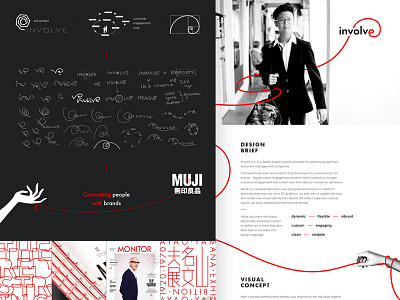
In case of Involve Inc., I started with leveling up of my knowledge in the color meaning and symbols in Japanese culture. That is a completely another world!
The discovery of Red String of Fate legend and it’s interpretation to client’s business was that “a-ha!” moment. Despite having alternative concept No.2 (more digital and understandable), the feedback from client came immediately: “First concept based on legend. We love red line. Please, continue.”
And I shouldn't explain here what designer feels, when client chooses the RIGHT concept :)
(not your favourite, exactly the right one)
The project was designed during my days in Chimera Prime (https://chimeraprime.com/)