Revolution Marketing Rebrand

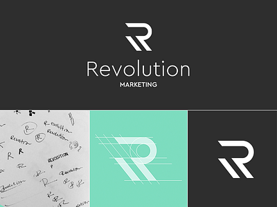


Our friends at Revolution Marketing came to us needing a total rebrand. They are a super cool and edgy experiential marketing agency whose prior identity wasn't in line with the cutting edge stuff they make. The double-slashed R paired with the dark gray and teal color scheme aligns their branding with the feel of their company.