Postpartum Depression Infographic

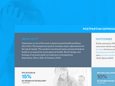
Data visualization is something I haven’t often ventured into, not sure why that is but I’m glad I took the time to do so. This shot is basically a semi-detailed infographic (if you can call it that) talking about postpartum depression and how it affects mothers as well as the people around them.
Coming from a user experience perspective I tried asking myself (and some nurse friends) questions such like “Who would see this?”, “What would they be looking for?”, “What must their takeaways revolve around?” amongst a bunch of others.
Whilst researching guidelines for how to design for projects such as this, I’ve found there has been a bit of a debate as to what actually constitutes of an infographic and what doesn’t. The general rule(s) of thumb were quite straightforward though. Make use of a palette and type pairings that are easily digestible and scannable. Tell a story but be objective. Have a hook. Remember accessibility.